FocusView component for Stripe AppsDashboard only
Use FocusView to open a dedicated space for the end user to complete a specific task.
A FocusView component can be opened from other View components and allows the developer to open a dedicated space for the end user to complete a specific task. Examples include:
- Enter details to create a new entry in a database
- Go through a wizard to decide on next steps
- Confirm that the user wants to take the action they indicated
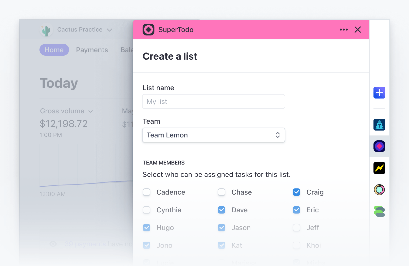
What FocusView looks like
FocusView must be a child of ContextView. Don’t wrap the FocusView in a conditional, instead use the shown property to control its visible state. For more information, see ContextView.
To add the FocusView component to your app:
import {FocusView} from '@stripe/ui-extension-sdk/ui';
FocusView props
| Property | Type |
|---|---|
| Required
The contents of the component. |
| Required
The title of the |
| Optional
If provided, confirmCloseMessages will be displayed when the user closes the Related types: ConfirmCloseMessages. |
| Optional
React node adjacent to any actions in the footer. |
| Optional
A primary call to action (“Save” or “Continue”) |
| Optional
A secondary call to action (“Cancel”) |
| Optional
Allows the |
| Optional
Whether the |
| OptionalDeprecated Use
|
ConfirmCloseMessages
| Property | Type |
|---|---|
| Required
|
| Required
|
| Required
|
| Required
|
Close Confirmation Window
When passing confirmCloseMessages, in order for the close confirmation window to work properly in every close scenario, pass the setShown prop so the FocusView can manage its shown state. To control when the close confirmation window displays, you can use state to conditionally pass confirmCloseMessages to the FocusView, like in the following example:
Example
import React from 'react';
import {
  Box,
  Button,
  ContextView,
  FocusView,
  Select,
} from '@stripe/ui-extension-sdk/ui';

type Mood = 'Happy' | 'Sad';

const confirmCloseMessages = {
  title: 'Your mood will not be saved',
  description: 'Are you sure you want to exit?',
  cancelAction: 'Cancel',
  exitAction: 'Exit',
};

const [mood, setMood] = React.useState<Mood>('Happy');
const [shown, setShown] = React.useState<boolean>(false);
const [confirmClose, setConfirmClose] = React.useState<boolean>(false);

const open = () => {
  setConfirmClose(true);
  setShown(true);
};

const closeWithoutConfirm = () => {
  setConfirmClose(false);
  setShown(false);
};

const closeWithConfirm = () => {
  setShown(false);
};

const updateMood = (newMood: Mood) => {
  setMood(newMood);
  closeWithoutConfirm();
};

return (
  <ContextView
    title="Mood picker"
    description="This section communicates my extension's feelings"
  >
    <FocusView
      title="Pick your mood"
      shown={shown}
      setShown={setShown}
      confirmCloseMessages={confirmClose ? confirmCloseMessages : undefined}
      secondaryAction={<Button onPress={closeWithConfirm}>Cancel</Button>}
    >
      <Select onChange={(e) => updateMood(e.target.value as Mood)}>
        <option label="">Select mood</option>
        <option label="Happy">Happy</option>
        <option label="Sad">Sad</option>
      </Select>
    </FocusView>
    <Box css={{stack: 'x', gap: 'medium'}}>
      <Box
        css={{
          font: 'subheading',
          color: mood === 'Happy' ? 'success' : 'info',
        }}
      >
        {mood}
      </Box>
      <Button onPress={open}>Change mood</Button>
    </Box>
  </ContextView>
)