Elements Appearance API
Customize the look and feel of Elements to match the design of your site.
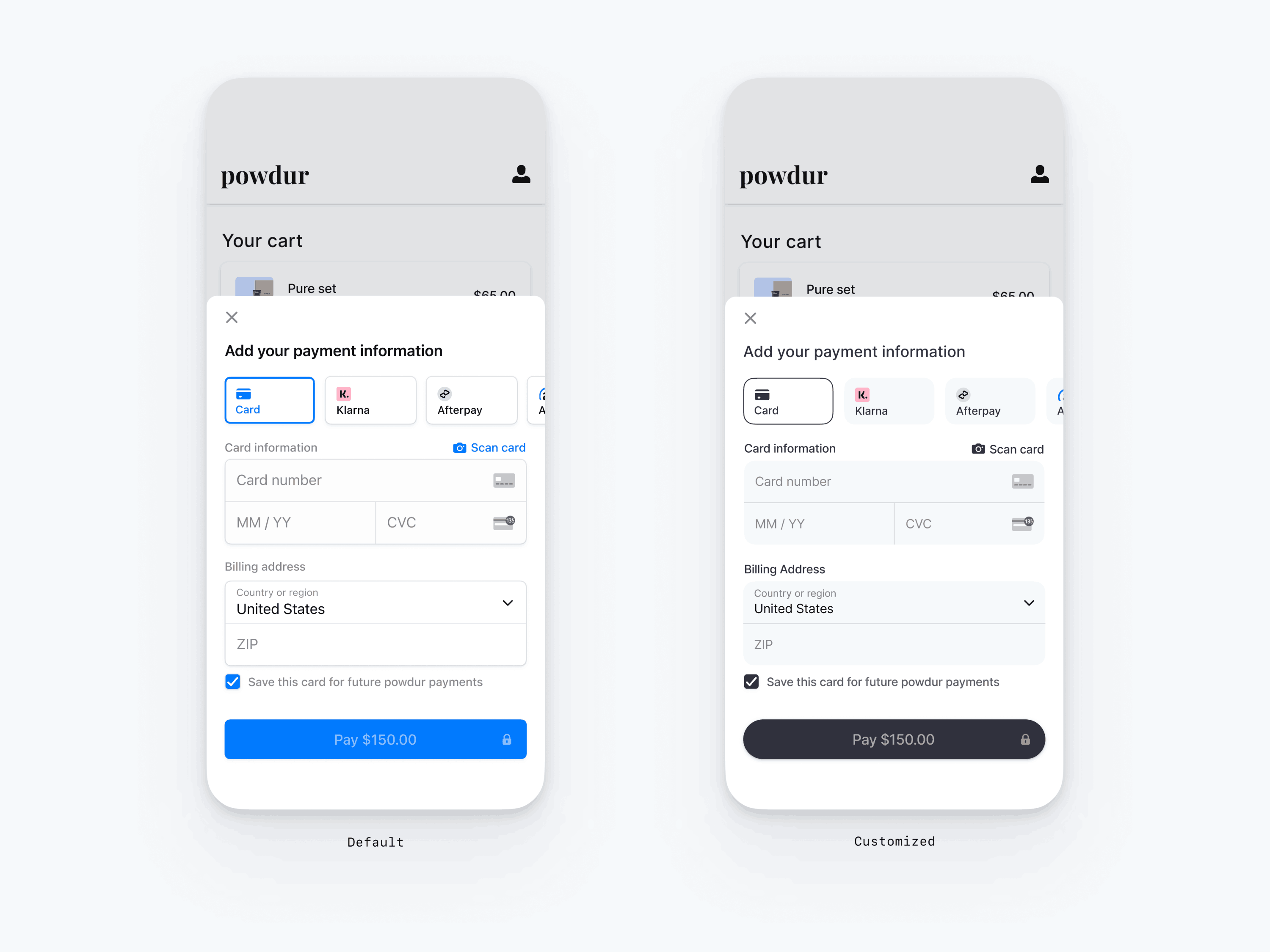
The mobile Payment Element supports visual customization, which allows you to match the design of your app. The layout stays consistent, but you can modify colors, fonts, and more by including the appearance parameter when you call initPaymentSheet().
- Start by customizing the font
- Customize colors to match your app
- Customize shapes like the border radius
- Fine-tune specific components

// The following code creates the appearance shown in the screenshot above
const customAppearance = {
 font: {
   family:
     Platform.OS === 'android' ? 'avenirnextregular' : 'AvenirNext-Regular',
 },
 shapes: {
   borderRadius: 12,
   borderWidth: 0.5,
 },
 primaryButton: {
   shapes: {
    borderRadius: 20,
   },
 },
 colors: {
   primary: '#fcfdff',
   background: '#ffffff',
   componentBackground: '#f3f8fa',
   componentBorder: '#f3f8fa',
   componentDivider: '#000000',
   primaryText: '#000000',
   secondaryText: '#000000',
   componentText: '#000000',
   placeholderText: '#73757b',
 },
};

const { error } = await initPaymentSheet({
 ...
 appearance: customAppearance,
});
Fonts
Customize the font by passing a FontConfig to font and setting family. On iOS, the value of family should be the “PostScript name” found in Font Book. On Android, copy the . or . file from android/app/src/main/assets/font/<your-font> to android/app/src/main/res/font/<your-font> and use the name of the font file (containing only lowercase, alphanumeric characters). The mobile Payment Element uses the font family of your custom font, but determines sizes and weights itself.
To increase or decrease the size of text, set scale. We multiply font sizes by this value before displaying them. This is useful if your custom font is slightly larger or smaller than the system font.
const { error } = await initPaymentSheet({
 ...
 appearance: {
   font: {
     family: Platform.OS === 'android' ? 'avenirnextregular' : 'AvenirNext-Regular',
     scale: 1.15,
   },
 },
});
Colors
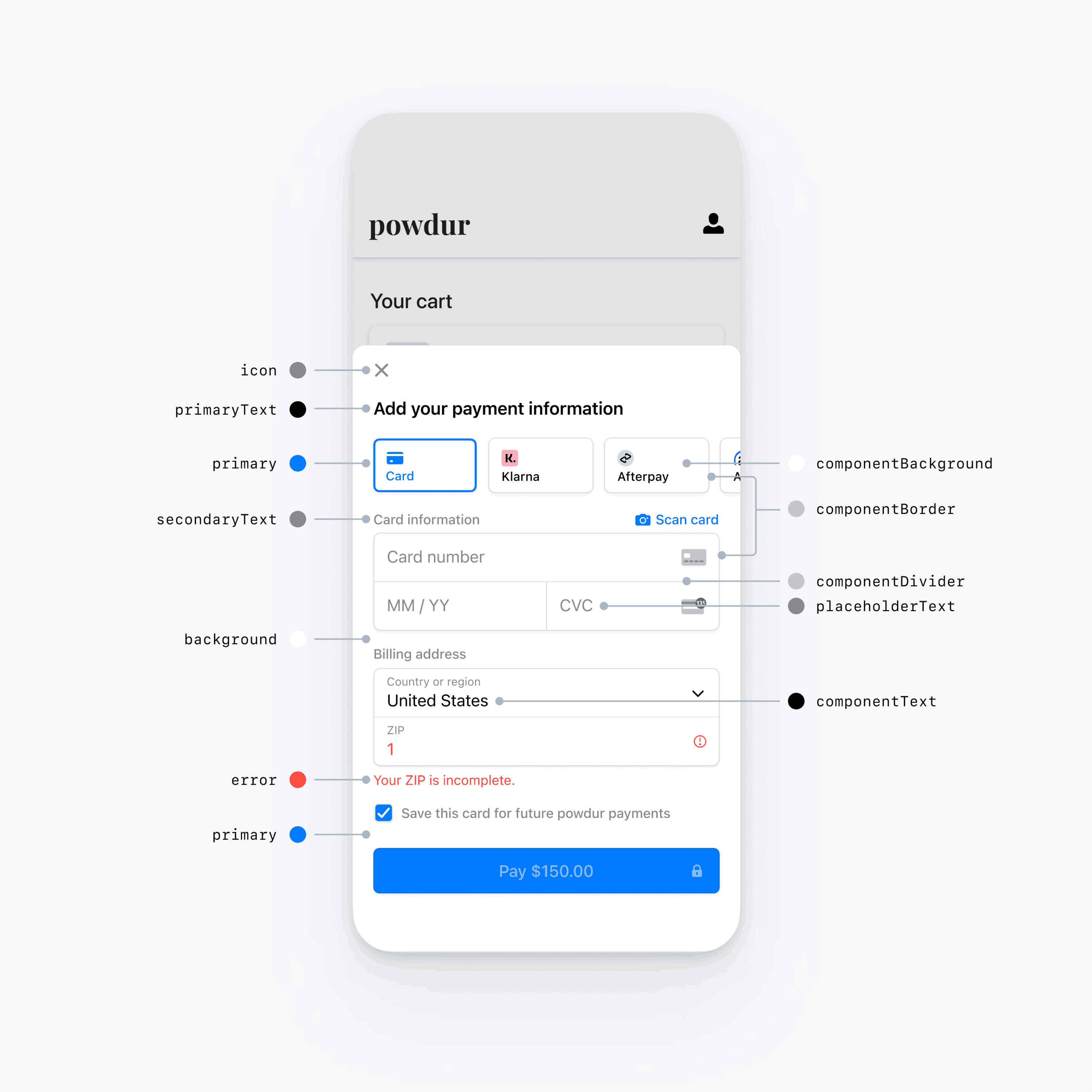
Customize the colors in the mobile Payment Element by modifying the color categories defined in GlobalColorConfig. Each color category determines the color of one or more components in the UI. For example, primary defines the color of the Pay button and selected items like the Save this card checkbox. Refer to the diagram below to see some of the UI elements associated with each color category.
Notiz
To support dark mode, pass maps for both light and dark colors to colors.

Shapes
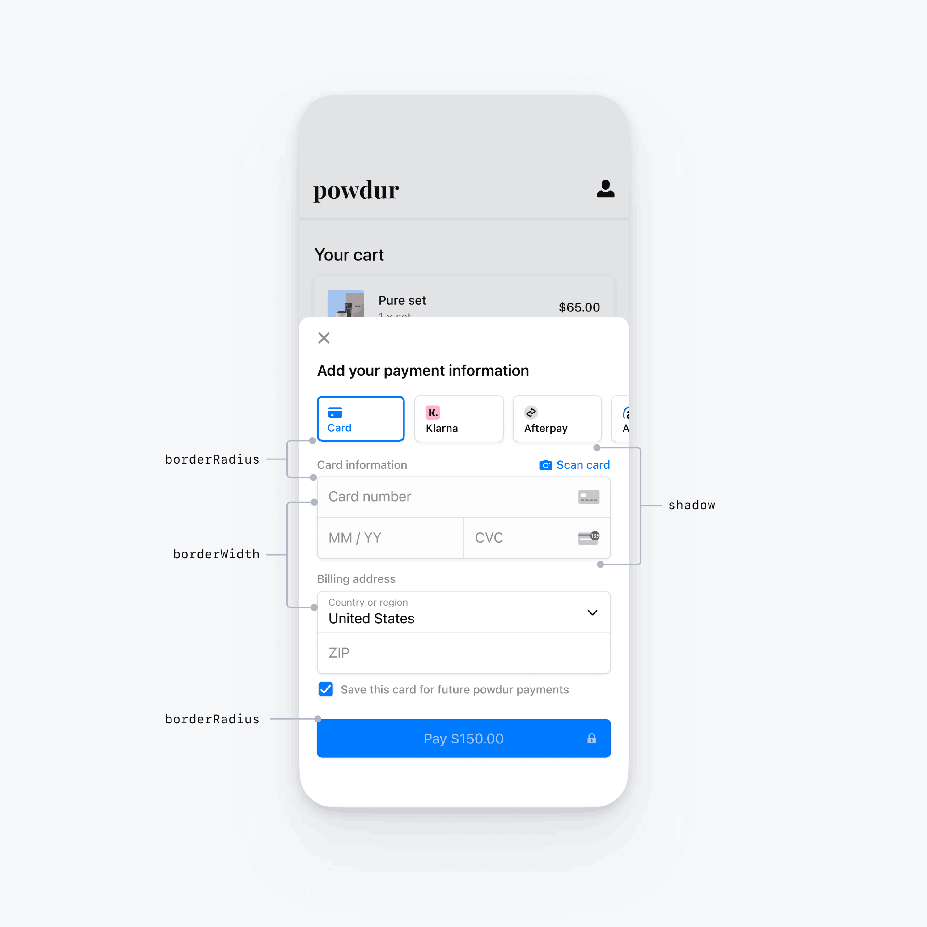
Besides fonts and colors, you can also customize the border radius, border width, and shadow used throughout the mobile Payment Element.

Specific UI components
The sections above describe customization options that affect the mobile Payment Element broadly, across multiple UI components. We also provide customization options specifically for the primary button (for example, the Pay button). Refer to the PrimaryButtonConfig for the full list of customization options.
Customization options for specific UI components take precedence over other values. For example, primaryButton. overrides the value of shapes..
Notiz
Let us know if you think we need to add more customization options.