Elements Appearance API
Customize the look and feel of Elements to match the design of your site.
The mobile Payment Element supports visual customization, which allows you to match the design of your app. The layout stays consistent, but you can modify colors, fonts, and more by creating your PaymentSheet.Configuration object with an appearance object.
- Start by customizing the font
- Customize colors to match your app
- Customize shapes like corner radius
- Fine-tune specific components

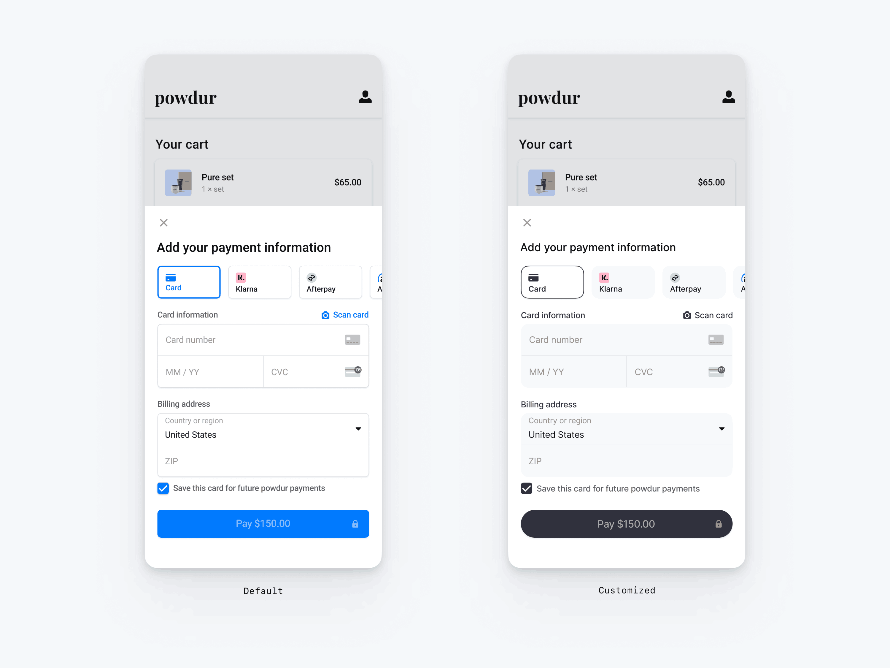
// The following code creates the appearance shown in the screenshot above
val appearance = PaymentSheet.Appearance(
   colorsLight = PaymentSheet.Colors(
       primary = Color(red = 36, green = 36, blue = 47),
       surface = Color.White,
       component = Color(red = 243, green = 248, blue = 245),
       componentBorder = Color.Transparent,
       componentDivider = Color.Black,
       onComponent = Color.Black,
       subtitle = Color.Black,
       placeholderText = Color(red = 115, green = 117, blue = 123),
       onSurface = Color.Black,
       appBarIcon = Color.Black,
       error = Color.Red,
   ),
   shapes = PaymentSheet.Shapes(
       cornerRadiusDp = 12.0f,
       borderStrokeWidthDp = 0.5f
   ),
   typography = PaymentSheet.Typography.default.copy(
       fontResId = R.font.avenir_next
   ),
   primaryButton = PaymentSheet.PrimaryButton(
   shape = PaymentSheet.PrimaryButtonShape(
       cornerRadiusDp = 20f
   ),
)

// ...

paymentSheet.presentWithPaymentIntent(
   clientSecret,
   PaymentSheet.Configuration(
       merchantDisplayName = merchantName,
       appearance = appearance
   )
)
Fonts
Customize the font by setting typography.fontResId to your custom font’s resource ID. The mobile Payment Element uses the font family of your custom font, but determines sizes and weights itself.
To increase or decrease the size of text, set typography.sizeScaleFactor. We multiply font sizes by this value before displaying them. This is useful if your custom font is slightly larger or smaller than the system font.
val appearance = PaymentSheet.Appearance(
  // …
  typography = PaymentSheet.Typography.default.copy(
    sizeScaleFactor = 1.15f, // Increase the size of all text by 1.15x
    fontResId = R.font.myFont
)
val configuration = PaymentSheet.Configuration(
  // …
  appearance = appearance
)
Colors
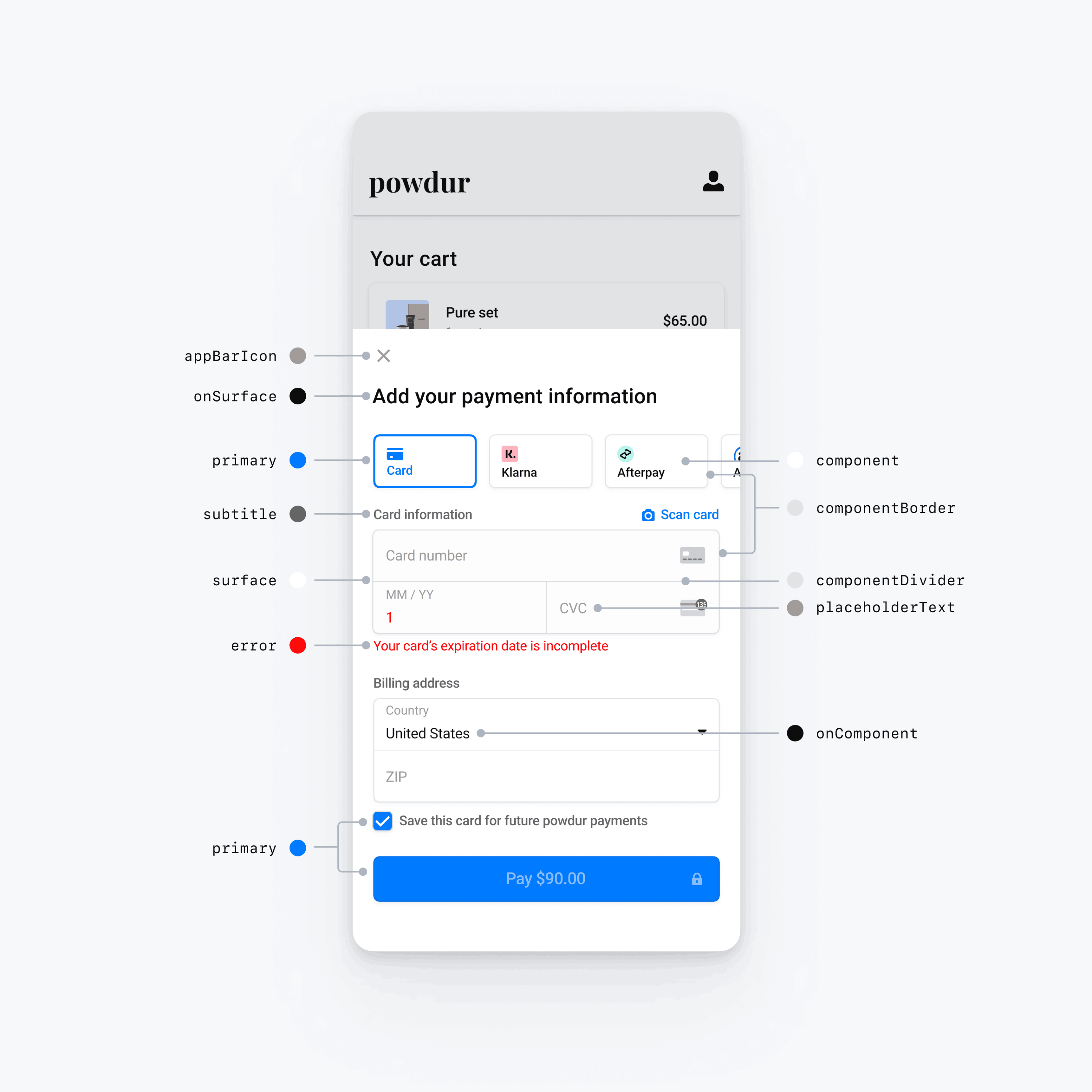
Customize the colors in the mobile Payment Element by modifying the color categories defined in PaymentSheet.Colors. Each color category determines the color of one or more components in the UI. For example, primary defines the color of the Pay button and selected items like the Save this card checkbox. Refer to the diagram below to see some of the UI elements associated with each color category.
Notiz
To support dark mode, set appearance.colorsDark. If you don’t support dark mode, set appearance.colorsDark to the same value as appearance.colorsLight

Shapes
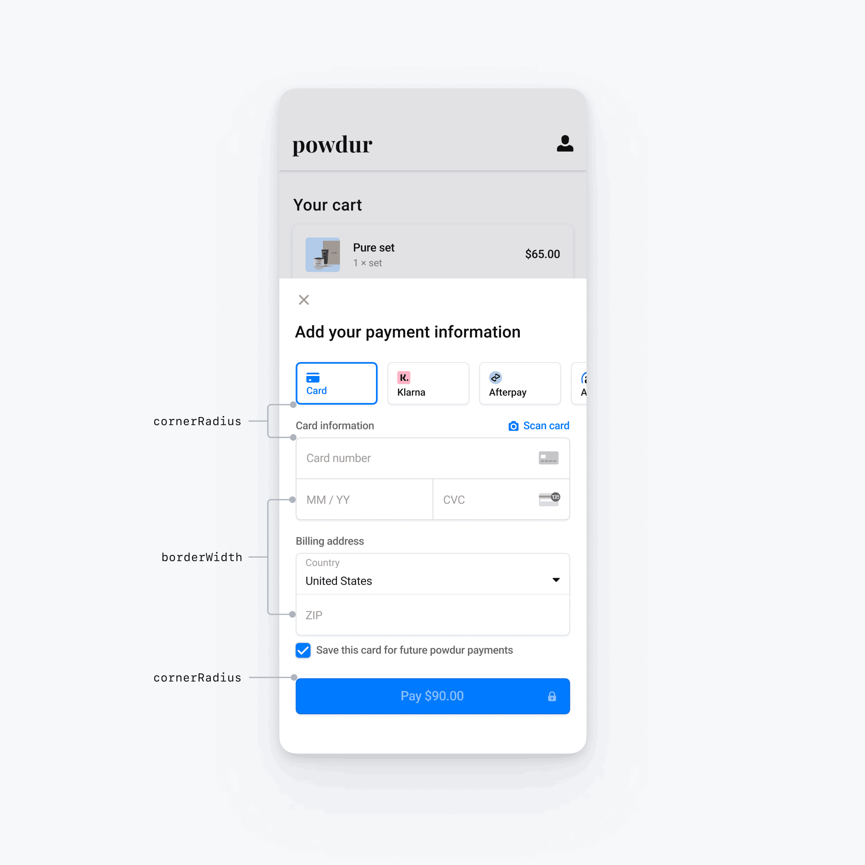
Besides fonts and colors, you can also customize the corner radius, border width used throughout the mobile Payment Element by setting appearance.shapes.

Specific UI components
The sections above describe customization options that affect the mobile Payment Element broadly, across multiple UI components. We also provide customization options specifically for the primary button (for example, the Pay button). Refer to Appearance.PrimaryButton for the full list of customization options.
Customization options for specific UI components take precedence over other values. For example, appearance. overrides the value of appearance..
Notiz
Let us know if you think we need to add more customization options.