自定义外观
自定义结账页面的颜色、字体、形状等。
- 首先选择一个主题。
通过选择与您的网站最相似的预构建主题,立即启动并运行。
- 使用变量自定义主题。
设置 fontFamily 和 colorPrimary 等变量来广泛自定义出现在每个 Element 中的组件。
- 如果需要,使用 规则 微调个别组件和状态。
为实现完全控制,请为 Element 中出现的各个组件指定自定义 CSS 属性。
主题
请从以下主题开始自定义 Element:
stripenightflat
const appearance = {
  theme: 'night'
};
变量
设置变量可影响 Element 中众多组件的外观。

variables 选项功能类似 CSS 变量。您可为每个变量指定 CSS 值,并使用 var(--myVariable) 语法引用其他变量。您甚至可以使用浏览器 DOM 检查器查看最终生成的 DOM。
const appearance = {
  theme: 'stripe',

  variables: {
    colorPrimary: '#0570de',
    colorBackground: '#ffffff',
    colorText: '#30313d',
    colorDanger: '#df1b41',
    fontFamily: 'Ideal Sans, system-ui, sans-serif',
    spacingUnit: '2px',
    borderRadius: '4px',
    // See all possible variables below
  }
};
常用变量
| 变动 | 描述 |
|---|---|
fontFamily | 整个 Element 中使用的字体族。Element 支持自定义字体,方式是将 fonts 选项传入 initCheckout 或 CheckoutProvider。 |
fontSizeBase | 在 Element 的根目录上设置的字体大小。默认情况下,其他字体大小变量(如 fontSizeXs 或 fontSizeSm)使用 rem 单位从该值缩放。请确保为移动设备上的输入字段选择的字体大小至少为 16px。 |
spacingUnit | 所有其他间距值基于此基础间距单位。增减此值可调整整体布局的疏密程度 |
borderRadius | 用于 Element 中选项卡、输入框及其他组件的边框圆角半径。 |
colorPrimary | 整个 Element 中使用的主色调。请将此设置为您品牌的主色调。 |
colorBackground | 用于 Element 中输入框、选项卡及其他组件背景的颜色。 |
colorText | Element 中使用的默认文本颜色。 |
colorDanger | 用于指示 Element 中错误或破坏性操作的颜色。 |
不太常用的变量
| 变动 | 描述 |
|---|---|
buttonBorderRadius | 按钮使用的边框半径。默认情况下,按钮使用 borderRadius。 |
fontSmooth | 要在 Element 中使用的文本抗锯齿设置。可选值为 always、auto 或 never。 |
fontVariantLigatures | Element 中文本的 font-variant-ligatures 设置。 |
fontVariationSettings | Element 中文本的 font-variation-settings 设置。 |
fontWeightLight | 浅色文本使用的字体粗细。 |
fontWeightNormal | 普通文本使用的字体粗细。 |
fontWeightMedium | 中等文本使用的字体粗细。 |
fontWeightBold | 粗体文本使用的字体粗细。 |
fontLineHeight | Element 中文本的行高度设置。 |
fontSizeXl | Element 中特大号文本的字体大小。默认基于 var(--fontSizeBase) 使用 rem 单位缩放。 |
fontSizeLg | Element 中大号文本的字体大小。默认基于 var(--fontSizeBase) 使用 rem 单位缩放。 |
fontSizeSm | Element 中小号文本的字体大小。默认基于 var(--fontSizeBase) 使用 rem 单位缩放。 |
fontSizeXs | Element 中极小号文本的字体大小。默认基于 var(--fontSizeBase) 使用 rem 单位缩放。 |
fontSize2Xs | Element 中特小号文本的字体大小。默认基于 var(--fontSizeBase) 使用 rem 单位缩放。 |
fontSize3Xs | Element 中超特小号文本的字体大小。默认基于 var(--fontSizeBase) 使用 rem 单位缩放。 |
logoColor | 徽标变体的显示偏好设置(light 或 dark)。 |
tabLogoColor | 在 . 组件中显示的徽标变体(light 或 dark)。 |
tabLogoSelectedColor | 在 . 组件中显示的徽标变体(light 或 dark)。 |
blockLogoColor | 在 . 组件中显示的徽标变体(light 或 dark)。 |
colorSuccess | 用于表示 Element 中积极操作或成功结果的颜色。 |
colorWarning | 用于表示 Element 中潜在破坏性操作的颜色。 |
accessibleColorOnColorPrimary | 显示在 var(--colorPrimary) 背景上的文本颜色。 |
accessibleColorOnColorBackground | 出现在任何 var(--colorBackground) 背景之上的文本颜色。 |
accessibleColorOnColorSuccess | 显示在 var(--colorSuccess) 背景上的文本颜色。 |
accessibleColorOnColorDanger | 显示在 var(--colorDanger) 背景上的文本颜色。 |
accessibleColorOnColorWarning | 显示在 var(--colorWarning) 背景上的文本颜色。 |
colorTextSecondary | 次要重要性文本的颜色。例如,该颜色用于当前未选中的选项卡标签。 |
colorTextPlaceholder | Element 中输入框占位文本的颜色。 |
iconColor | Element 中图标的默认颜色(例如显示在卡片选项卡中的图标)。 |
iconHoverColor | 鼠标悬停时图标的颜色。 |
iconCardErrorColor | 卡片图标处于错误状态时的颜色。 |
iconCardCvcColor | 卡片图标 CVC 变体的颜色。 |
iconCardCvcErrorColor | 当 CVC 字段输入无效时,卡片图标 CVC 变体的颜色。 |
iconCheckmarkColor | 在类似 . 组件中显示的勾选标记颜色。 |
iconChevronDownColor | 选择输入框内显示的箭头图标颜色。 |
iconChevronDownHoverColor | 鼠标悬停时箭头图标的颜色。 |
iconCloseColor | 关闭图标的颜色(用于表示关闭或取消操作)。 |
iconCloseHoverColor | 鼠标悬停时关闭图标的颜色。 |
iconLoadingIndicatorColor | 加载指示器中旋转图标的颜色。 |
iconMenuColor | 用于表示附加操作集的菜单图标颜色。 |
iconMenuHoverColor | 鼠标悬停时菜单图标的颜色。 |
iconMenuOpenColor | 菜单打开时菜单图标的颜色。 |
iconPasscodeDeviceColor | 密码设备图标的颜色(用于表示消息已发送至用户移动设备)。 |
iconPasscodeDeviceHoverColor | 鼠标悬停时,密码设备图标的颜色。 |
iconPasscodeDeviceNotificationColor | 显示在密码设备图标上的通知指示器颜色。 |
iconRedirectColor | 基于重定向的支付方式所显示的重定向图标颜色。 |
tabIconColor | 选项卡内显示的图标颜色。 |
tabIconHoverColor | 鼠标悬停时,选项卡内显示的图标颜色。 |
tabIconSelectedColor | 选项卡被选中时,选项卡内显示的图标颜色。 |
tabIconMoreColor | 附加支付方式菜单触发器中显示的图标颜色。 |
tabIconMoreHoverColor | 鼠标悬停时,附加支付方式菜单触发器中显示的图标颜色。 |
accordionItemSpacing | . 组件之间的垂直间距。仅当 spacedAccordionItems 为 true 时才适用。 |
gridColumnSpacing | Element 布局中所用网格内的列间距。 |
gridRowSpacing | Element 布局中所用网格内的行间距。 |
pickerItemSpacing | . 中呈现的 . 组件间的间距。 |
tabSpacing | . 组件之间的水平间距。 |
规则
rules 选项是类 CSS 选择器到 CSS 属性的映射,允许对单个组件进行精细自定义。定义好您的 theme 和 variables 后,用 rules 无缝集成 Element,使其匹配您的网站设计。
const appearance = {
    rules: {
      '.Tab': {
        border: '1px solid #E0E6EB',
        boxShadow: '0px 1px 1px rgba(0, 0, 0, 0.03), 0px 3px 6px rgba(18, 42, 66, 0.02)',
      },

      '.Tab:hover': {
        color: 'var(--colorText)',
      },

      '.Tab--selected': {
        borderColor: '#E0E6EB',
        boxShadow: '0px 1px 1px rgba(0, 0, 0, 0.03), 0px 3px 6px rgba(18, 42, 66, 0.02), 0 0 0 2px var(--colorPrimary)',
      },

      '.Input--invalid': {
        boxShadow: '0 1px 1px 0 rgba(0, 0, 0, 0.07), 0 0 0 2px var(--colorDanger)',
      },

      // See all supported class names and selector syntax below
    }
  };
所有规则
规则的选择器可以指向 Element 中的任何 Public 类名称,以及每个类中支持的状态、伪类 (pseudo-class) 和伪元素 (pseudo-element)。例如,以下是有效的选择器:
.Tab, . Label, . Input .Tab:focus .Input--invalid, . Label--invalid .Input::placeholder
以下是无效的选择器:
.,只能指向 Public 类名称p-SomePrivateClass, img .,不支持选择器中的祖先后代关系。Tab . TabLabel .,其中Tab--invalid .类不支持Tab --invalid状态
在选择器中使用的每个类名仅支持特定 CSS 属性允许列表,这些属性需使用驼峰命名法指定(例如,box-shadow 属性应写作 boxShadow)。
以下是支持的类名及其相应的状态、伪类 (pseudo-classes) 和伪元素 (pseudo-element) 的完整列表。
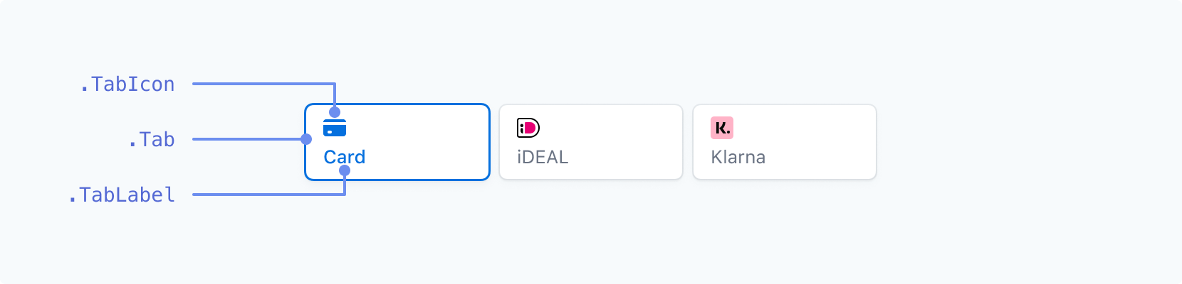
标签
| 类名 | 状态 | Pseudo-classes | Pseudo-elements |
|---|---|---|---|
. | --selected | :hover, :focus, :active, :disabled | |
. | --selected | :hover, :focus, :active, :disabled | |
. | --selected | :hover, :focus, :active, :disabled |
表单输入 - 上方标签
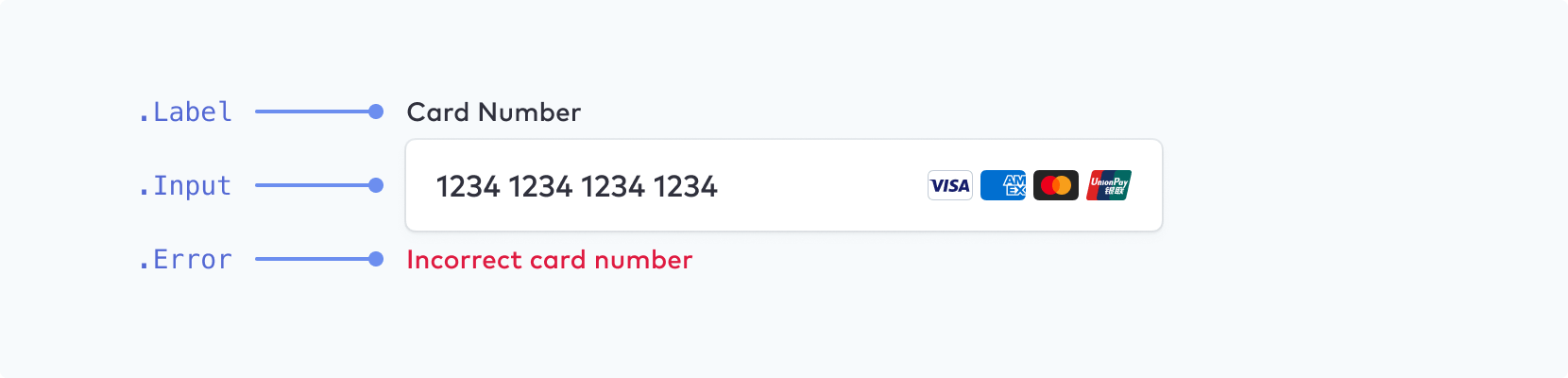
请确保为移动设备上的输入字段选择的字体大小至少为 16px。
| 类名 | 状态 | Pseudo-classes | Pseudo-elements |
|---|---|---|---|
. | --empty, --invalid, --focused | ||
. | --empty, --invalid | :hover, :focus, :disabled, :autofill | ::placeholder, ::selection |
. |
表单输入 - 浮动标签
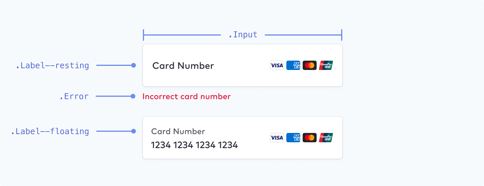
注意
浮动标签可作为额外的配置选项启用。
| 类名 | 状态 | Pseudo-classes | Pseudo-elements |
|---|---|---|---|
. | --empty, --invalid, --focused, --floating, --resting | ||
. | --empty, --invalid | :hover, :focus, :disabled, :autofill | ::placeholder, ::selection |
. |
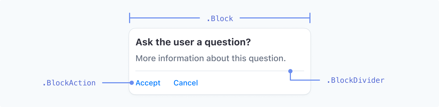
阻止
| 类名 | 状态 | Pseudo-classes | Pseudo-elements |
|---|---|---|---|
. | |||
. | |||
. | --negative | :hover, :focus, :active |
代码输入
| 类名 | 状态 | Pseudo-classes | Pseudo-elements |
|---|---|---|---|
. | :hover, :focus, :disabled |
复选框
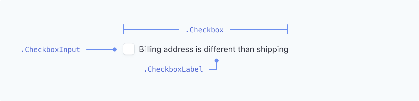
| 类名 | 状态 | Pseudo-classes | Pseudo-elements |
|---|---|---|---|
. | --checked | ||
. | --checked | :hover, :focus, :focus-visible | |
. | --checked | :hover, :focus, :focus-visible |
下拉列表
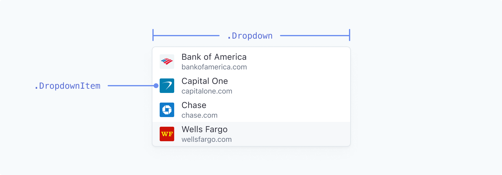
| 类名 | 状态 | Pseudo-classes | Pseudo-elements |
|---|---|---|---|
. | |||
. | --highlight | :active |
开关

| 类名 | 状态 | Pseudo-classes | Pseudo-elements |
|---|---|---|---|
. | --active | :hover | |
. | :hover |
选择器
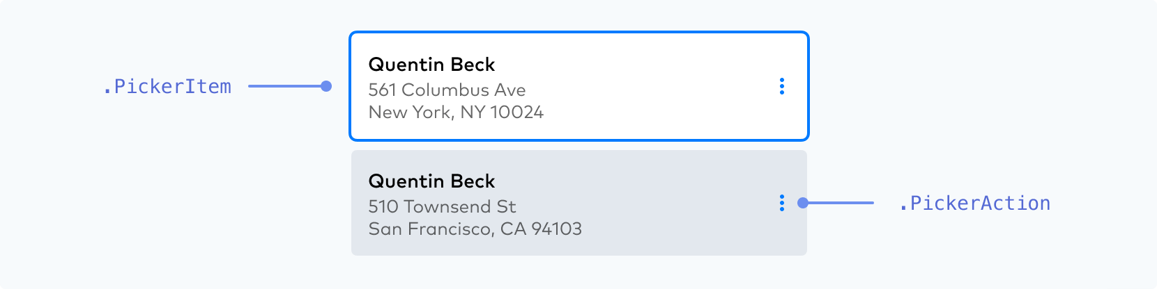
| 类名 | 状态 | Pseudo-classes | Pseudo-elements |
|---|---|---|---|
. | --selected, --highlight, --new, --disabled | :hover, :focus, :active | |
. | :hover, :focus, :active |
确保您的 . 的活动状态在其他状态中脱颖而出。
 |  |
一定要 使用明显的、高对比度的原色、粗细和/或轮廓来区分客户已经选择的活动状态。 | 一定不要 不要为您的 .PickerItem 状态使用两个权重相等的选项或低对比度的颜色,因为它使区分哪个是活动的变得更加困难。 |
菜单
| 类名 | 状态 | Pseudo-classes | Pseudo-elements |
|---|---|---|---|
. | |||
. | --open | :hover | |
. | --negative | :hover, :focus, :active |
手风琴
| 类名 | 状态 | Pseudo-classes | Pseudo-elements |
|---|---|---|---|
. | --selected | :hover, :focus-visible |
Payment Method Messaging Element
| 类名 | 状态 | Pseudo-classes | Pseudo-elements |
|---|---|---|---|
. |
单选图标

| 类名 | 状态 | Pseudo-classes | Pseudo-elements |
|---|---|---|---|
. | |||
. | --checked, --hovered | ||
. | --checked, --hovered |
您可以通过 . 中的 width 属性控制图标的整体大小。您可以用 r(半径)属性控制 . 的相对大小。. 和 . 是 SVG 元素,可以使用 stroke 和 fill 属性设置样式。请参见下方支持的 CSS 属性的完整列表。
const appearance = {
  rules: {
    '.RadioIcon': {
      width: '24px'
    },
    '.RadioIconOuter': {
      stroke: '#E0E6EB'
    },
    '.RadioIconInner': {
      r: '16'
    }
  }
};
支持的 CSS 属性
| CSS 属性 | 支持的类别 |
|---|---|
-moz-osx-font-smoothing | AccordionItem, Action, BlockAction, Button, Checkbox, CheckboxLabel, CodeInput, DropdownItem, Error, Input, Label, Link, MenuAction, PickerAction, PickerItem, RedirectText, SecondaryLink, Tab, TabLabel, TermsLink, TermsText, Text, ToggleItem |
-webkit-font-smoothing | AccordionItem, Action, BlockAction, Button, Checkbox, CheckboxLabel, CodeInput, DropdownItem, Error, Input, Label, Link, MenuAction, PickerAction, PickerItem, RedirectText, SecondaryLink, Tab, TabLabel, TermsLink, TermsText, Text, ToggleItem |
-webkit-text-fill-color | AccordionItem, Action, BlockAction, Button, Checkbox, CheckboxLabel, CodeInput, DropdownItem, Error, Input, Label, Link, MenuAction, PickerAction, PickerItem, RedirectText, SecondaryLink, Tab, TabLabel, TermsLink, TermsText, Text, ToggleItem |
backgroundColor | AccordionItem, Action, Block, BlockAction, BlockDivider, Button, CheckboxInput, CodeInput, DropdownItem, Error, Input, InputDivider, MenuAction, MenuIcon, PickerAction, PickerItem, Switch, Tab, ToggleItem |
border | AccordionItem, Action, Block, BlockAction, Button, CheckboxInput, CodeInput, Dropdown, DropdownItem, Error, Input, MenuAction, MenuIcon, PickerAction, PickerItem, RedirectText, Switch, SwitchControl, Tab, TermsText, Text, ToggleItem |
borderBottom | AccordionItem, Action, Block, BlockAction, Button, CheckboxInput, CodeInput, Dropdown, DropdownItem, Error, Input, MenuAction, MenuIcon, PickerAction, PickerItem, RedirectText, Switch, SwitchControl, Tab, TermsText, Text, ToggleItem |
borderBottomColor | AccordionItem, Action, Block, BlockAction, Button, CheckboxInput, CodeInput, Dropdown, DropdownItem, Error, Input, MenuAction, MenuIcon, PickerAction, PickerItem, RedirectText, Switch, SwitchControl, Tab, TermsText, Text, ToggleItem |
borderBottomLeftRadius | AccordionItem, Action, Block, BlockAction, Button, CheckboxInput, CodeInput, Dropdown, DropdownItem, Error, Input, MenuAction, MenuIcon, PickerAction, PickerItem, RedirectText, Switch, SwitchControl, Tab, TermsText, Text, ToggleItem |
borderBottomRightRadius | AccordionItem, Action, Block, BlockAction, Button, CheckboxInput, CodeInput, Dropdown, DropdownItem, Error, Input, MenuAction, MenuIcon, PickerAction, PickerItem, RedirectText, Switch, SwitchControl, Tab, TermsText, Text, ToggleItem |
borderBottomStyle | AccordionItem, Action, Block, BlockAction, Button, CheckboxInput, CodeInput, Dropdown, DropdownItem, Error, Input, MenuAction, MenuIcon, PickerAction, PickerItem, RedirectText, Switch, SwitchControl, Tab, TermsText, Text, ToggleItem |
borderBottomWidth | AccordionItem, Action, Block, BlockAction, Button, CheckboxInput, CodeInput, Dropdown, DropdownItem, Error, Input, MenuAction, MenuIcon, PickerAction, PickerItem, RedirectText, Switch, SwitchControl, Tab, TermsText, Text, ToggleItem |
borderColor | AccordionItem, Action, Block, BlockAction, Button, CheckboxInput, CodeInput, Dropdown, DropdownItem, Error, Input, MenuAction, MenuIcon, PickerAction, PickerItem, RedirectText, Switch, SwitchControl, Tab, TermsText, Text, ToggleItem |
borderLeft | AccordionItem, Action, Block, BlockAction, Button, CheckboxInput, CodeInput, Dropdown, DropdownItem, Error, Input, MenuAction, MenuIcon, PickerAction, PickerItem, RedirectText, Switch, SwitchControl, Tab, TermsText, Text, ToggleItem |
borderLeftColor | AccordionItem, Action, Block, BlockAction, Button, CheckboxInput, CodeInput, Dropdown, DropdownItem, Error, Input, MenuAction, MenuIcon, PickerAction, PickerItem, RedirectText, Switch, SwitchControl, Tab, TermsText, Text, ToggleItem |
borderLeftStyle | AccordionItem, Action, Block, BlockAction, Button, CheckboxInput, CodeInput, Dropdown, DropdownItem, Error, Input, MenuAction, MenuIcon, PickerAction, PickerItem, RedirectText, Switch, SwitchControl, Tab, TermsText, Text, ToggleItem |
borderLeftWidth | AccordionItem, Action, Block, BlockAction, Button, CheckboxInput, CodeInput, Dropdown, DropdownItem, Error, Input, MenuAction, MenuIcon, PickerAction, PickerItem, RedirectText, Switch, SwitchControl, Tab, TermsText, Text, ToggleItem |
borderRadius | AccordionItem, Action, Block, BlockAction, Button, CheckboxInput, CodeInput, Dropdown, DropdownItem, Error, Input, InputCloseIcon, Link, MenuAction, MenuIcon, PasscodeCloseIcon, PasscodeShowIcon, PickerAction, PickerItem, RedirectText, SecondaryLink, Switch, SwitchControl, Tab, TermsLink, TermsText, Text, ToggleItem |
borderRight | AccordionItem, Action, Block, BlockAction, Button, CheckboxInput, CodeInput, Dropdown, DropdownItem, Error, Input, MenuAction, MenuIcon, PickerAction, PickerItem, RedirectText, Switch, SwitchControl, Tab, TermsText, Text, ToggleItem |
borderRightColor | AccordionItem, Action, Block, BlockAction, Button, CheckboxInput, CodeInput, Dropdown, DropdownItem, Error, Input, MenuAction, MenuIcon, PickerAction, PickerItem, RedirectText, Switch, SwitchControl, Tab, TermsText, Text, ToggleItem |
borderRightStyle | AccordionItem, Action, Block, BlockAction, Button, CheckboxInput, CodeInput, Dropdown, DropdownItem, Error, Input, MenuAction, MenuIcon, PickerAction, PickerItem, RedirectText, Switch, SwitchControl, Tab, TermsText, Text, ToggleItem |
borderRightWidth | AccordionItem, Action, Block, BlockAction, Button, CheckboxInput, CodeInput, Dropdown, DropdownItem, Error, Input, MenuAction, MenuIcon, PickerAction, PickerItem, RedirectText, Switch, SwitchControl, Tab, TermsText, Text, ToggleItem |
borderStyle | AccordionItem, Action, Block, BlockAction, Button, CheckboxInput, CodeInput, Dropdown, DropdownItem, Error, Input, MenuAction, MenuIcon, PickerAction, PickerItem, RedirectText, Switch, SwitchControl, Tab, TermsText, Text, ToggleItem |
borderTop | AccordionItem, Action, Block, BlockAction, Button, CheckboxInput, CodeInput, Dropdown, DropdownItem, Error, Input, MenuAction, MenuIcon, PickerAction, PickerItem, RedirectText, Switch, SwitchControl, Tab, TermsText, Text, ToggleItem |
borderTopColor | AccordionItem, Action, Block, BlockAction, Button, CheckboxInput, CodeInput, Dropdown, DropdownItem, Error, Input, MenuAction, MenuIcon, PickerAction, PickerItem, RedirectText, Switch, SwitchControl, Tab, TermsText, Text, ToggleItem |
borderTopLeftRadius | AccordionItem, Action, Block, BlockAction, Button, CheckboxInput, CodeInput, Dropdown, DropdownItem, Error, Input, MenuAction, MenuIcon, PickerAction, PickerItem, RedirectText, Switch, SwitchControl, Tab, TermsText, Text, ToggleItem |
borderTopRightRadius | AccordionItem, Action, Block, BlockAction, Button, CheckboxInput, CodeInput, Dropdown, DropdownItem, Error, Input, MenuAction, MenuIcon, PickerAction, PickerItem, RedirectText, Switch, SwitchControl, Tab, TermsText, Text, ToggleItem |
borderTopStyle | AccordionItem, Action, Block, BlockAction, Button, CheckboxInput, CodeInput, Dropdown, DropdownItem, Error, Input, MenuAction, MenuIcon, PickerAction, PickerItem, RedirectText, Switch, SwitchControl, Tab, TermsText, Text, ToggleItem |
borderTopWidth | AccordionItem, Action, Block, BlockAction, Button, CheckboxInput, CodeInput, Dropdown, DropdownItem, Error, Input, MenuAction, MenuIcon, PickerAction, PickerItem, RedirectText, Switch, SwitchControl, Tab, TermsText, Text, ToggleItem |
borderWidth | AccordionItem, Action, Block, BlockAction, Button, CheckboxInput, CodeInput, Dropdown, DropdownItem, Error, Input, MenuAction, MenuIcon, PickerAction, PickerItem, RedirectText, Switch, SwitchControl, Tab, TermsText, Text, ToggleItem |
boxShadow | AccordionItem, Action, Block, BlockAction, Button, CheckboxInput, CodeInput, Dropdown, DropdownItem, Error, Input, InputCloseIcon, Link, MenuAction, MenuIcon, PasscodeCloseIcon, PasscodeShowIcon, PickerAction, PickerItem, SecondaryLink, Switch, SwitchControl, Tab, TermsLink, ToggleItem |
color | AccordionItem, Action, BlockAction, Button, Checkbox, CheckboxLabel, CodeInput, DropdownItem, Error, Input, Label, Link, MenuAction, PickerAction, PickerItem, RedirectText, SecondaryLink, Tab, TabIcon, TabLabel, TermsLink, TermsText, Text, ToggleItem |
fill | Action, BlockAction, Button, CodeInput, DropdownItem, Error, Input, MenuAction, MenuIcon, PickerAction, PickerItem, RadioIconInner, RadioIconOuter, SwitchControl, Tab, TabIcon, ToggleItem |
fillOpacity | RadioIconInner, RadioIconOuter |
fontFamily | AccordionItem, Action, BlockAction, Button, Checkbox, CheckboxLabel, CodeInput, DropdownItem, Error, Input, Label, Link, MenuAction, PickerAction, PickerItem, RedirectText, SecondaryLink, Tab, TabLabel, TermsLink, TermsText, Text, ToggleItem |
fontSize | AccordionItem, Action, BlockAction, Button, Checkbox, CheckboxLabel, CodeInput, DropdownItem, Error, Input, Label, Link, MenuAction, PickerAction, PickerItem, RedirectText, SecondaryLink, Switch, Tab, TabLabel, TermsLink, TermsText, Text, ToggleItem |
fontVariant | AccordionItem, Action, BlockAction, Button, Checkbox, CheckboxLabel, CodeInput, DropdownItem, Error, Input, Label, Link, MenuAction, PickerAction, PickerItem, RedirectText, SecondaryLink, Tab, TabLabel, TermsLink, TermsText, Text, ToggleItem |
fontWeight | AccordionItem, Action, BlockAction, Button, Checkbox, CheckboxLabel, CodeInput, DropdownItem, Error, Input, Label, Link, MenuAction, PickerAction, PickerItem, RedirectText, SecondaryLink, Tab, TabLabel, TermsLink, TermsText, Text, ToggleItem |
letterSpacing | AccordionItem, Action, BlockAction, Button, Checkbox, CheckboxLabel, CodeInput, DropdownItem, Error, Input, Label, Link, MenuAction, PickerAction, PickerItem, RedirectText, SecondaryLink, Tab, TabLabel, TermsLink, TermsText, Text, ToggleItem |
lineHeight | AccordionItem, Action, BlockAction, Button, Checkbox, CheckboxLabel, CodeInput, DropdownItem, Error, Input, Label, Link, MenuAction, PickerAction, PickerItem, RedirectText, SecondaryLink, Tab, TabLabel, TermsLink, TermsText, Text, ToggleItem |
margin | Action, BlockAction, Button, CodeInput, DropdownItem, Error, Input, Label, MenuAction, PickerAction, PickerItem, Tab, ToggleItem |
marginBottom | Action, BlockAction, Button, CodeInput, DropdownItem, Error, Input, Label, MenuAction, PickerAction, PickerItem, Tab, ToggleItem |
marginLeft | Action, BlockAction, Button, CodeInput, DropdownItem, Error, Input, Label, MenuAction, PickerAction, PickerItem, Tab, ToggleItem |
marginRight | Action, BlockAction, Button, CodeInput, DropdownItem, Error, Input, Label, MenuAction, PickerAction, PickerItem, Tab, ToggleItem |
marginTop | Action, BlockAction, Button, CodeInput, DropdownItem, Error, Input, Label, MenuAction, PickerAction, PickerItem, Tab, ToggleItem |
opacity | Label |
outline | AccordionItem, Action, Block, BlockAction, Button, CheckboxInput, CodeInput, Dropdown, DropdownItem, Error, Input, InputCloseIcon, Link, MenuAction, MenuIcon, PasscodeCloseIcon, PasscodeShowIcon, PickerAction, PickerItem, SecondaryLink, Switch, SwitchControl, Tab, TermsLink, ToggleItem |
outlineOffset | AccordionItem, Action, Block, BlockAction, Button, CheckboxInput, CodeInput, Dropdown, DropdownItem, Error, Input, InputCloseIcon, Link, MenuAction, MenuIcon, PasscodeCloseIcon, PasscodeShowIcon, PickerAction, PickerItem, SecondaryLink, Switch, SwitchControl, Tab, TermsLink, ToggleItem |
padding | AccordionItem, Action, Block, BlockAction, Button, CodeInput, DropdownItem, Error, Input, Label, Menu, MenuAction, MenuIcon, PickerAction, PickerItem, RedirectText, Tab, TabIcon, TabLabel, TermsText, Text, ToggleItem |
paddingBottom | AccordionItem, Action, Block, BlockAction, Button, CodeInput, DropdownItem, Error, Input, Label, Menu, MenuAction, MenuIcon, PickerAction, PickerItem, RedirectText, Tab, TabIcon, TabLabel, TermsText, Text, ToggleItem |
paddingLeft | AccordionItem, Action, Block, BlockAction, Button, CodeInput, DropdownItem, Error, Input, Label, Menu, MenuAction, MenuIcon, PickerAction, PickerItem, RedirectText, Tab, TabIcon, TabLabel, TermsText, Text, ToggleItem |
paddingRight | AccordionItem, Action, Block, BlockAction, Button, CodeInput, DropdownItem, Error, Input, Label, Menu, MenuAction, MenuIcon, PickerAction, PickerItem, RedirectText, Tab, TabIcon, TabLabel, TermsText, Text, ToggleItem |
paddingTop | AccordionItem, Action, Block, BlockAction, Button, CodeInput, DropdownItem, Error, Input, Label, Menu, MenuAction, MenuIcon, PickerAction, PickerItem, RedirectText, Tab, TabIcon, TabLabel, TermsText, Text, ToggleItem |
r | RadioIconInner |
stroke | RadioIconInner, RadioIconOuter |
strokeOpacity | RadioIconInner, RadioIconOuter |
strokeWidth | RadioIconInner, RadioIconOuter |
textAlign | PaymentMethodMessaging |
textDecoration | AccordionItem, Action, BlockAction, Button, Checkbox, CheckboxLabel, CodeInput, DropdownItem, Error, Input, Label, Link, MenuAction, PickerAction, PickerItem, RedirectText, SecondaryLink, Tab, TabLabel, TermsLink, TermsText, Text, ToggleItem |
textShadow | AccordionItem, Action, BlockAction, Button, Checkbox, CheckboxLabel, CodeInput, DropdownItem, Error, Input, Label, Link, MenuAction, PickerAction, PickerItem, RedirectText, SecondaryLink, Tab, TabLabel, TermsLink, TermsText, Text, ToggleItem |
textTransform | AccordionItem, Action, BlockAction, Button, Checkbox, CheckboxLabel, CodeInput, DropdownItem, Error, Input, Label, Link, MenuAction, PickerAction, PickerItem, RedirectText, SecondaryLink, Tab, TabLabel, TermsLink, TermsText, Text, ToggleItem |
transition | Action, Block, BlockAction, Button, CheckboxInput, CheckboxLabel, CodeInput, Dropdown, DropdownItem, Error, Icon, Input, InputCloseIcon, Label, Link, MenuAction, MenuIcon, PasscodeCloseIcon, PasscodeShowIcon, PickerAction, PickerItem, RadioIconInner, RadioIconOuter, RedirectText, SecondaryLink, Switch, SwitchControl, Tab, TabIcon, TabLabel, TermsLink, TermsText, Text, ToggleItem |
width | RadioIcon |
上述属性的一些例外是:
-webkit-text-fill-color与伪类不兼容
其他配置选项
除了 themes、variables 和 rules 之外,我们还提供了额外的外观配置选项来设置 Element 的样式。
您可以通过将它们添加到外观对象来自定义它们:
const appearance = {
  labels: 'floating',

  // other configurations such as `theme`, `variables` and `rules`...
}
我们目前支持以下选项:
| 配置 | 描述 |
|---|---|
disableAnimations | 禁用整个 Element 中的动画。布尔值,默认为 false。 |
labels | 允许在表单字段上方的标签和表单字段中的浮动标签之间切换;它可以是 above 或 floating |