Personalizar a aparência
Personalize sua integração móvel com a API Appearance.
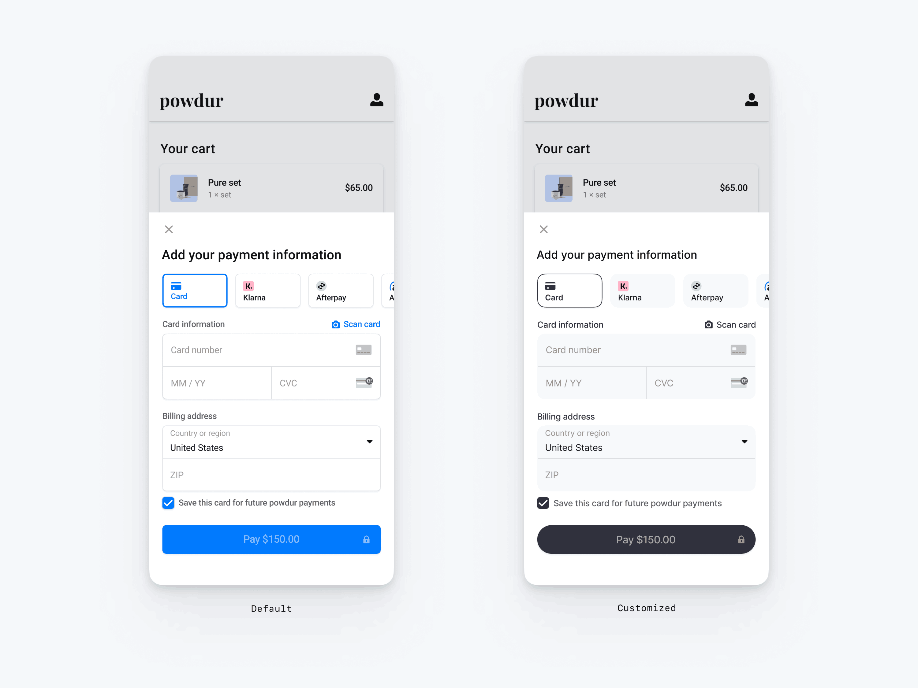
O Payment Element móvel oferece suporte à personalização visual, permitindo que você combine com o design do seu app. O layout permanece consistente, mas você pode modificar cores, fontes e mais criando o objeto PaymentSheet.Configuration com um objeto aparência.
- Comece personalizando a fonte
- Personalize as cores para corresponder ao seu aplicativo
- Personalize formas como raio de canto
- Ajuste fino de componentes específicos
// The following code creates the appearance shown in the screenshot above
val appearance = PaymentSheet.Appearance(
   colorsLight = PaymentSheet.Colors(
       primary = Color(red = 36, green = 36, blue = 47),
       surface = Color.White,
       component = Color(red = 243, green = 248, blue = 245),
       componentBorder = Color.Transparent,
       componentDivider = Color.Black,
       onComponent = Color.Black,
       subtitle = Color.Black,
       placeholderText = Color(red = 115, green = 117, blue = 123),
       onSurface = Color.Black,
       appBarIcon = Color.Black,
       error = Color.Red,
   ),
   shapes = PaymentSheet.Shapes(
       cornerRadiusDp = 12.0f,
       borderStrokeWidthDp = 0.5f
   ),
   typography = PaymentSheet.Typography.default.copy(
       fontResId = R.font.avenir_next
   ),
   primaryButton = PaymentSheet.PrimaryButton(
      shape = PaymentSheet.PrimaryButtonShape(
         cornerRadiusDp = 20f
      ),
   )
)

// ...

paymentSheet.presentWithPaymentIntent(
   clientSecret,
   PaymentSheet.Configuration(
       merchantDisplayName = merchantName,
       appearance = appearance
   )
)
Fontes
Personalize a fonte definindo typography.fontResId como o ID de recurso da fonte personalizada. O Payment Element para dispositivos móveis usa a família de fontes da sua fonte personalizada, mas determina os próprios tamanhos e pesos.
Para aumentar ou diminuir o tamanho do texto, defina typography.sizeScaleFactor. A Stripe multiplica os tamanhos das fontes por esse valor antes de exibi-los. Essa configuração é útil se a fonte personalizada for um pouco maior ou menor que a fonte do sistema.
val appearance = PaymentSheet.Appearance(
    // …
    typography = PaymentSheet.Typography.default.copy(
        sizeScaleFactor = 1.15f, // Increase the size of all text by 1.15x
        fontResId = R.font.myFont,
    ),
)
val configuration = PaymentSheet.Configuration.Builder("Example, Inc.")
    // …
    .appearance(appearance)
    .build()
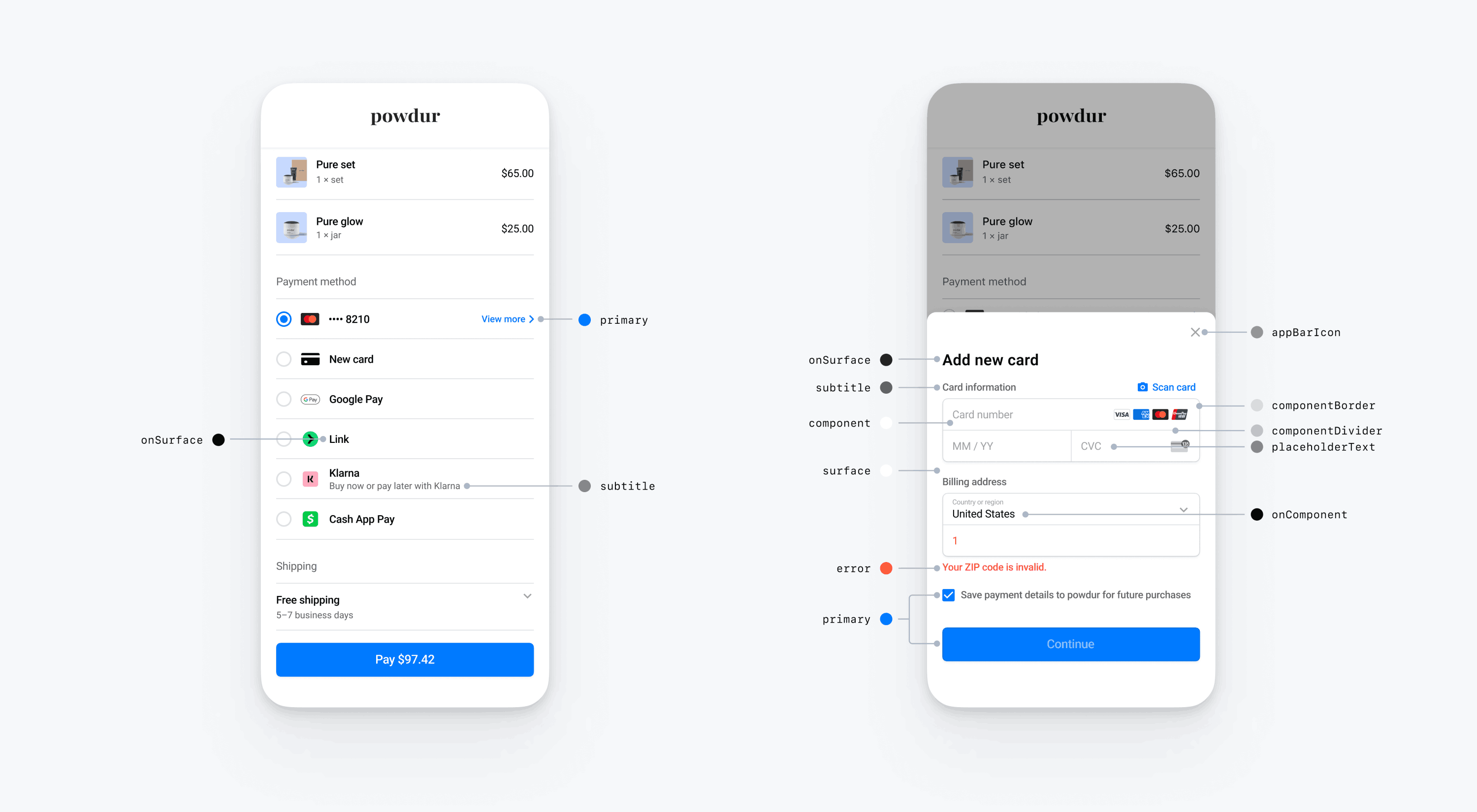
Cores
Personalize as cores no Payment Element para dispositivos móveis modificando as categorias de cores definidas em PaymentSheet.Colors. Cada categoria de cores determina a cor de um ou mais componentes na IU. Por exemplo, principal define a cor do botão Pagar e seleciona itens como a caixa de seleção Salvar este cartão. Consulte o diagrama abaixo para ver alguns dos elementos da IU associados a cada categoria de cores.
Nota
Para aceitar o modo escuro, defina appearance.colorsDark. Você pode desativar efetivamente o modo escuro definindo appearance.colorsDark com o mesmo valor de appearance.colorsLight
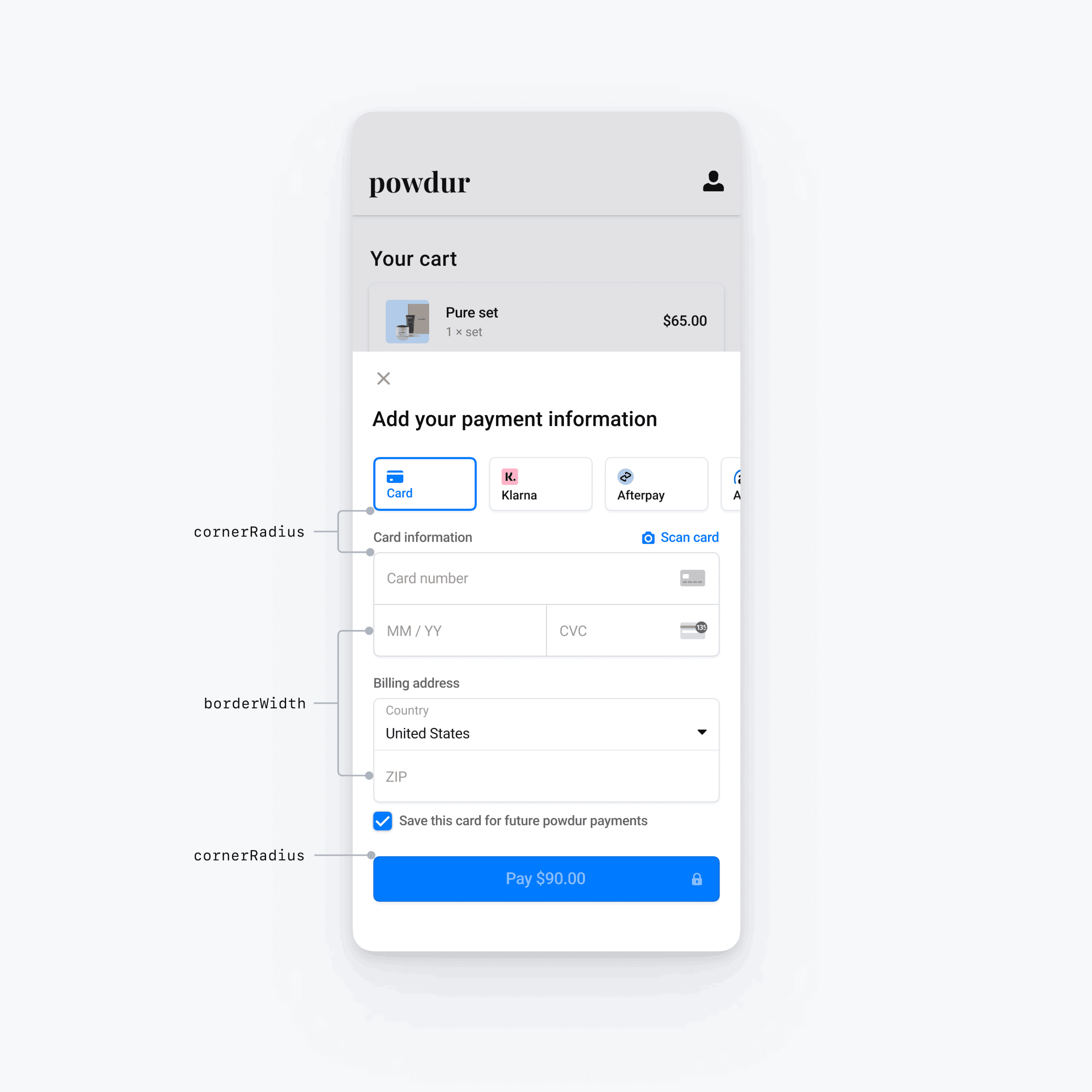
Formatos
Além de personalizar fontes e cores, você também pode personalizar o raio do canto e a largura da borda usadas em todo o Payment Element para dispositivos móveis definindo appearance.shapes.
Componentes específicos da IU
As seções acima descrevem as opções de personalização que afetam o Payment Element para dispositivos móveis de forma ampla, em vários componentes de IU. Também oferecemos opções de personalização específicas para o botão principal (por exemplo, o botão Pagar). Consulte Appearance.PrimaryButton para obter a lista completa de opções de personalização.
As opções de personalização para componentes específicos da IU têm precedência sobre outros valores. Por exemplo, appearance. substitui o valor de appearance..
Nota
Se tiver ideias para opções adicionais de personalização, fale conosco.