Personaliza el aspecto
Personaliza tu integración móvil con la API Appearance.
El Payment Element móvil admite la personalización visual, lo que te permite combinar el diseño de tu aplicación. El diseño sigue siendo uniforme, pero puedes modificar colores, fuentes y mucho más mediante la creación de tu objeto PaymentSheet.Configuration con un objeto aspecto.
- Empieza por personalizar la fuente
- Personaliza los colores para que coincidan con tu aplicación
- Personaliza formas como el radio de las esquinas
- Ajusta componentes específicos
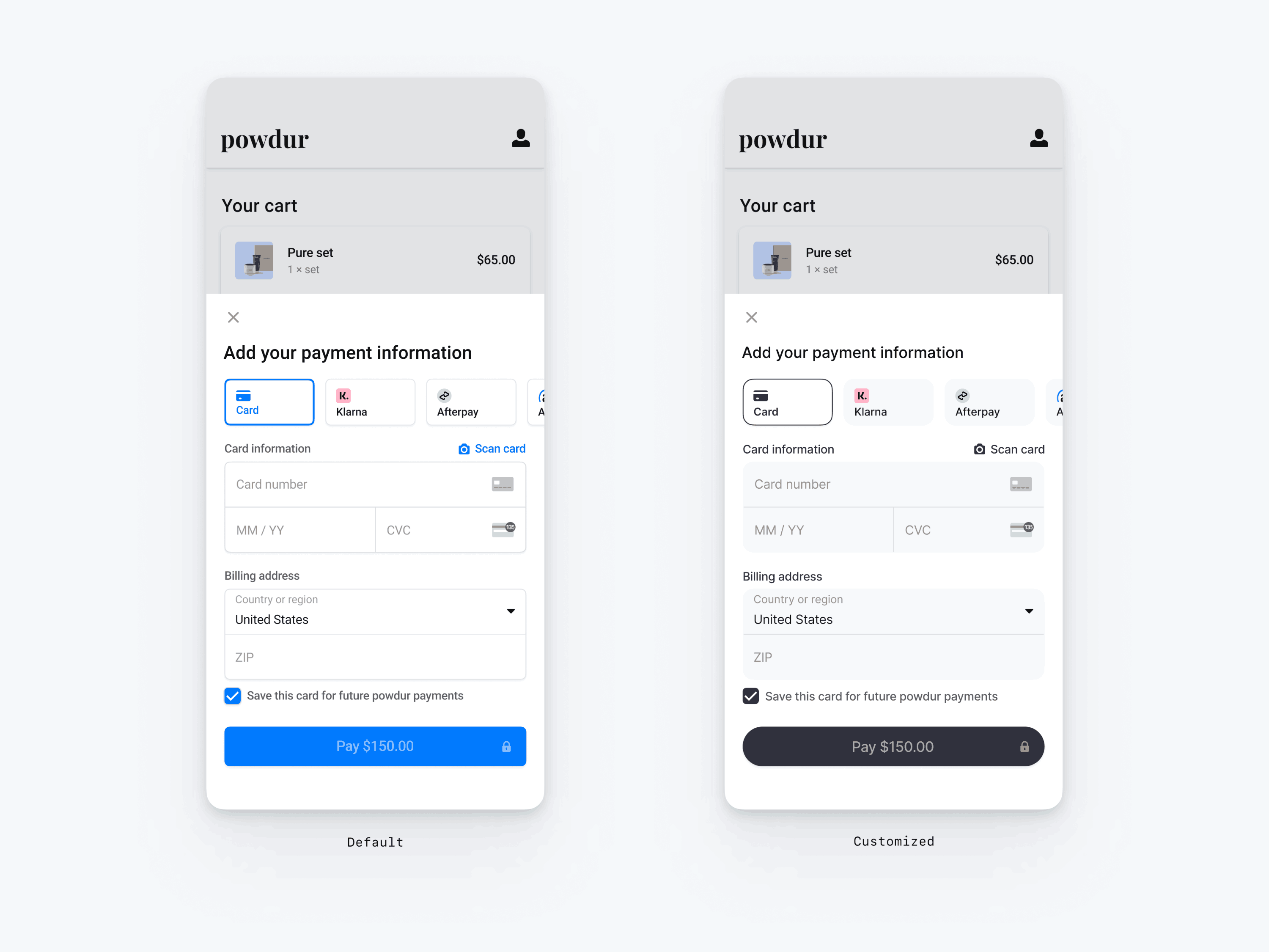
// The following code creates the appearance shown in the screenshot above
val appearance = PaymentSheet.Appearance(
   colorsLight = PaymentSheet.Colors(
       primary = Color(red = 36, green = 36, blue = 47),
       surface = Color.White,
       component = Color(red = 243, green = 248, blue = 245),
       componentBorder = Color.Transparent,
       componentDivider = Color.Black,
       onComponent = Color.Black,
       subtitle = Color.Black,
       placeholderText = Color(red = 115, green = 117, blue = 123),
       onSurface = Color.Black,
       appBarIcon = Color.Black,
       error = Color.Red,
   ),
   shapes = PaymentSheet.Shapes(
       cornerRadiusDp = 12.0f,
       borderStrokeWidthDp = 0.5f
   ),
   typography = PaymentSheet.Typography.default.copy(
       fontResId = R.font.avenir_next
   ),
   primaryButton = PaymentSheet.PrimaryButton(
      shape = PaymentSheet.PrimaryButtonShape(
         cornerRadiusDp = 20f
      ),
   )
)

// ...

paymentSheet.presentWithPaymentIntent(
   clientSecret,
   PaymentSheet.Configuration(
       merchantDisplayName = merchantName,
       appearance = appearance
   )
)
Fuentes
Personaliza la fuente estableciendo typography.fontResId en el ID de recurso de la fuente personalizada. El Payment Element móvil utiliza la familia de fuentes de tu fuente personalizada, pero determina los tamaños y los pesos por sí mismo.
Para aumentar o disminuir el tamaño del texto, configura typography.sizeScaleFactor. Stripe multiplica los tamaños de fuente por este valor antes de mostrarlos. Esta configuración es útil si la fuente personalizada es un poco más grande o pequeña que la fuente del sistema.
val appearance = PaymentSheet.Appearance(
    // …
    typography = PaymentSheet.Typography.default.copy(
        sizeScaleFactor = 1.15f, // Increase the size of all text by 1.15x
        fontResId = R.font.myFont,
    ),
)
val configuration = PaymentSheet.Configuration.Builder("Example, Inc.")
    // …
    .appearance(appearance)
    .build()
Colores
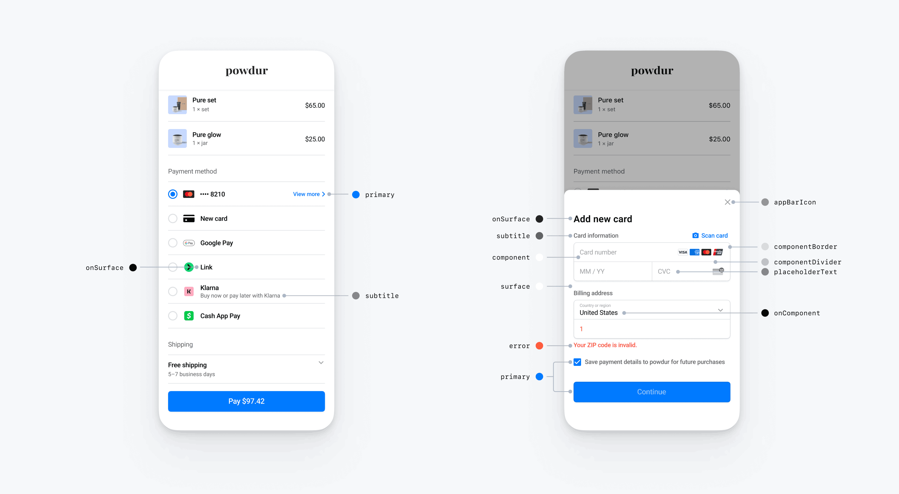
Personaliza los colores del Payment Element móvil modificando las categorías de color definidas en PaymentSheet.Colors. Cada categoría de color determina el color de uno o varios componentes de la interfaz de usuario. Por ejemplo, principal define el color del botón Pagar y de los elementos seleccionados, como la casilla Guardar esta tarjeta. Consulta el diagrama siguiente para ver algunos de los elementos de la interfaz de usuario asociados con cada categoría de color.
Nota
Para admitir el modo oscuro, configura appearance.colorsDark. Puedes desactivar eficazmente el modo oscuro estableciendo appearance.colorsDark en el mismo valor que appearance.colorsLight
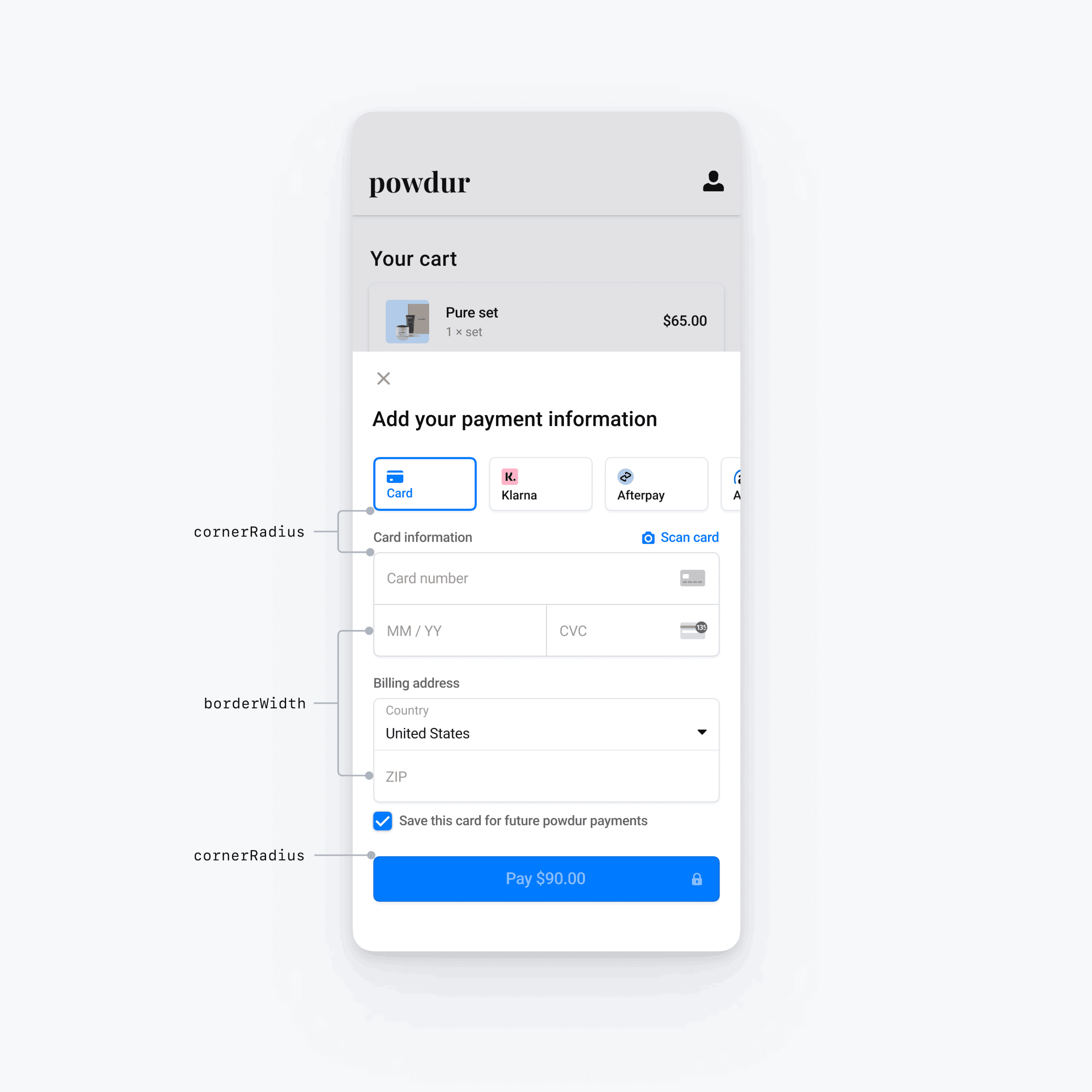
Formas
Además de personalizar las fuentes y los colores, también puedes personalizar el radio de las esquinas y el ancho del borde que se usan en todo el Payment Element móvil configurando la apariencia. formas.
Componentes específicos de la interfaz de usuario
En las secciones anteriores se describen las opciones de personalización que afectan al Payment Element móvil en general, a través de varios componentes de la interfaz de usuario. También ofrecemos opciones de personalización específicas para el botón principal (por ejemplo, el botón Paga). Consulta Appearance.PrimaryButton para obtener la lista completa de opciones de personalización.
Las opciones de personalización para componentes específicos de la interfaz de usuario tienen prioridad sobre otros valores. Por ejemplo, appearance. invalida el valor de appearance..
Nota
Si tienes ideas para otras opciones de personalización, comunícate con nosotros.