Customize appearance
Customize your in-app integration with the Appearance API.
The Payment Element supports visual customization, which allows you to match the design of your app. The layout stays consistent, but you can modify colors, fonts, and more by creating your EmbeddedPaymentElement. object with an appearance object.
- Customize the font
- Customize colors to match your app
- Customize shapes like corner radius
- Fine-tune specific components
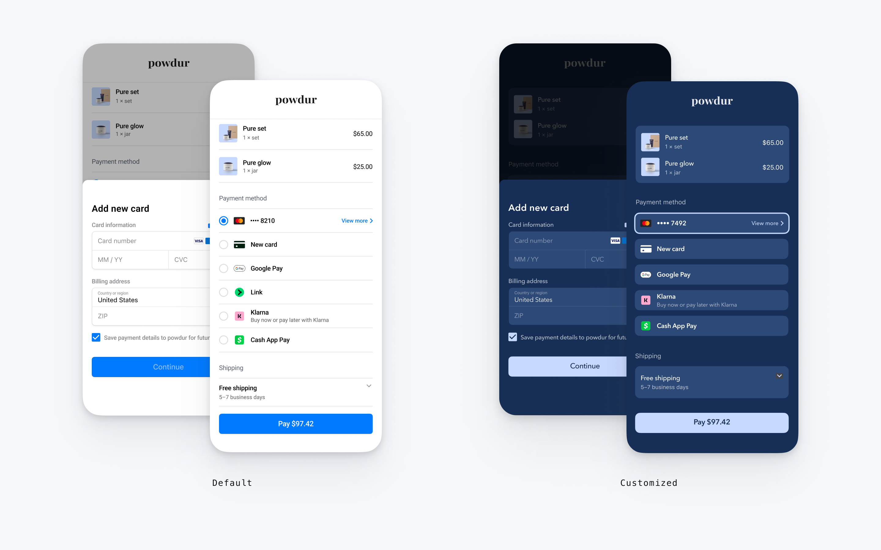
// The following code creates the appearance shown in the screenshot above
import androidx.compose.ui.graphics.Color

val appearance = PaymentSheet.Appearance(
   colorsLight = PaymentSheet.Colors(
       primary = Color(red = 36, green = 36, blue = 47),
       surface = Color.White,
       component = Color(red = 243, green = 248, blue = 245),
       componentBorder = Color.Transparent,
       componentDivider = Color.Black,
       onComponent = Color.Black,
       subtitle = Color.Black,
       placeholderText = Color(red = 115, green = 117, blue = 123),
       onSurface = Color.Black,
       appBarIcon = Color.Black,
       error = Color.Red,
   ),
   shapes = PaymentSheet.Shapes(
       cornerRadiusDp = 12.0f,
       borderStrokeWidthDp = 0.5f
   ),
   typography = PaymentSheet.Typography.default.copy(
       fontResId = R.font.avenir_next
   ),
   primaryButton = PaymentSheet.PrimaryButton(
   shape = PaymentSheet.PrimaryButtonShape(
            cornerRadiusDp = 20f
        ),
    ),
    embeddedAppearance = PaymentSheet.Appearance.Embedded(
        style = PaymentSheet.Appearance.Embedded.RowStyle.FloatingButton(
            spacingDp = 20f,
            additionalInsetsDp = 10f
        )
    )
)

// ...

embeddedPaymentElement.configure(
    intentConfiguration = intentConfiguration,
    configuration = EmbeddedPaymentElement.Configuration.Builder(merchantName)
        .appearance(appearance)
        .build()
)
Fonts
Customize the font by setting typography.fontResId to your custom font’s resource ID. The mobile Payment Element uses the font family of your custom font, but determines sizes and weights itself.
To increase or decrease the size of text, set typography.sizeScaleFactor. Stripe multiplies font sizes by this value before displaying them. This setting is useful if your custom font is slightly larger or smaller than the system font.
val appearance = PaymentSheet.Appearance(
    // …
    typography = PaymentSheet.Typography.default.copy(
        sizeScaleFactor = 1.15f, // Increase the size of all text by 1.15x
        fontResId = R.font.myFont,
    ),
)
val configuration = EmbeddedPaymentElement.Configuration(merchantName).Builder()
    .appearance(appearance)
    .build()
Colors
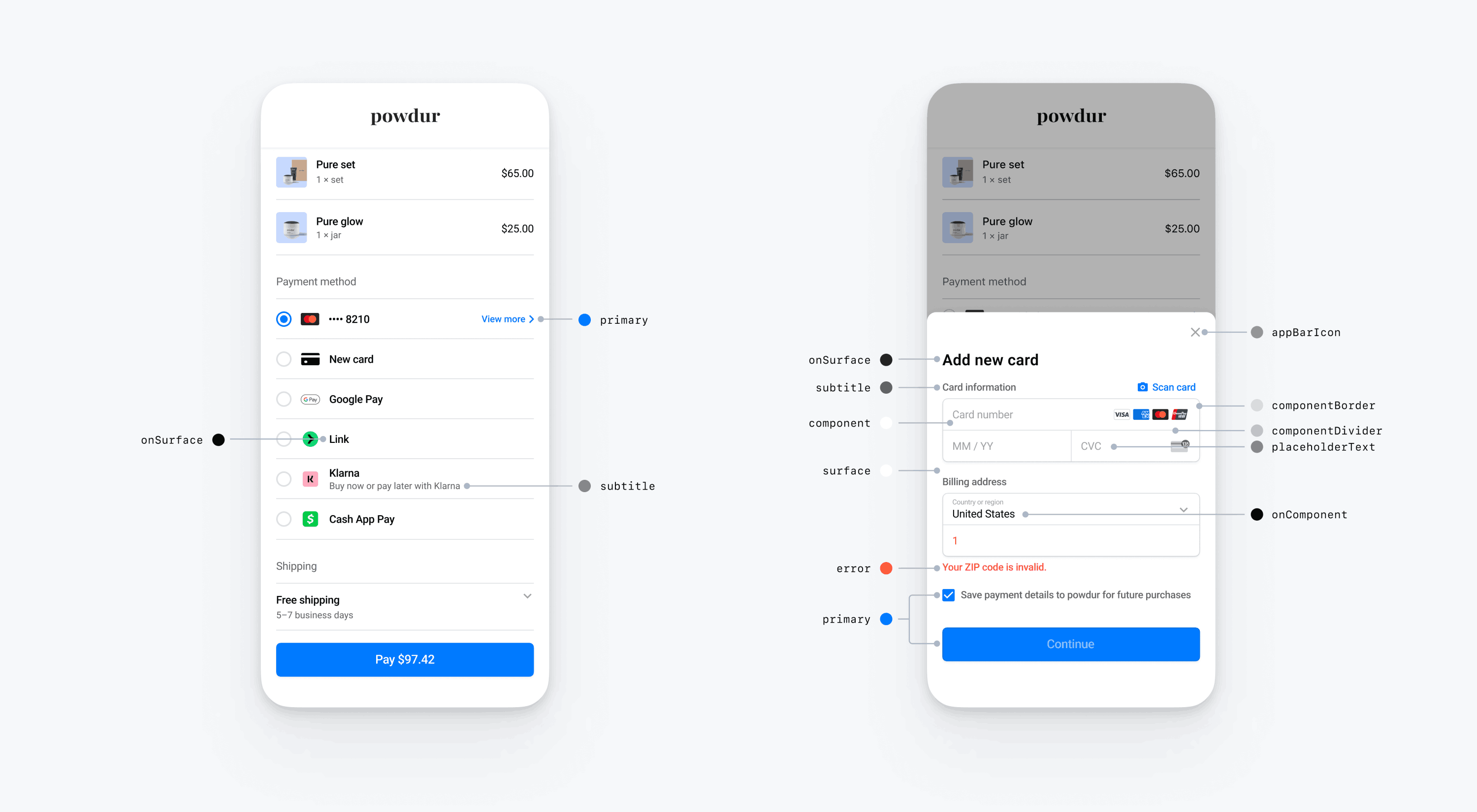
Customize the colors in the mobile Payment Element by modifying the color categories defined in PaymentSheet.Colors. Each color category determines the color of one or more components in the UI. For example, primary defines the color of the Pay button and selected items like the Save this card checkbox. Refer to the diagram below to see some of the UI elements associated with each color category.
Note
To support dark mode, set appearance.colorsDark. You can effectively disable dark mode by setting appearance.colorsDark to the same value as appearance.colorsLight
Shapes
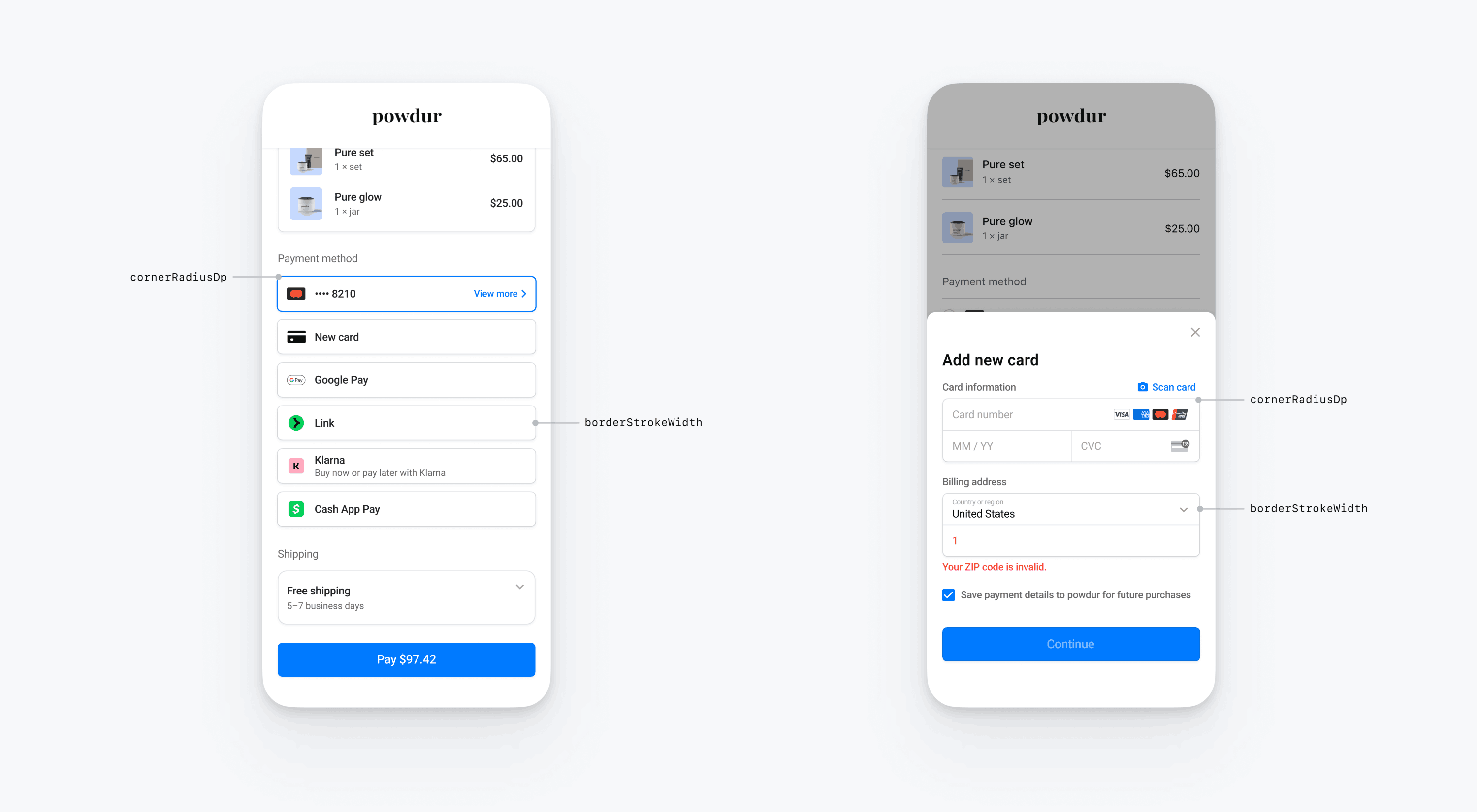
In addition to customizing fonts and colors, you can also customize the corner radius and border width used throughout the mobile Payment Element by setting appearance.shapes.
Specific UI components
The sections above describe customization options that affect the mobile Payment Element broadly, across multiple UI components. We also provide customization options specifically for the primary button (for example, the Pay button). Refer to Appearance.PrimaryButton for the full list of customization options.
Customization options for specific UI components take precedence over other values. For example, appearance. overrides the value of appearance..
Note
If you have ideas for additional customization options, let us know.
Payment Element
The Payment Element has the following styles: flat with radio buttons, flat with checkmarks, flat with disclosure, and floating buttons. Each style has its own options.
Flat with radio buttons
To use the flat with radio buttons style, set the FlatWithRadio properties as shown in the code example.
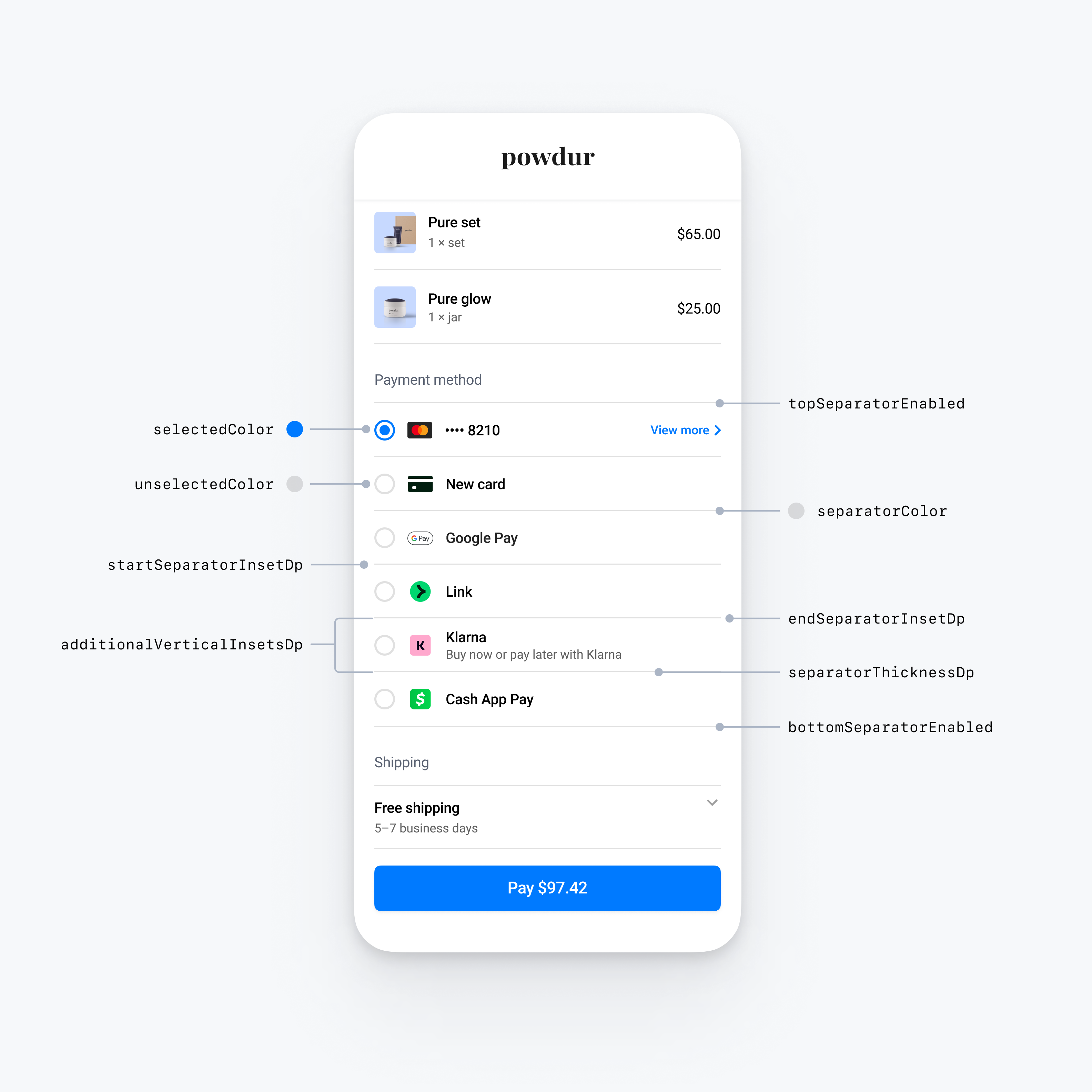
import androidx.compose.ui.graphics.Color
import androidx.compose.ui.graphics.toArgb

val embeddedColors = PaymentSheet.Appearance.Embedded.RowStyle.FlatWithRadio.Colors(
    selectedColor = Color.Yellow.toArgb(), // Change color of radio button when selected to yellow
    unselectedColor = Color.DarkGray.toArgb(), // Change color of radio button when unselected to darkGray
    separatorColor = Color.Gray.toArgb(), // Change the separator color to gray
)
val embeddedAppearance = PaymentSheet.Appearance.Embedded.Builder()
    .rowStyle(
      PaymentSheet.Appearance.Embedded.RowStyle.FlatWithRadio.Builder()
        .separatorThicknessDp(2f) // Increase separator thickness to 2
        .startSeparatorInsetDp(0f) // Make start separator full width
        .endSeparatorInsetDp(0f) // Make end separator full width
        .topSeparatorEnabled(false) // Hide the top separator
        .bottomSeparatorEnabled(false) // Hide the bottom separator
        .additionalVerticalInsetsDp(10f) // Increase row height
        .horizontalInsetsDp(10f)
        .colorsLight(embeddedColors)
        .colorsDark(embeddedColors)
        .build()
    )
    .build()

val appearance = PaymentSheet.Appearance(
    embeddedAppearance = embeddedAppearance,
)

val configuration = EmbeddedPaymentElement.Configuration.Builder("Powdur")
    .appearance(appearance)
    .build()
Flat with checkmarks
To use the flat with checkmarks style, set the FlatWithCheckmark properties, as shown in the code example.
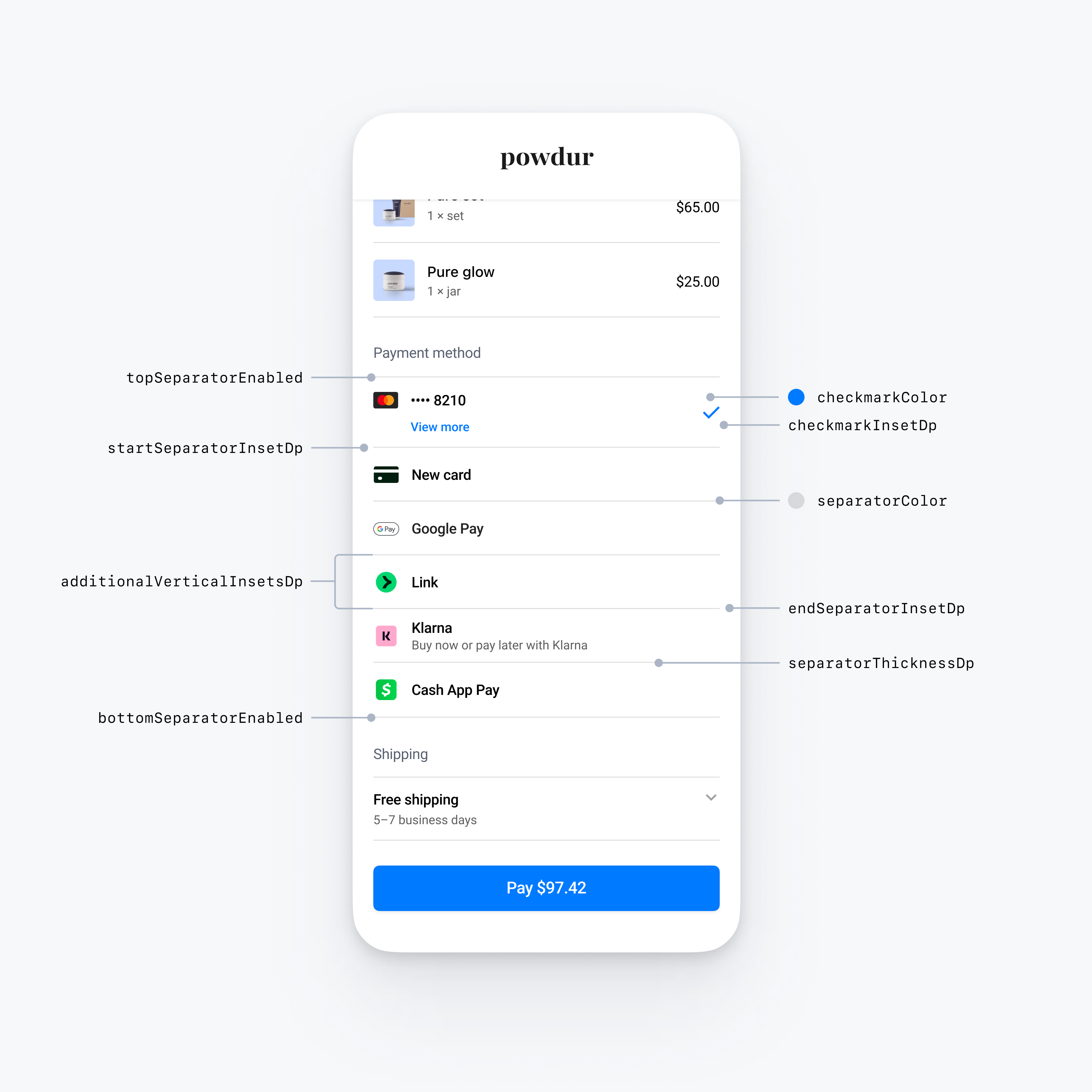
import androidx.compose.ui.graphics.Color
import androidx.compose.ui.graphics.toArgb

val embeddedColors = PaymentSheet.Appearance.Embedded.RowStyle.FlatWithCheckmark.Colors(
    checkmarkColor = Color.Blue.toArgb(), // Change color of the checkmark
    separatorColor = Color.Gray.toArgb(), // Change the separator color to gray
)
val embeddedAppearance = PaymentSheet.Appearance.Embedded.Builder()
    .rowStyle(
      PaymentSheet.Appearance.Embedded.RowStyle.FlatWithCheckmark.Builder()
        .separatorThicknessDp(2f) // Increase separator thickness to 2
        .startSeparatorInsetDp(0f) // Make start separator full width
        .endSeparatorInsetDp(0f) // Make end separator full width
        .topSeparatorEnabled(false) // Hide the top separator
        .bottomSeparatorEnabled(false) // Hide the bottom separator
        .checkmarkInsetDp(2f) // Inset the checkmark
        .additionalVerticalInsetsDp(10f) // Increase row height
        .horizontalInsetsDp(10f)
        .colorsLight(embeddedColors)
        .colorsDark(embeddedColors)
        .build()
    )
    .build()

val appearance = PaymentSheet.Appearance(
    embeddedAppearance = embeddedAppearance,
)

val configuration = EmbeddedPaymentElement.Configuration.Builder("Powdur")
    .appearance(appearance)
    .build()
Flat with disclosure
To use the flat with disclosure style, set the FlatWithDisclosure properties, as shown in the code example below.
The FlatWithDisclosure style requires you to set the immediateAction row selection behavior. After the customer selects a payment method, move them to a new screen (for example, back to your main checkout screen) because the row of their selected payment method won’t appear selected.
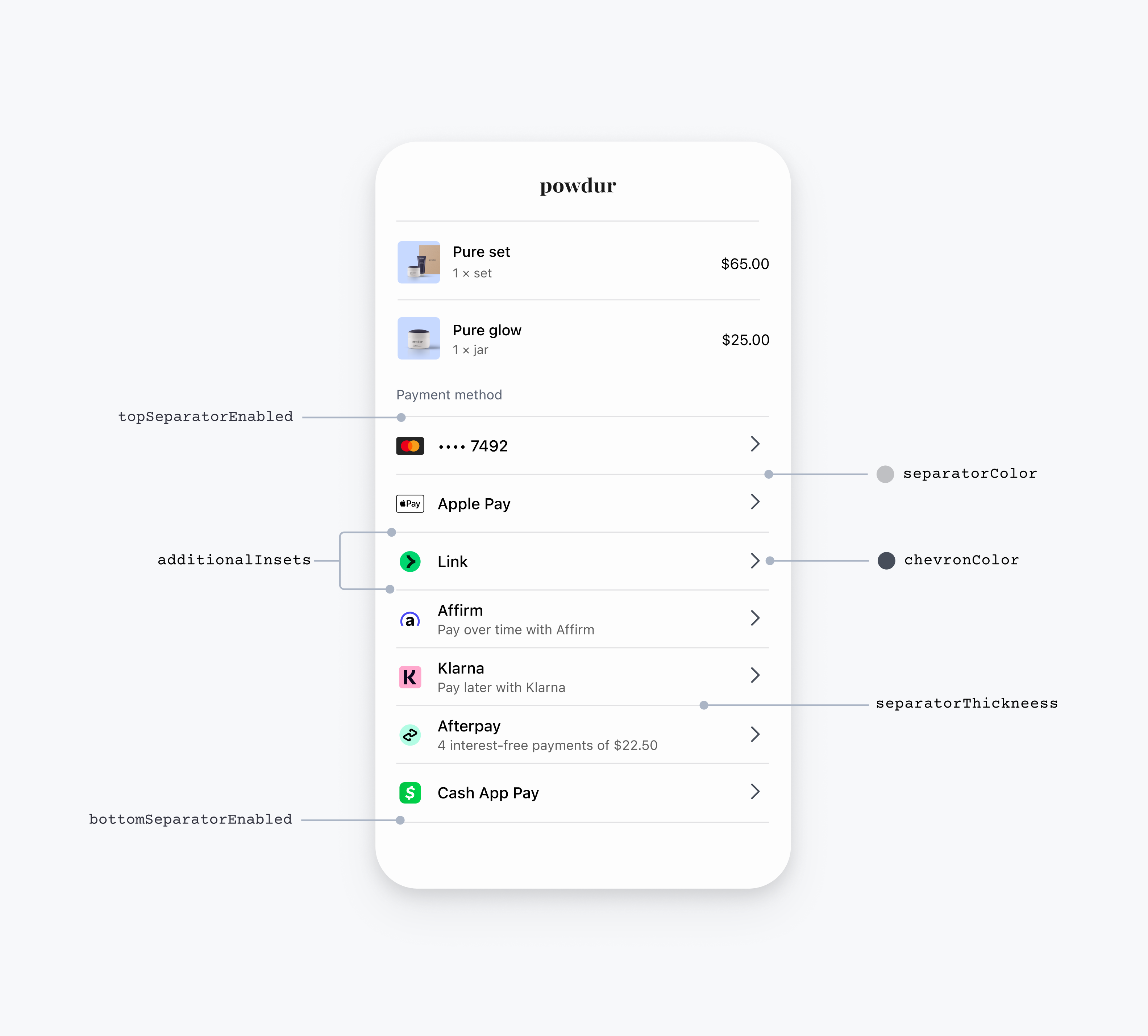
import androidx.compose.ui.graphics.Color
import androidx.compose.ui.graphics.toArgb

// EmbeddedPaymentElement initialization

val embeddedBuilder = EmbeddedPaymentElement.Builder(
  ...,
)
  // The FlatWithDisclosure style requires the immediateAction row selection behavior, which accepts a handler for a user selecting a payment method.
  .rowSelectionBehavior(EmbeddedPaymentElement.RowSelectionBehavior.immediateAction { embeddedPaymentElement ->
    // Handle the customer tapping a payment method row here
  })

...

// Configuration

val embeddedColors = PaymentSheet.Appearance.Embedded.RowStyle.FlatWithDisclosure.Colors(
    disclosureColor = Color.Blue.toArgb(), // Change color of the disclosure
    separatorColor = Color.Gray.toArgb(), // Change the separator color to gray
)
val embeddedAppearance = PaymentSheet.Appearance.Embedded.Builder()
    .rowStyle(
      PaymentSheet.Appearance.Embedded.RowStyle.FlatWithDisclosure.Builder()
        .separatorThicknessDp(2f) // Increase separator thickness to 2
        .startSeparatorInsetDp(0f) // Make start separator full width
        .endSeparatorInsetDp(0f) // Make end separator full width
        .topSeparatorEnabled(false) // Hide the top separator
        .bottomSeparatorEnabled(false) // Hide the bottom separator
        .additionalVerticalInsetsDp(10f) // Increase row height
        .horizontalInsetsDp(10f)
        .colorsLight(embeddedColors)
        .colorsDark(embeddedColors)
        .build()
    )
    .build()


val appearance = PaymentSheet.Appearance(
    embeddedAppearance = embeddedAppearance,
)

val configuration = EmbeddedPaymentElement.Configuration.Builder("Powdur")
  .appearance(appearance)
  .build()
Floating buttons
To use the floating buttons style, set the FloatingButton properties, as shown in the code example.
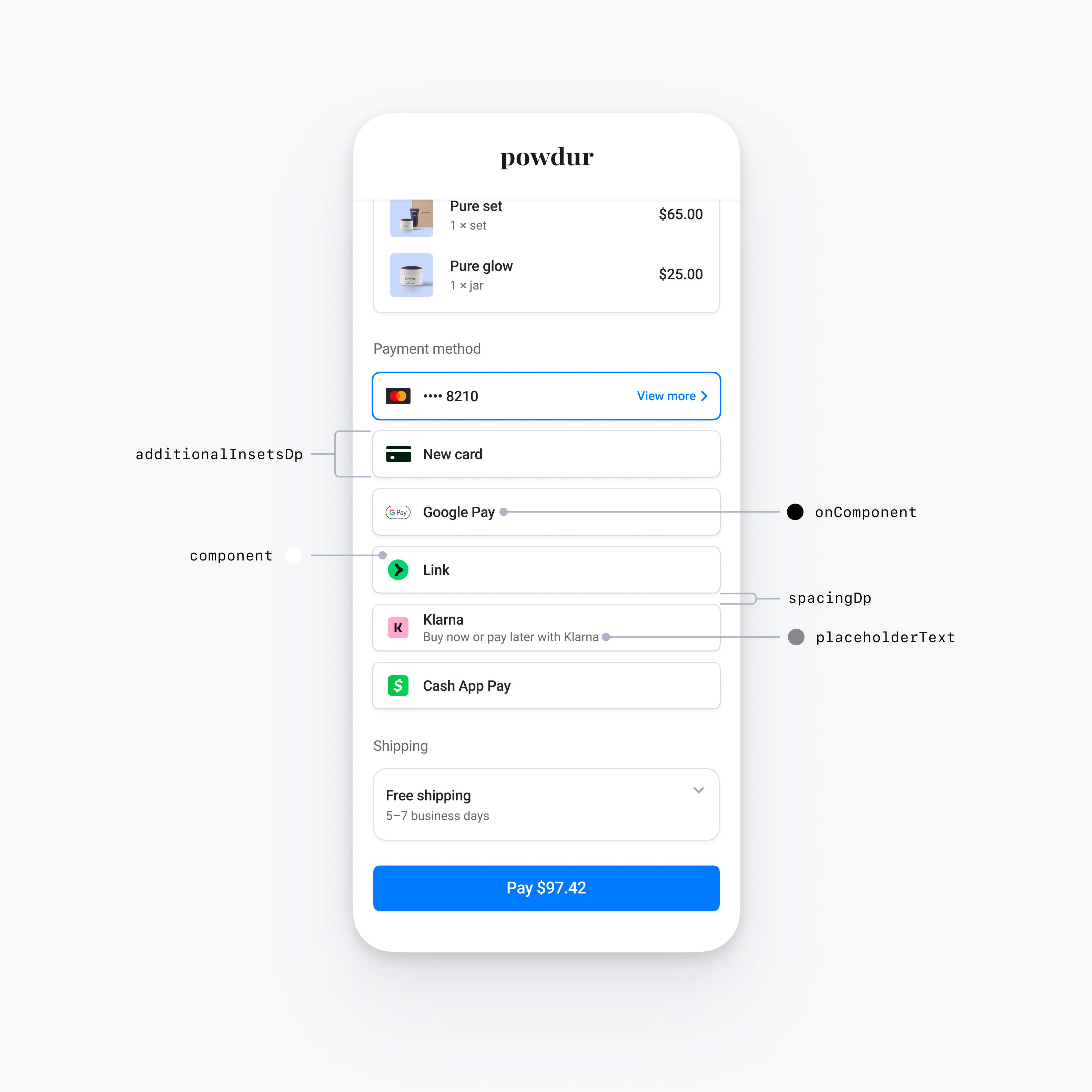
val embeddedAppearance = PaymentSheet.Appearance.Embedded.Builder()
    .rowStyle(
      PaymentSheet.Appearance.Embedded.RowStyle.FloatingButton.Builder()
        .additionalInsetsDp(10f) // Increase row height
        .spacingDp(20f) // Increase spacing
    )
    .build()


val appearance = PaymentSheet.Appearance(
    embeddedAppearance = embeddedAppearance,
)

val configuration = EmbeddedPaymentElement.Configuration.Builder("Powdur")
    .appearance(appearance)
    .build()
Common row customizations
You can customize row properties that apply across all row styles:
@OptIn(AppearanceAPIAdditionsPreview::class)
val embeddedAppearance = PaymentSheet.Appearance.Embedded.Builder()
    // Custom margins for the payment method icon (for example, the Klarna logo)
    .paymentMethodIconMargins(
      PaymentSheet.Insets(
        horizontalDp = 10f,
        verticalDp = 5f
      )
    )
    // Custom font for the row title (for example, "Klarna")
    .titleFont(
      PaymentSheet.Typography.Font(
        fontFamily = R.font.custom_font,
        fontSizeSp = 20f,
        fontWeight = 50,
        letterSpacingSp = 8f
      )
    )
    // Custom font for the row subtitle (for example, "Buy now or pay later with Klarna")
    .titleFont(
      PaymentSheet.Typography.Font(
        fontFamily = R.font.custom_font,
        fontSizeSp = 14f,
        fontWeight = 50,
        letterSpacingSp = 8f
      )
    )
    .build()

val appearance = PaymentSheet.Appearance(
    embeddedAppearance = embeddedAppearance,
)

val configuration = EmbeddedPaymentElement.Configuration.Builder("Powdur")
    .appearance(appearance)
    .build()