デザインをカスタマイズする
Appearance API を使用してアプリ内統合をカスタマイズします。
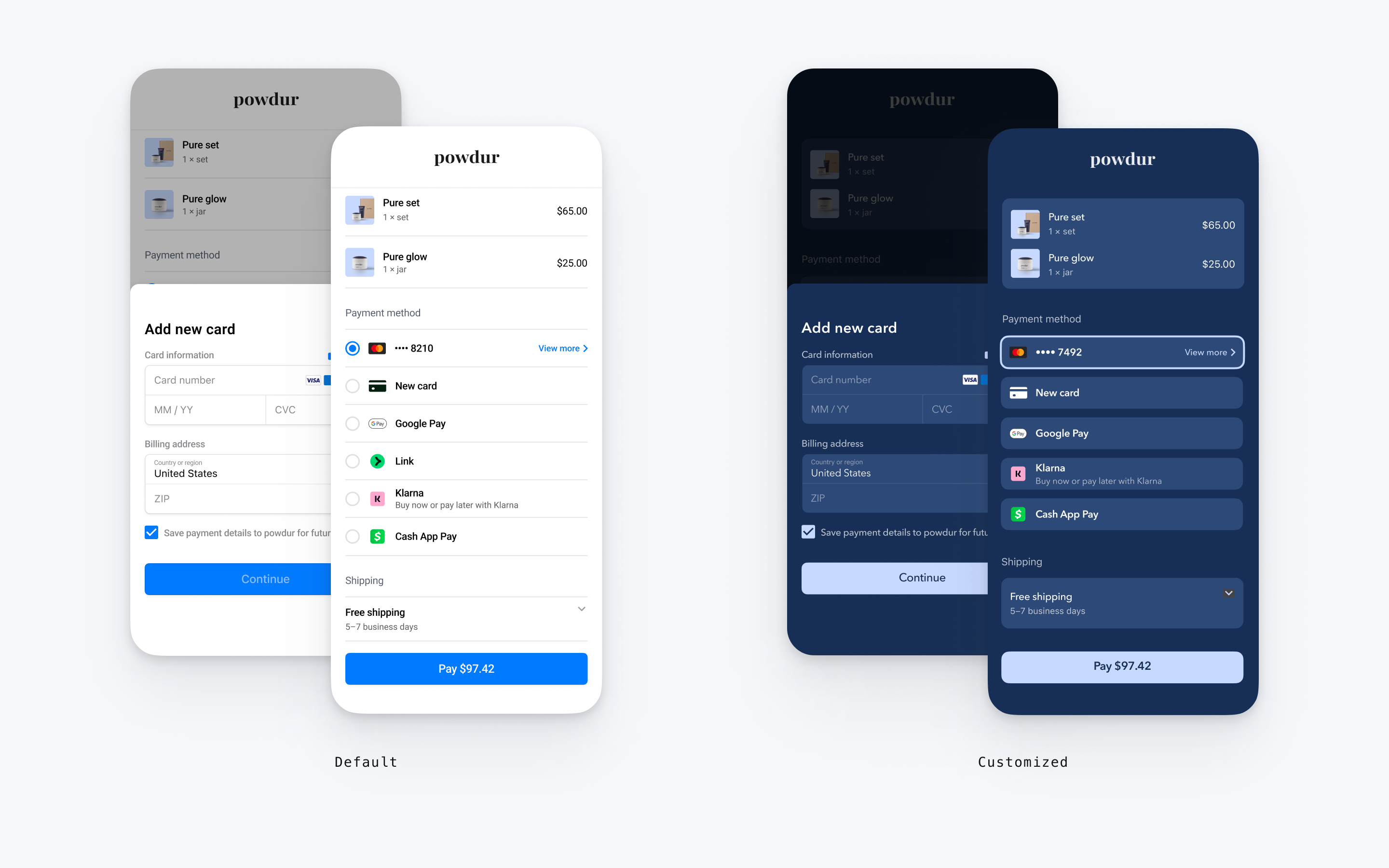
Payment Element は視覚的なカスタマイズをサポートしているため、アプリのデザインに合わせてカスタマイズできます。レイアウトの一貫性は保たれますが、appearance オブジェクトと一緒に EmbeddedPaymentElement. オブジェクトを作成して、色やフォントなどを変更できます。
- フォントをカスタマイズする
- アプリに合わせてカラーをカスタマイズします。
- 角の半径などの形状をカスタマイズします。
- 特定のコンポーネントを微調整します。
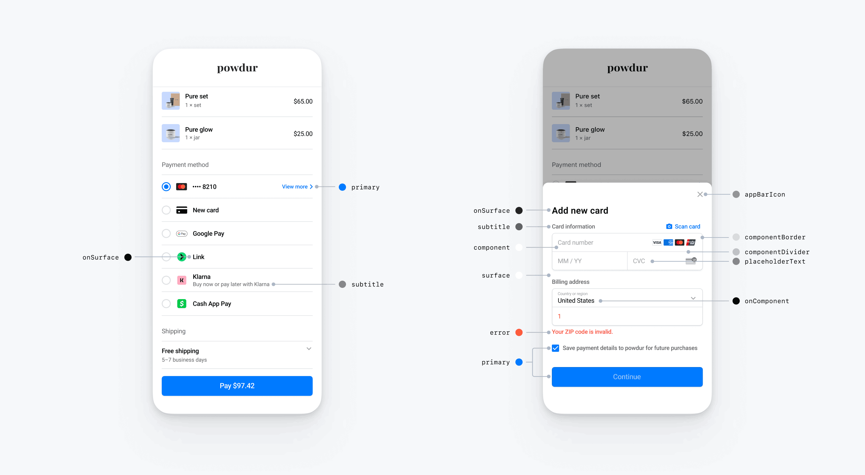
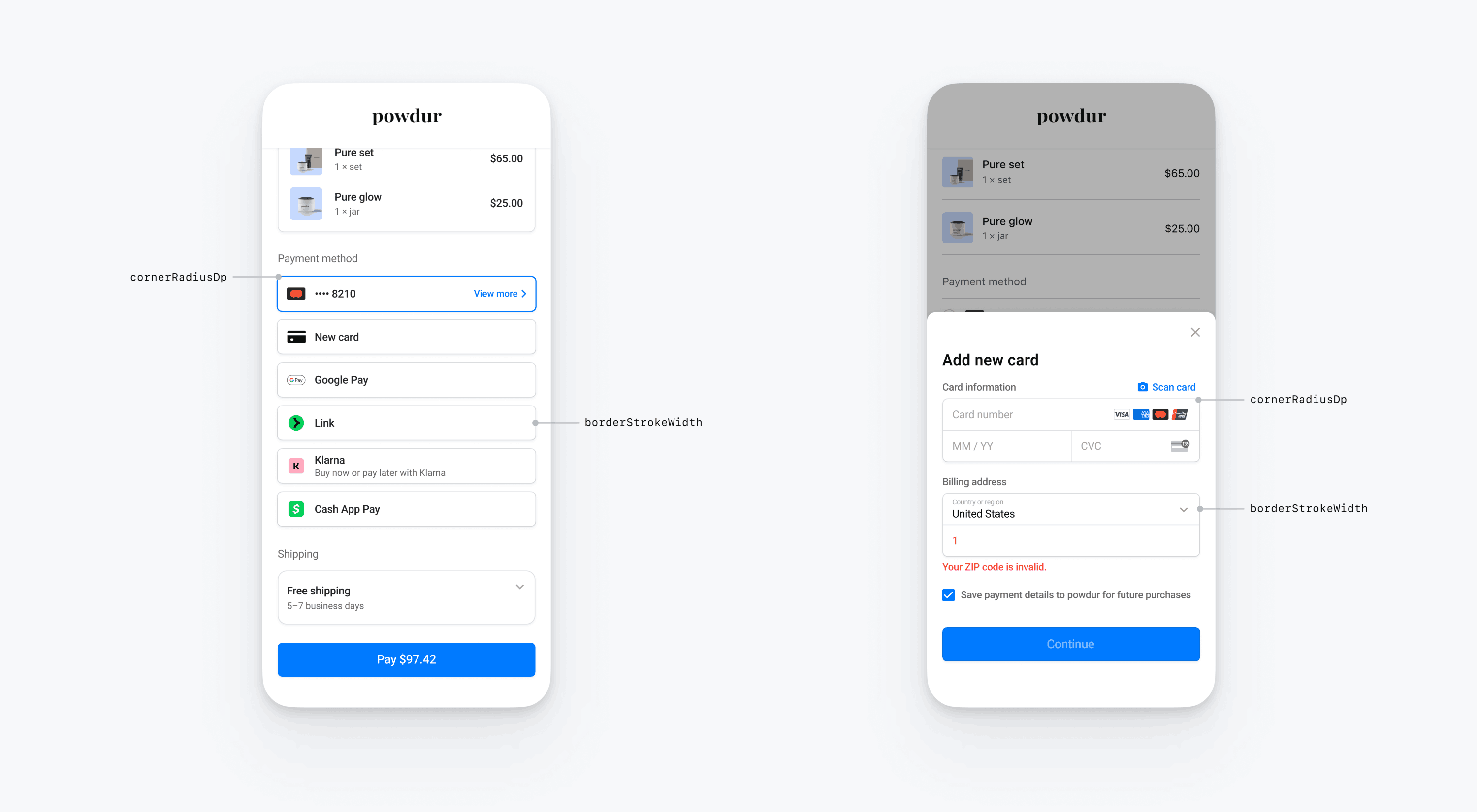
// The following code creates the appearance shown in the screenshot above
import androidx.compose.ui.graphics.Color

val appearance = PaymentSheet.Appearance(
   colorsLight = PaymentSheet.Colors(
       primary = Color(red = 36, green = 36, blue = 47),
       surface = Color.White,
       component = Color(red = 243, green = 248, blue = 245),
       componentBorder = Color.Transparent,
       componentDivider = Color.Black,
       onComponent = Color.Black,
       subtitle = Color.Black,
       placeholderText = Color(red = 115, green = 117, blue = 123),
       onSurface = Color.Black,
       appBarIcon = Color.Black,
       error = Color.Red,
   ),
   shapes = PaymentSheet.Shapes(
       cornerRadiusDp = 12.0f,
       borderStrokeWidthDp = 0.5f
   ),
   typography = PaymentSheet.Typography.default.copy(
       fontResId = R.font.avenir_next
   ),
   primaryButton = PaymentSheet.PrimaryButton(
   shape = PaymentSheet.PrimaryButtonShape(
            cornerRadiusDp = 20f
        ),
    ),
    embeddedAppearance = PaymentSheet.Appearance.Embedded(
        style = PaymentSheet.Appearance.Embedded.RowStyle.FloatingButton(
            spacingDp = 20f,
            additionalInsetsDp = 10f
        )
    )
)

// ...

embeddedPaymentElement.configure(
    intentConfiguration = intentConfiguration,
    configuration = EmbeddedPaymentElement.Configuration.Builder(merchantName)
        .appearance(appearance)
        .build()
)
フォント
typography.fontResId をカスタムフォントのリソース ID に設定し、フォントをカスタマイズします。モバイルの Payment Element ではカスタムフォントのフォントファミリーが使用されますが、サイズと太さは自動的に決定されます。
テキストのサイズを拡大縮小するには、typography.sizeScaleFactor を設定します。Stripe は、フォントサイズを表示する前に、この値をフォントサイズにかけます。この設定は、カスタムフォントがシステムフォントよりもわずかに大きいか小さい場合に便利です。
val appearance = PaymentSheet.Appearance(
    // …
    typography = PaymentSheet.Typography.default.copy(
        sizeScaleFactor = 1.15f, // Increase the size of all text by 1.15x
        fontResId = R.font.myFont,
    ),
)
val configuration = EmbeddedPaymentElement.Configuration(merchantName).Builder()
    .appearance(appearance)
    .build()
カラー
モバイルの Payment Element で、PaymentSheet.Colors で定義されているカラーカテゴリーを変更して、色をカスタマイズします。各カラーカテゴリーは、UI の 1 つ以上のコンポーネントの色を決定します。たとえば、primary は、支払うボタンと、このカードを保存のチェックボックスといった選択された項目の色を定義します。下の図で、各カラーカテゴリーに関連付けられた UI エレメントをご覧いただけます。
メモ
ダークモードに対応するには、appearance.colorsDark を設定します。appearance.colorsDark を appearance.colorsLight と同じ値に設定することで、ダークモードを効果的に無効にすることができます
図形
フォントとカラーをカスタマイズするだけでなく、appearance.shapes を設定することで、Mobile Payment Element 全体で使用されるコーナー半径と枠線の幅もカスタマイズできます。
特定の UI コンポーネント
上記のセクションでは、複数の UI コンポーネントにわたりモバイル Payment Element に広く影響を与えるカスタマイズオプションについて説明しています。また、1 次ボタン (たとえば、支払うボタン) 専用のカスタマイズオプションも提供しています。カスタマイズオプションの詳細なリストについては、Appearance.PrimaryButton をご覧ください。
一部の UI コンポーネントのカスタマイズオプションは、他の値よりも優先されます。たとえば、appearance. は、appearance. の値を上書きします。
メモ
その他のカスタマイズオプションのアイデアがございましたら、お知らせください。
Payment Element
Payment Element には、ラジオボタン付きのフラット、チェックマーク付きのフラット、開示付きのフラット、フローティングボタンのスタイルがあります。各スタイルには独自のオプションがあります。
ラジオボタン付きフラット
ラジオボタン付きフラットスタイルを使用するには、コード例に示すように FlatWithRadio プロパティを設定します。
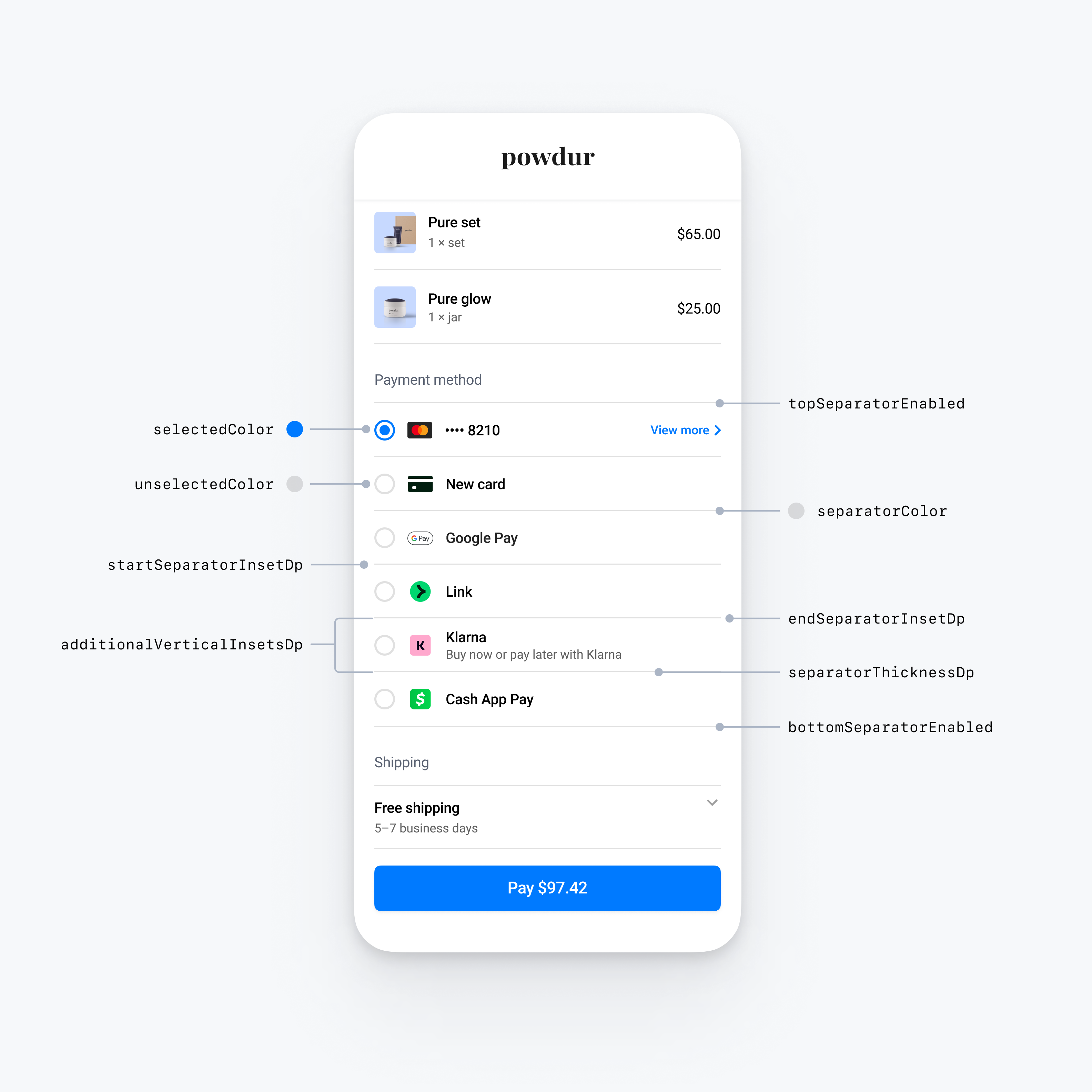
import androidx.compose.ui.graphics.Color
import androidx.compose.ui.graphics.toArgb

val embeddedColors = PaymentSheet.Appearance.Embedded.RowStyle.FlatWithRadio.Colors(
    selectedColor = Color.Yellow.toArgb(), // Change color of radio button when selected to yellow
    unselectedColor = Color.DarkGray.toArgb(), // Change color of radio button when unselected to darkGray
    separatorColor = Color.Gray.toArgb(), // Change the separator color to gray
)
val embeddedAppearance = PaymentSheet.Appearance.Embedded.Builder()
    .rowStyle(
      PaymentSheet.Appearance.Embedded.RowStyle.FlatWithRadio.Builder()
        .separatorThicknessDp(2f) // Increase separator thickness to 2
        .startSeparatorInsetDp(0f) // Make start separator full width
        .endSeparatorInsetDp(0f) // Make end separator full width
        .topSeparatorEnabled(false) // Hide the top separator
        .bottomSeparatorEnabled(false) // Hide the bottom separator
        .additionalVerticalInsetsDp(10f) // Increase row height
        .horizontalInsetsDp(10f)
        .colorsLight(embeddedColors)
        .colorsDark(embeddedColors)
        .build()
    )
    .build()

val appearance = PaymentSheet.Appearance(
    embeddedAppearance = embeddedAppearance,
)

val configuration = EmbeddedPaymentElement.Configuration.Builder("Powdur")
    .appearance(appearance)
    .build()
チェックマーク付きフラット
チェックマーク付きフラットスタイルを使用するには、コード例に示すように、FlatWithCheckmark プロパティを設定します。
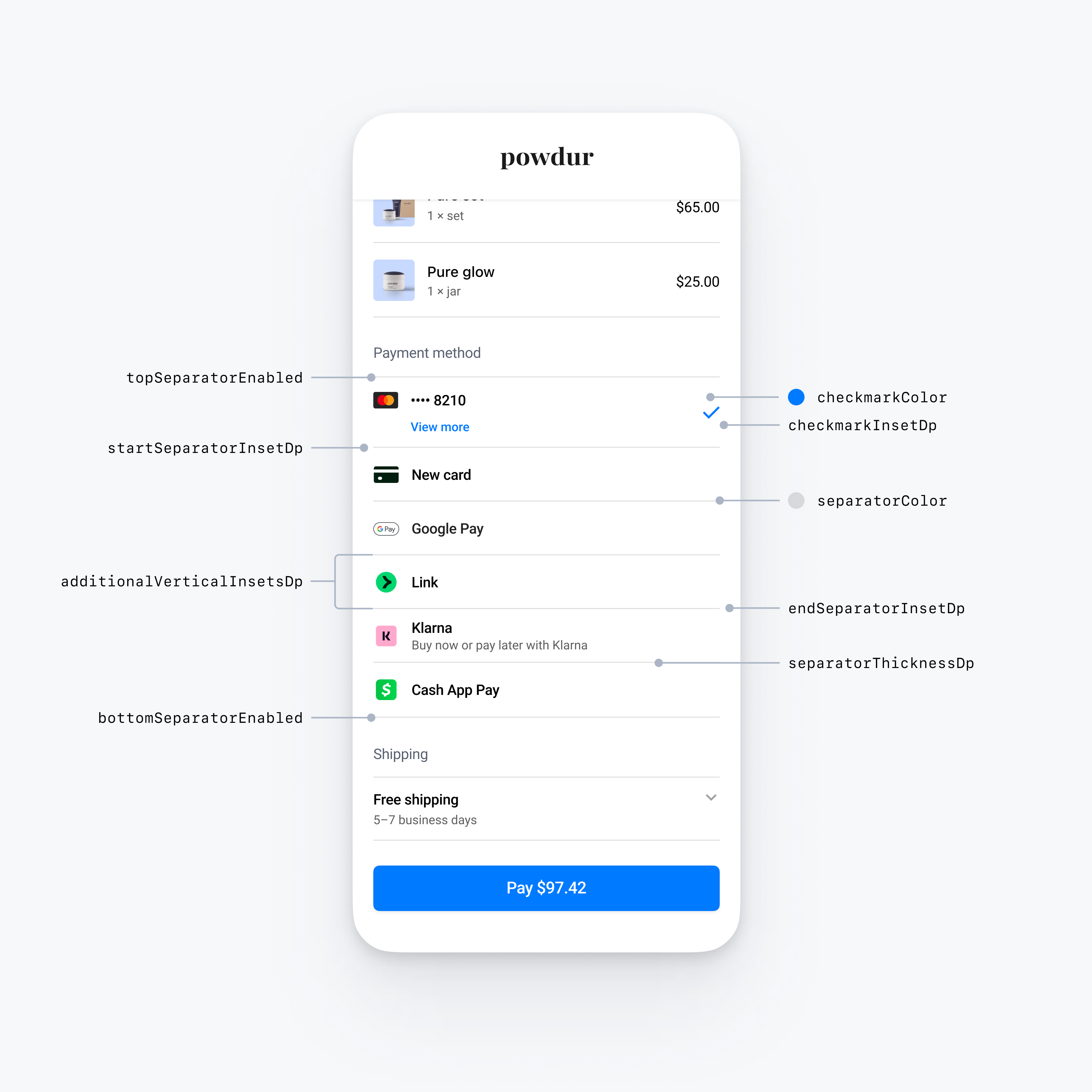
import androidx.compose.ui.graphics.Color
import androidx.compose.ui.graphics.toArgb

val embeddedColors = PaymentSheet.Appearance.Embedded.RowStyle.FlatWithCheckmark.Colors(
    checkmarkColor = Color.Blue.toArgb(), // Change color of the checkmark
    separatorColor = Color.Gray.toArgb(), // Change the separator color to gray
)
val embeddedAppearance = PaymentSheet.Appearance.Embedded.Builder()
    .rowStyle(
      PaymentSheet.Appearance.Embedded.RowStyle.FlatWithCheckmark.Builder()
        .separatorThicknessDp(2f) // Increase separator thickness to 2
        .startSeparatorInsetDp(0f) // Make start separator full width
        .endSeparatorInsetDp(0f) // Make end separator full width
        .topSeparatorEnabled(false) // Hide the top separator
        .bottomSeparatorEnabled(false) // Hide the bottom separator
        .checkmarkInsetDp(2f) // Inset the checkmark
        .additionalVerticalInsetsDp(10f) // Increase row height
        .horizontalInsetsDp(10f)
        .colorsLight(embeddedColors)
        .colorsDark(embeddedColors)
        .build()
    )
    .build()

val appearance = PaymentSheet.Appearance(
    embeddedAppearance = embeddedAppearance,
)

val configuration = EmbeddedPaymentElement.Configuration.Builder("Powdur")
    .appearance(appearance)
    .build()
開示付きフラット
開示付きフラットスタイルを使用するには、以下のコード例のように FlatWithDisclosure プロパティを設定します。
FlatWithDisclosure スタイルを使用する場合、immediateAction の行選択動作を設定する必要があります。顧客が決済方法を選択した後、選択した決済方法の行が選択された状態になっていないため、顧客を新しい画面 (Checkout のメイン画面に戻るなど) に移動します。
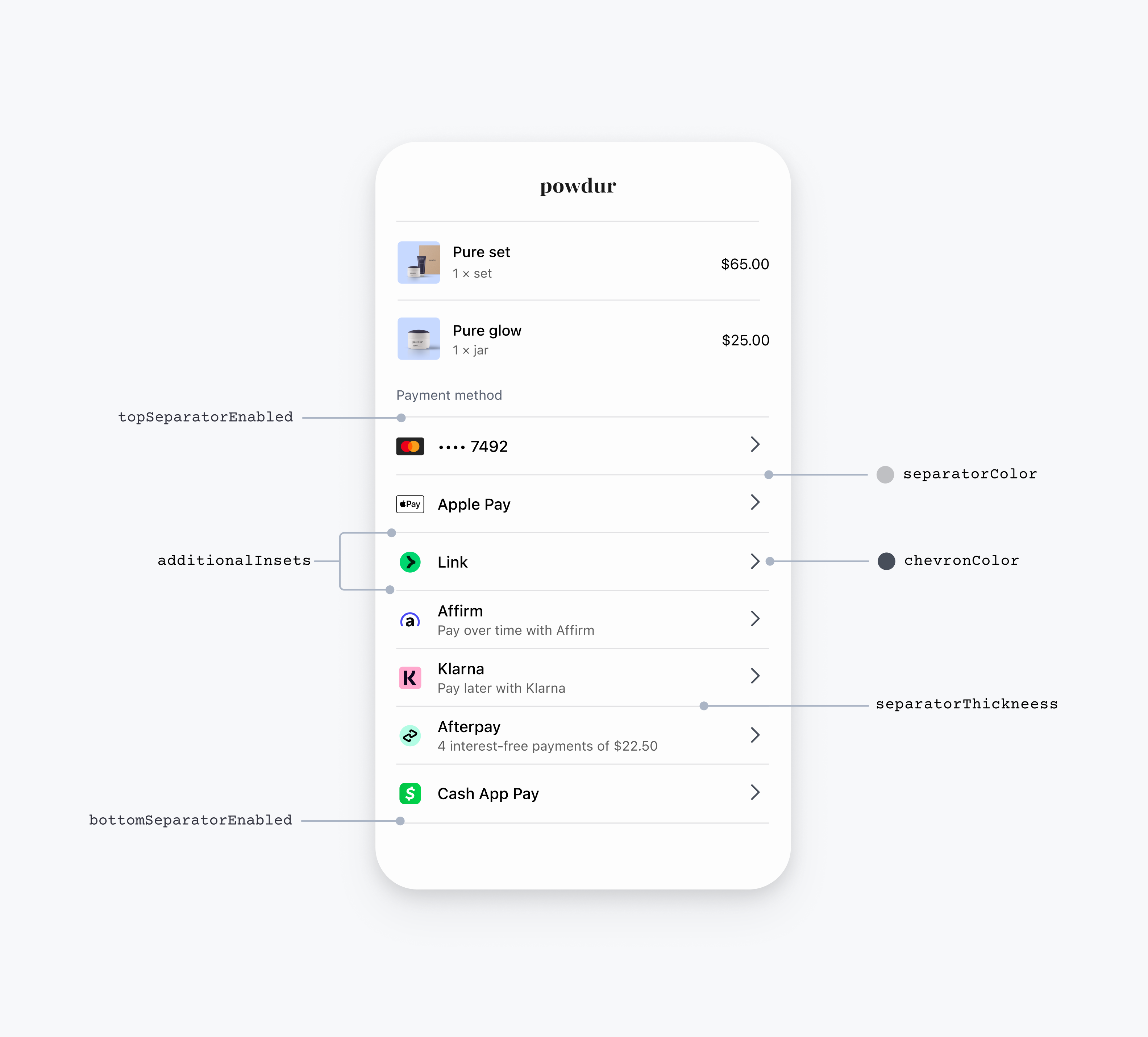
import androidx.compose.ui.graphics.Color
import androidx.compose.ui.graphics.toArgb

// EmbeddedPaymentElement initialization

val embeddedBuilder = EmbeddedPaymentElement.Builder(
  ...,
)
  // The FlatWithDisclosure style requires the immediateAction row selection behavior, which accepts a handler for a user selecting a payment method.
  .rowSelectionBehavior(EmbeddedPaymentElement.RowSelectionBehavior.immediateAction { embeddedPaymentElement ->
    // Handle the customer tapping a payment method row here
  })

...

// Configuration

val embeddedColors = PaymentSheet.Appearance.Embedded.RowStyle.FlatWithDisclosure.Colors(
    disclosureColor = Color.Blue.toArgb(), // Change color of the disclosure
    separatorColor = Color.Gray.toArgb(), // Change the separator color to gray
)
val embeddedAppearance = PaymentSheet.Appearance.Embedded.Builder()
    .rowStyle(
      PaymentSheet.Appearance.Embedded.RowStyle.FlatWithDisclosure.Builder()
        .separatorThicknessDp(2f) // Increase separator thickness to 2
        .startSeparatorInsetDp(0f) // Make start separator full width
        .endSeparatorInsetDp(0f) // Make end separator full width
        .topSeparatorEnabled(false) // Hide the top separator
        .bottomSeparatorEnabled(false) // Hide the bottom separator
        .additionalVerticalInsetsDp(10f) // Increase row height
        .horizontalInsetsDp(10f)
        .colorsLight(embeddedColors)
        .colorsDark(embeddedColors)
        .build()
    )
    .build()


val appearance = PaymentSheet.Appearance(
    embeddedAppearance = embeddedAppearance,
)

val configuration = EmbeddedPaymentElement.Configuration.Builder("Powdur")
  .appearance(appearance)
  .build()
フローティングボタン
フローティングボタンスタイルを使用するには、コード例に示すように FloatingButton プロパティを設定します。
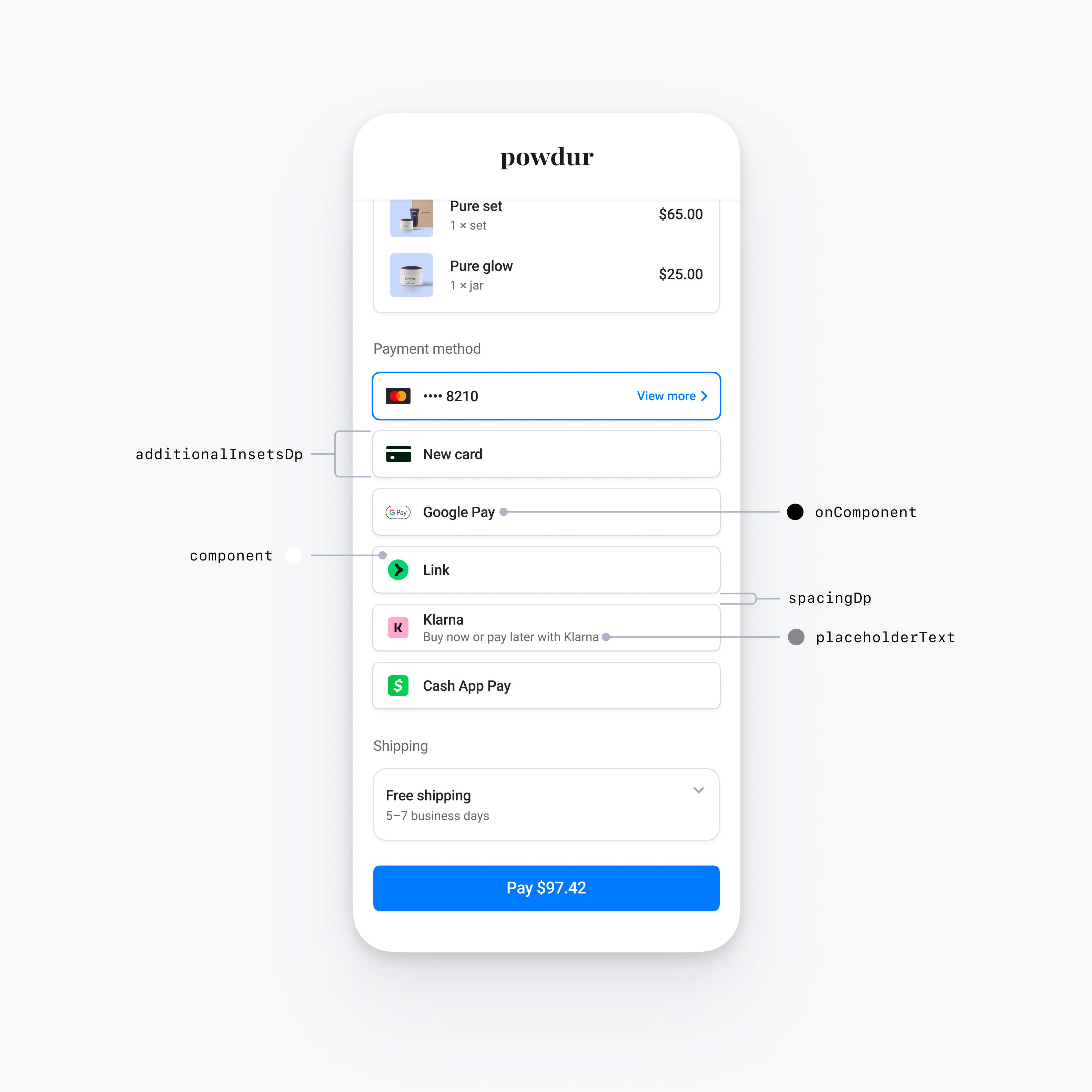
val embeddedAppearance = PaymentSheet.Appearance.Embedded.Builder()
    .rowStyle(
      PaymentSheet.Appearance.Embedded.RowStyle.FloatingButton.Builder()
        .additionalInsetsDp(10f) // Increase row height
        .spacingDp(20f) // Increase spacing
    )
    .build()


val appearance = PaymentSheet.Appearance(
    embeddedAppearance = embeddedAppearance,
)

val configuration = EmbeddedPaymentElement.Configuration.Builder("Powdur")
    .appearance(appearance)
    .build()
一般的な行のカスタマイズ
すべての行スタイルに適用される行プロパティをカスタマイズできます。
@OptIn(AppearanceAPIAdditionsPreview::class)
val embeddedAppearance = PaymentSheet.Appearance.Embedded.Builder()
    // Custom margins for the payment method icon (for example, the Klarna logo)
    .paymentMethodIconMargins(
      PaymentSheet.Insets(
        horizontalDp = 10f,
        verticalDp = 5f
      )
    )
    // Custom font for the row title (for example, "Klarna")
    .titleFont(
      PaymentSheet.Typography.Font(
        fontFamily = R.font.custom_font,
        fontSizeSp = 20f,
        fontWeight = 50,
        letterSpacingSp = 8f
      )
    )
    // Custom font for the row subtitle (for example, "Buy now or pay later with Klarna")
    .titleFont(
      PaymentSheet.Typography.Font(
        fontFamily = R.font.custom_font,
        fontSizeSp = 14f,
        fontWeight = 50,
        letterSpacingSp = 8f
      )
    )
    .build()

val appearance = PaymentSheet.Appearance(
    embeddedAppearance = embeddedAppearance,
)

val configuration = EmbeddedPaymentElement.Configuration.Builder("Powdur")
    .appearance(appearance)
    .build()