# Elements Appearance API
Customize the look and feel of Elements to match the design of your site.
Stripe Elements supports visual customization, which allows you to match the design of your site with the `appearance` option. The layout of each Element stays consistent, but you can modify colors, fonts, borders, padding, and more.
1. Pick a prebuilt [theme](https://docs.stripe.com/elements/appearance-api.md#theme) that most closely resembles your website.
1. Customize the theme using [inputs and labels](https://docs.stripe.com/elements/appearance-api.md#inputs-and-labels). You can also set [variables](https://docs.stripe.com/elements/appearance-api.md#variables), such as the `fontFamily` and `colorPrimary` to broadly customize components appearing throughout each Element.
1. If needed, fine-tune individual components and states using [rules](https://docs.stripe.com/elements/appearance-api.md#rules).
For complete control, specify custom CSS properties for individual components appearing in the Element.
> The Elements Appearance API doesn’t support individual payment method Elements (such as `CardElement`). Use the [Style](https://docs.stripe.com/js/appendix/style) object to customize your Element instead.
# Checkout Sessions API
> This is a Checkout Sessions API for when api-integration is checkout. View the full page at https://docs.stripe.com/elements/appearance-api?api-integration=checkout.
## 主题
通过选择以下主题之一开始自定义 Elements:
- `stripe`
- `night`
- `flat`
#### HTML + JS
```js
const appearance = {
theme: 'night'
};
// Pass the appearance object when initializing checkout
const checkout = stripe.initCheckoutElementsSdk({clientSecret, elementsOptions: {appearance}});
```
#### React
```jsx
import {CheckoutElementsProvider} from '@stripe/react-stripe-js/checkout';
const appearance = {
theme: 'night'
};
// Pass the appearance object to CheckoutElementsProvider
```
## 输入框与标签
自定义输入字段及其关联标签的外观。
`const appearance = {
inputs: 'spaced',
labels: 'auto'
}`
### 输入框
选择适合您设计的输入字段样式。
| 变体 | 描述 |
| ----- | ---------------------- |
| `间隔式` | 每个输入字段周围都有空白区域。这是默认选项。 |
| `紧凑式` | 相关的输入字段组合在一起,彼此之间没有间距。 |
### 标签
控制与输入字段关联的标签的位置和可见性。
| 变体 | 描述 |
| ------ | ------------------------------------------------------------------ |
| `auto` | 标签会根据输入字段的变体进行调整。当输入框为`间隔式`时,标签位于`上方`。当输入框为`紧凑式`时,标签为`浮动式`。这是默认选项。 |
| `上方` | 标签位于相应输入字段的上方。 |
| `浮动式` | 标签浮动在输入字段内部。 |
## 变量
设置变量以影响每个 Checkout 元素中出现的多个组件的外观。

`变量`选项的工作方式类似于 [CSS 变量](https://developer.mozilla.org/en-US/docs/Web/CSS/Using_CSS_custom_properties)。您可以为每个变量指定 CSS 值,并使用 `var(--myVariable)` 语法引用其他外观变量。您甚至可以使用浏览器中的 DOM 检查器来查看生成的 DOM 结构。
> `colorPrimary`、`colorBackground`、`colorText`、`colorSuccess`、`colorDanger` 和 `colorWarning` 变量不支持 `rgba()` 或 `var(--myVariable)` 语法。
#### HTML + JS
```js
const appearance = {
theme: 'stripe',
variables: {
colorPrimary: '#0570de',
colorBackground: '#ffffff',
colorText: '#30313d',
colorDanger: '#df1b41',
fontFamily: 'Ideal Sans, system-ui, sans-serif',
spacingUnit: '2px',
borderRadius: '4px',
// See all possible variables below
}
};
// Pass the appearance object when initializing checkout
const checkout = stripe.initCheckoutElementsSdk({clientSecret, elementsOptions: {appearance}});
```
#### React
```jsx
import {CheckoutElementsProvider} from '@stripe/react-stripe-js/checkout';
const appearance = {
theme: 'stripe',
variables: {
colorPrimary: '#0570de',
colorBackground: '#ffffff',
colorText: '#30313d',
colorDanger: '#df1b41',
fontFamily: 'Ideal Sans, system-ui, sans-serif',
spacingUnit: '2px',
borderRadius: '4px',
// See all possible variables below
}
};
// Pass the appearance object to CheckoutElementsProvider
```
### 常用变量
| 变动 | 描述 |
| ----------------- | -------------------------------------------------------------------------------------------------------------------------------------------------------------------------------------------------------------------------------------------------------------------------------------------------------------------------------------------- |
| `fontFamily` | 整个用户界面使用的字体系列。Elements 支持自定义字体,只需将 `fonts` 选项传递给 [initCheckoutElementsSdk](https://docs.stripe.com/js/custom_checkout/init#custom_checkout_init-options-elementsOptions-fonts) 或 [CheckoutElementsProvider](https://docs.stripe.com/js/react_stripe_js/checkout/checkout_provider#react_checkout_provider-options-elementsOptions-fonts) 即可。 |
| `fontSizeBase` | 设置在用户界面根元素上的字体大小。默认情况下,其他字体大小变量(如 `fontSizeXs` 或 `fontSizeSm`)会使用 `rem` 单位根据此值进行缩放。请确保为移动端输入字段选择至少 16px 的字体大小。 |
| `spacingUnit` | 所有其他间距值基于此基础间距单位。增减此值可调整整体布局的疏密程度 |
| `borderRadius` | 用于选项卡、输入框及其他组件的边框圆角半径。 |
| `colorPrimary` | 在整个用户界面中使用的主色调。请将此颜色设置为您的主品牌色。 |
| `colorBackground` | 用于输入框、选项卡及其他组件背景的颜色。 |
| `colorText` | 使用的默认文本颜色。 |
| `colorDanger` | 用于表示错误或破坏性操作的颜色。 |
### 不太常用的变量
| 变动 | 描述 |
| ------------------------------------- | ------------------------------------------------------------------------------------------------------------------------------------------------------------------------------------------------- |
| `buttonBorderRadius` | 按钮使用的边框半径。默认情况下,按钮使用 `borderRadius`。 |
| `buttonColorBackground` | 用于按钮背景的颜色。默认情况下,按钮使用 `colorPrimary`。 |
| `buttonColorText` | 用于按钮文本的颜色。默认情况下,按钮使用 `accessibleColorOnColorPrimary`。 |
| `focusBoxShadow` | 用于焦点组件的 `box-shadow`。 |
| `focusOutline` | 用于焦点组件的 `outline`。 |
| `fontSmooth` | 使用何种文本抗锯齿设置。可选值为 `always`、`auto` 或 `never`。 |
| `fontVariantLigatures` | 文本的 [font-variant-ligatures](http://developer.mozilla.org/en-US/docs/Web/CSS/font-variant-ligatures) 设置。 |
| `fontVariationSettings` | 文本的 [font-variation-settings](http://developer.mozilla.org/en-US/docs/Web/CSS/font-variation-settings) 设置。 |
| `fontWeightLight` | 浅色文本使用的字体粗细。 |
| `fontWeightNormal` | 普通文本使用的字体粗细。 |
| `fontWeightMedium` | 中等文本使用的字体粗细。 |
| `fontWeightBold` | 粗体文本使用的字体粗细。 |
| `fontLineHeight` | 文本的 [line-height](http://developer.mozilla.org/en-US/docs/Web/CSS/line-height) 设置。 |
| `fontSize2Xl` | 双特大号文本的字体大小。默认情况下,此值使用 `rem` 单位根据 `var(--fontSizeBase)` 进行缩放。 |
| `fontSizeXl` | 特大号文本的字体大小。默认情况下,此值使用 `rem` 单位根据 `var(--fontSizeBase)` 进行缩放。 |
| `fontSizeLg` | 大号文本的字体大小。默认情况下,此值使用 `rem` 单位根据 `var(--fontSizeBase)` 进行缩放。 |
| `fontSizeSm` | 小号文本的字体大小。默认情况下,此值使用 `rem` 单位根据 `var(--fontSizeBase)` 进行缩放。 |
| `fontSizeXs` | 特小号文本的字体大小。默认情况下,此值使用 `rem` 单位根据 `var(--fontSizeBase)` 进行缩放。 |
| `fontSize2Xs` | 双特小号文本的字体大小。默认情况下,此值使用 `rem` 单位根据 `var(--fontSizeBase)` 进行缩放。 |
| `fontSize3Xs` | 三特小号文本的字体大小。默认情况下,此值使用 `rem` 单位根据 `var(--fontSizeBase)` 进行缩放。 |
| `logoColor` | 徽标变体的显示偏好设置(`light` 或 `dark`)。 |
| `tabLogoColor` | 在 `.Tab` 组件中显示的徽标变体(`light` 或 `dark`)。 |
| `tabLogoSelectedColor` | 在 `.Tab--selected` 组件中显示的徽标变体(`light` 或 `dark`)。 |
| `blockLogoColor` | 在 `.Block` 组件中显示的徽标变体(`light` 或 `dark`)。 |
| `colorSuccess` | 用于表示肯定操作或成功结果的颜色。 |
| `colorWarning` | 用于表示潜在破坏性操作的颜色。 |
| `accessibleColorOnColorPrimary` | 显示在 `var(--colorPrimary)` 背景上的文本颜色。 |
| `accessibleColorOnColorBackground` | 出现在任何 `var(--colorBackground)` 背景之上的文本颜色。 |
| `accessibleColorOnColorSuccess` | 显示在 `var(--colorSuccess)` 背景上的文本颜色。 |
| `accessibleColorOnColorDanger` | 显示在 `var(--colorDanger)` 背景上的文本颜色。 |
| `accessibleColorOnColorWarning` | 显示在 `var(--colorWarning)` 背景上的文本颜色。 |
| `colorTextSecondary` | 次要重要性文本的颜色。例如,该颜色用于当前未选中的选项卡标签。 |
| `colorTextPlaceholder` | 用于输入框占位符文本的颜色。 |
| `iconColor` | 图标的默认颜色,例如卡片选项卡中显示的图标。 |
| `iconHoverColor` | 鼠标悬停时图标的颜色。 |
| `iconCardErrorColor` | 卡片图标处于错误状态时的颜色。 |
| `iconCardCvcColor` | 卡片图标 CVC 变体的颜色。 |
| `iconCardCvcErrorColor` | 当 CVC 字段输入无效时,卡片图标 CVC 变体的颜色。 |
| `iconCheckmarkColor` | 在类似 `.Checkbox` 组件中显示的勾选标记颜色。 |
| `iconChevronDownColor` | 选择输入框内显示的箭头图标颜色。 |
| `iconChevronDownHoverColor` | 鼠标悬停时箭头图标的颜色。 |
| `iconCloseColor` | 关闭图标的颜色(用于表示关闭或取消操作)。 |
| `iconCloseHoverColor` | 鼠标悬停时关闭图标的颜色。 |
| `iconLoadingIndicatorColor` | 加载指示器中旋转图标的颜色。 |
| `iconMenuColor` | 用于表示附加操作集的菜单图标颜色。 |
| `iconMenuHoverColor` | 鼠标悬停时菜单图标的颜色。 |
| `iconMenuOpenColor` | 菜单打开时菜单图标的颜色。 |
| `iconPasscodeDeviceColor` | 密码设备图标的颜色(用于表示消息已发送至用户移动设备)。 |
| `iconPasscodeDeviceHoverColor` | 鼠标悬停时,密码设备图标的颜色。 |
| `iconPasscodeDeviceNotificationColor` | 显示在密码设备图标上的通知指示器颜色。 |
| `iconRedirectColor` | 基于重定向的支付方式所显示的重定向图标颜色。 |
| `tabIconColor` | 选项卡内显示的图标颜色。 |
| `tabIconHoverColor` | 鼠标悬停时,选项卡内显示的图标颜色。 |
| `tabIconSelectedColor` | 选项卡被选中时,选项卡内显示的图标颜色。 |
| `tabIconMoreColor` | 附加支付方式菜单触发器中显示的图标颜色。 |
| `tabIconMoreHoverColor` | 鼠标悬停时,附加支付方式菜单触发器中显示的图标颜色。 |
| `accordionItemSpacing` | `.AccordionItem` 组件之间的垂直间距。仅当 [spacedAccordionItems](https://docs.stripe.com/js/elements_object/create_payment_element#payment_element_create-options-layout-spacedAccordionItems) 为 `true` 时才适用。 |
| `gridColumnSpacing` | 用于用户界面布局的网格中列与列之间的间距。 |
| `gridRowSpacing` | 用于用户界面布局的网格中行与行之间的间距。 |
| `pickerItemSpacing` | `.Picker` 中呈现的 `.PickerItem` 组件间的间距。 |
| `tabSpacing` | `.Tab` 组件之间的水平间距。 |
## 规则
`rules` 选项是一个将类似 CSS 的选择器映射到 CSS 属性的映射表,允许对单个组件进行更精细的自定义。在定义好 `theme` 和 `variables` 之后,使用 `rules` 来集成用户界面,使其与您网站的设计相匹配。
#### HTML + JS
```js
const appearance = {
rules: {
'.Tab': {
border: '1px solid #E0E6EB',
boxShadow: '0px 1px 1px rgba(0, 0, 0, 0.03), 0px 3px 6px rgba(18, 42, 66, 0.02)',
},
'.Tab:hover': {
color: 'var(--colorText)',
},
'.Tab--selected': {
borderColor: '#E0E6EB',
boxShadow: '0px 1px 1px rgba(0, 0, 0, 0.03), 0px 3px 6px rgba(18, 42, 66, 0.02), 0 0 0 2px var(--colorPrimary)',
},
'.Input--invalid': {
boxShadow: '0 1px 1px 0 rgba(0, 0, 0, 0.07), 0 0 0 2px var(--colorDanger)',
},
// See all supported class names and selector syntax below
}
};
// Pass the appearance object when initializing checkout
const checkout = stripe.initCheckoutElementsSdk({clientSecret, elementsOptions: {appearance}});
```
#### React
```jsx
import {CheckoutElementsProvider} from '@stripe/react-stripe-js/checkout';
const appearance = {
rules: {
'.Tab': {
border: '1px solid #E0E6EB',
boxShadow: '0px 1px 1px rgba(0, 0, 0, 0.03), 0px 3px 6px rgba(18, 42, 66, 0.02)',
},
'.Tab:hover': {
color: 'var(--colorText)',
},
'.Tab--selected': {
borderColor: '#E0E6EB',
boxShadow: '0px 1px 1px rgba(0, 0, 0, 0.03), 0px 3px 6px rgba(18, 42, 66, 0.02), 0 0 0 2px var(--colorPrimary)',
},
'.Input--invalid': {
boxShadow: '0 1px 1px 0 rgba(0, 0, 0, 0.07), 0 0 0 2px var(--colorDanger)',
},
// See all supported class names and selector syntax below
}
};
// Pass the appearance object to CheckoutElementsProvider
```
### 所有规则
规则的选择器可以针对用户界面中的任何公开类名,以及每个类名支持的状态、伪类和伪元素。例如,以下都是有效的选择器:
- `.Tab, .Label, .Input`
- `.Tab:focus`
- `.Input--invalid, .Label--invalid`
- `.Input::placeholder`
以下是**无**效的选择器:
- `.p-SomePrivateClass, img`,只能指向 Public 类名称
- `.Tab .TabLabel`,不支持选择器中的祖先后代关系。
- `.Tab--invalid`,`.Tab` 类不支持 `--invalid` 状态
在选择器中使用的每个类名仅[支持特定 CSS 属性允许列表](https://docs.stripe.com/elements/appearance-api.md#supported-css-properties),这些属性需使用驼峰命名法指定(例如,[box-shadow](https://developer.mozilla.org/en-US/docs/Web/CSS/box-shadow) 属性应写作 `boxShadow`)。
以下是支持的类名及其相应的状态、伪类 (pseudo-classes) 和伪元素 (pseudo-element) 的完整列表。
### 标签
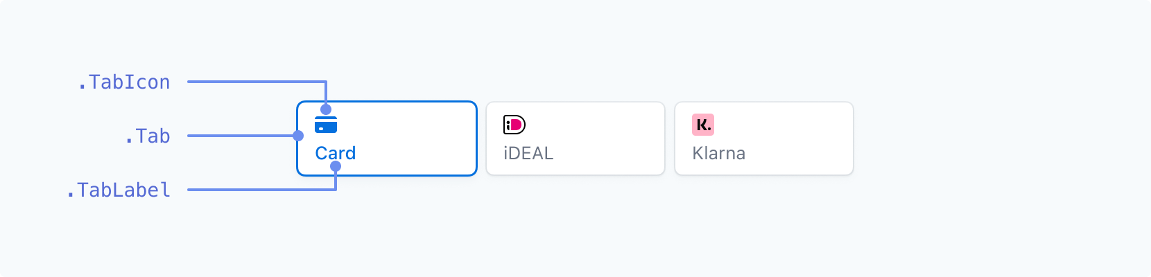
| 类名 | 状态 | Pseudo-classes | Pseudo-elements |
| ----------- | ------------ | ------------------------------------------ | --------------- |
| `.Tab` | `--selected` | `:hover`, `:focus`, `:active`, `:disabled` | |
| `.TabIcon` | `--selected` | `:hover`, `:focus`, `:active`, `:disabled` | |
| `.TabLabel` | `--selected` | `:hover`, `:focus`, `:active`, `:disabled` | |
### 输入框(标签在上方)
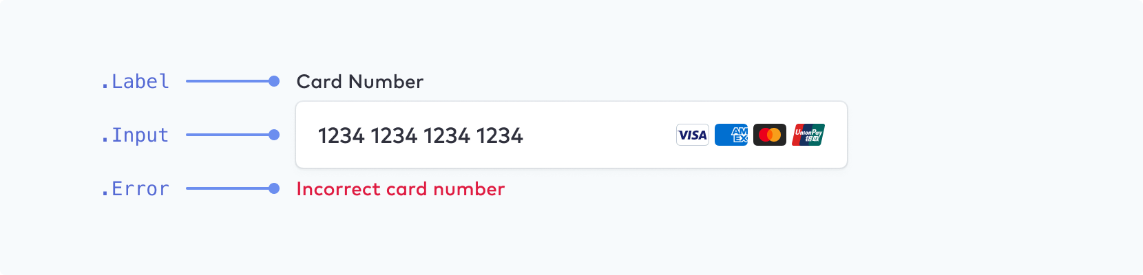
请确保为移动设备上的输入字段选择的字体大小至少为 16px。
| 类名 | 状态 | Pseudo-classes | Pseudo-elements |
| -------- | ----------------------------------- | -------------------------------------------- | ------------------------------ |
| `.Label` | `--empty`, `--invalid`, `--focused` | | |
| `.Input` | `--empty`, `--invalid` | `:hover`, `:focus`, `:disabled`, `:autofill` | `::placeholder`, `::selection` |
| `.Error` | | | |
### 输入框(浮动标签)
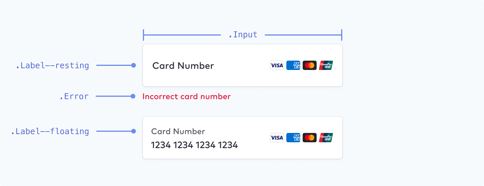
> 您可以将浮动标签启用为 [附加配置选项](https://docs.stripe.com/elements/appearance-api.md#others)。
| 类名 | 状态 | Pseudo-classes | Pseudo-elements |
| -------- | -------------------------------------------------------------- | -------------------------------------------- | ------------------------------ |
| `.Label` | `--empty`, `--invalid`, `--focused`, `--floating`, `--resting` | | |
| `.Input` | `--empty`, `--invalid` | `:hover`, `:focus`, `:disabled`, `:autofill` | `::placeholder`, `::selection` |
| `.Error` | | | |
### 阻止
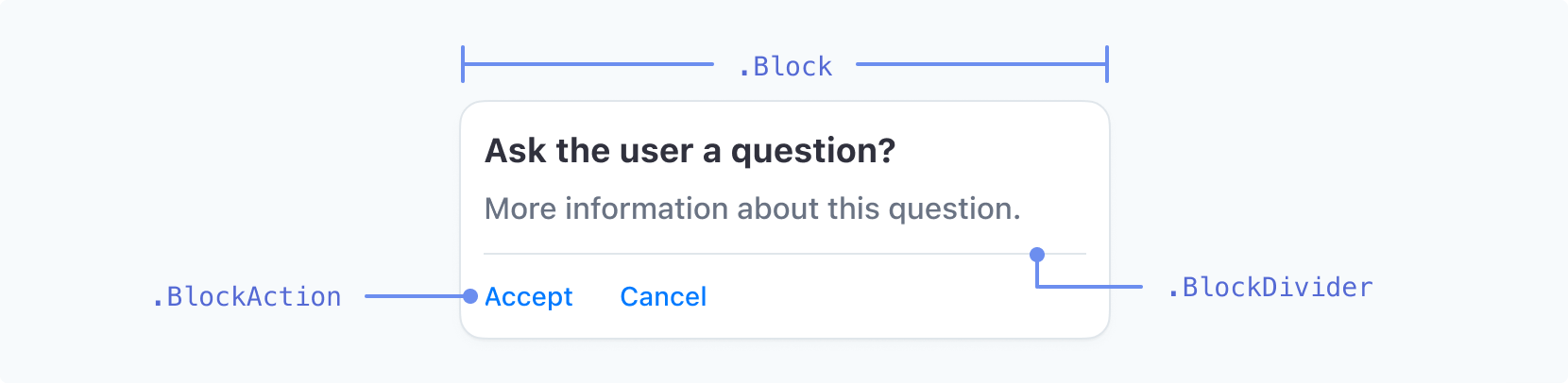
| 类名 | 状态 | Pseudo-classes | Pseudo-elements |
| --------------- | ------------ | ----------------------------- | --------------- |
| `.Block` | | | |
| `.BlockDivider` | | | |
| `.BlockAction` | `--negative` | `:hover`, `:focus`, `:active` | |
### 代码输入
| 类名 | 状态 | Pseudo-classes | Pseudo-elements |
| ------------ | -- | ------------------------------- | --------------- |
| `.CodeInput` | | `:hover`, `:focus`, `:disabled` | |
### 复选框
| 类名 | 状态 | Pseudo-classes | Pseudo-elements |
| ---------------- | ----------- | ------------------------------------ | --------------- |
| `.Checkbox` | `--checked` | | |
| `.CheckboxLabel` | `--checked` | `:hover`, `:focus`, `:focus-visible` | |
| `.CheckboxInput` | `--checked` | `:hover`, `:focus`, `:focus-visible` | |
### 下拉列表
| 类名 | 状态 | Pseudo-classes | Pseudo-elements |
| --------------- | ------------- | -------------- | --------------- |
| `.Dropdown` | | | |
| `.DropdownItem` | `--highlight` | `:active` | |
> 下拉菜单的样式在 macOS 上受到限制。下拉菜单的外观 API 主要影响 Windows 系统。在 macOS 上,由于操作系统的限制,您无法使用这些规则来设置系统下拉菜单(例如国家/地区选择器)的样式。
### 开关
| 类名 | 状态 | Pseudo-classes | Pseudo-elements |
| ---------------- | ---------- | -------------- | --------------- |
| `.Switch` | `--active` | `:hover` | |
| `.SwitchControl` | | `:hover` | |
### 选择器
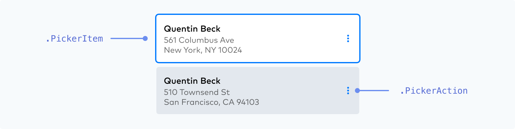
| 类名 | 状态 | Pseudo-classes | Pseudo-elements |
| --------------- | -------------------------------------------------- | ----------------------------- | --------------- |
| `.PickerItem` | `--selected`, `--highlight`, `--new`, `--disabled` | `:hover`, `:focus`, `:active` | |
| `.PickerAction` | | `:hover`, `:focus`, `:active` | |
请确保您的 `.PickerItem` 激活状态与其他状态有明显区分。
| |
| |
|  |  |
| **一定要**
使用明显的、高对比度的原色、粗细和/或轮廓来区分客户已经选择的活动状态。 | **一定不要**
不要为您的 .PickerItem 状态使用两个权重相等的选项或低对比度的颜色,因为它使区分哪个是活动的变得更加困难。 |
### 菜单
| 类名 | 状态 | Pseudo-classes | Pseudo-elements |
| ------------- | ------------ | ----------------------------- | --------------- |
| `.Menu` | | | |
| `.MenuIcon` | `--open` | `:hover` | |
| `.MenuAction` | `--negative` | `:hover`, `:focus`, `:active` | |
### 手风琴
| 类名 | 状态 | Pseudo-classes | Pseudo-elements |
| ---------------- | ------------ | -------------------------- | --------------- |
| `.AccordionItem` | `--selected` | `:hover`, `:focus-visible` | |
### Payment Method Messaging Element
| 类名 | 状态 | Pseudo-classes | Pseudo-elements |
| ------------------------- | -- | -------------- | --------------- |
| `.PaymentMethodMessaging` | | | |
### 单选图标

| 类名 | 状态 | Pseudo-classes | Pseudo-elements |
| ----------------- | ------------------------ | -------------- | --------------- |
| `.RadioIcon` | | | |
| `.RadioIconOuter` | `--checked`, `--hovered` | | |
| `.RadioIconInner` | `--checked`, `--hovered` | | |
您可以通过 `.RadioIcon` 中的 `width` 属性控制图标的整体大小。您可以用 `r`(半径)属性控制 `.RadioIconInner` 的相对大小。`.RadioIconOuter` 和 `.RadioIconInner` 是 SVG 元素,可以使用 `stroke` 和 `fill` 属性设置样式。请参见下方[支持的 CSS 属性](https://docs.stripe.com/elements/appearance-api.md#supported-css-properties)的完整列表。
```js
const appearance = {
rules: {
'.RadioIcon': {
width: '24px'
},
'.RadioIconOuter': {
stroke: '#E0E6EB'
},
'.RadioIconInner': {
r: '16'
}
}
};
```
### 切换

| 类名 | 状态 | Pseudo-classes | Pseudo-elements |
| ------------- | ------------ | ------------------------------------------ | --------------- |
| `.ToggleItem` | `--selected` | `:active`, `:hover`, `:focus`, `:disabled` | |
### 支持的 CSS 属性
| CSS 属性 | 支持的类别 |
| ------------------------- | ----------------------------------------------------------------------------------------------------------------------------------------------------------------------------------------------------------------------------------------------------------------------------------------------------------------------------------------------------------------------------------------------------------------------------------------------------------------- |
| `-moz-osx-font-smoothing` | `AccordionItem`, `Action`, `BlockAction`, `Button`, `Checkbox`, `CheckboxLabel`, `CodeInput`, `DropdownItem`, `Error`, `Input`, `Label`, `Link`, `MenuAction`, `PickerAction`, `PickerItem`, `RedirectText`, `SecondaryLink`, `Tab`, `TabLabel`, `TermsLink`, `TermsText`, `Text`, `ToggleItem` |
| `-webkit-font-smoothing` | `AccordionItem`, `Action`, `BlockAction`, `Button`, `Checkbox`, `CheckboxLabel`, `CodeInput`, `DropdownItem`, `Error`, `Input`, `Label`, `Link`, `MenuAction`, `PickerAction`, `PickerItem`, `RedirectText`, `SecondaryLink`, `Tab`, `TabLabel`, `TermsLink`, `TermsText`, `Text`, `ToggleItem` |
| `-webkit-text-fill-color` | `AccordionItem`, `Action`, `BlockAction`, `Button`, `Checkbox`, `CheckboxLabel`, `CodeInput`, `DropdownItem`, `Error`, `Input`, `Label`, `Link`, `MenuAction`, `PickerAction`, `PickerItem`, `RedirectText`, `SecondaryLink`, `Tab`, `TabLabel`, `TermsLink`, `TermsText`, `Text`, `ToggleItem` |
| `backgroundColor` | `AccordionItem`, `Action`, `Block`, `BlockAction`, `BlockDivider`, `Button`, `CheckboxInput`, `CodeInput`, `DropdownItem`, `Error`, `Input`, `InputDivider`, `MenuAction`, `MenuIcon`, `PickerAction`, `PickerItem`, `Switch`, `Tab`, `ToggleItem` |
| `border` | `AccordionItem`, `Action`, `Block`, `BlockAction`, `Button`, `CheckboxInput`, `CodeInput`, `Dropdown`, `DropdownItem`, `Error`, `Input`, `MenuAction`, `MenuIcon`, `PickerAction`, `PickerItem`, `RedirectText`, `Switch`, `SwitchControl`, `Tab`, `TermsText`, `Text`, `ToggleItem` |
| `borderBottom` | `AccordionItem`, `Action`, `Block`, `BlockAction`, `Button`, `CheckboxInput`, `CodeInput`, `Dropdown`, `DropdownItem`, `Error`, `Input`, `MenuAction`, `MenuIcon`, `PickerAction`, `PickerItem`, `RedirectText`, `Switch`, `SwitchControl`, `Tab`, `TermsText`, `Text`, `ToggleItem` |
| `borderBottomColor` | `AccordionItem`, `Action`, `Block`, `BlockAction`, `Button`, `CheckboxInput`, `CodeInput`, `Dropdown`, `DropdownItem`, `Error`, `Input`, `MenuAction`, `MenuIcon`, `PickerAction`, `PickerItem`, `RedirectText`, `Switch`, `SwitchControl`, `Tab`, `TermsText`, `Text`, `ToggleItem` |
| `borderBottomLeftRadius` | `AccordionItem`, `Action`, `Block`, `BlockAction`, `Button`, `CheckboxInput`, `CodeInput`, `Dropdown`, `DropdownItem`, `Error`, `Input`, `MenuAction`, `MenuIcon`, `PickerAction`, `PickerItem`, `RedirectText`, `Switch`, `SwitchControl`, `Tab`, `TermsText`, `Text`, `ToggleItem` |
| `borderBottomRightRadius` | `AccordionItem`, `Action`, `Block`, `BlockAction`, `Button`, `CheckboxInput`, `CodeInput`, `Dropdown`, `DropdownItem`, `Error`, `Input`, `MenuAction`, `MenuIcon`, `PickerAction`, `PickerItem`, `RedirectText`, `Switch`, `SwitchControl`, `Tab`, `TermsText`, `Text`, `ToggleItem` |
| `borderBottomStyle` | `AccordionItem`, `Action`, `Block`, `BlockAction`, `Button`, `CheckboxInput`, `CodeInput`, `Dropdown`, `DropdownItem`, `Error`, `Input`, `MenuAction`, `MenuIcon`, `PickerAction`, `PickerItem`, `RedirectText`, `Switch`, `SwitchControl`, `Tab`, `TermsText`, `Text`, `ToggleItem` |
| `borderBottomWidth` | `AccordionItem`, `Action`, `Block`, `BlockAction`, `Button`, `CheckboxInput`, `CodeInput`, `Dropdown`, `DropdownItem`, `Error`, `Input`, `MenuAction`, `MenuIcon`, `PickerAction`, `PickerItem`, `RedirectText`, `Switch`, `SwitchControl`, `Tab`, `TermsText`, `Text`, `ToggleItem` |
| `borderColor` | `AccordionItem`, `Action`, `Block`, `BlockAction`, `Button`, `CheckboxInput`, `CodeInput`, `Dropdown`, `DropdownItem`, `Error`, `Input`, `MenuAction`, `MenuIcon`, `PickerAction`, `PickerItem`, `RedirectText`, `Switch`, `SwitchControl`, `Tab`, `TermsText`, `Text`, `ToggleItem` |
| `borderLeft` | `AccordionItem`, `Action`, `Block`, `BlockAction`, `Button`, `CheckboxInput`, `CodeInput`, `Dropdown`, `DropdownItem`, `Error`, `Input`, `MenuAction`, `MenuIcon`, `PickerAction`, `PickerItem`, `RedirectText`, `Switch`, `SwitchControl`, `Tab`, `TermsText`, `Text`, `ToggleItem` |
| `borderLeftColor` | `AccordionItem`, `Action`, `Block`, `BlockAction`, `Button`, `CheckboxInput`, `CodeInput`, `Dropdown`, `DropdownItem`, `Error`, `Input`, `MenuAction`, `MenuIcon`, `PickerAction`, `PickerItem`, `RedirectText`, `Switch`, `SwitchControl`, `Tab`, `TermsText`, `Text`, `ToggleItem` |
| `borderLeftStyle` | `AccordionItem`, `Action`, `Block`, `BlockAction`, `Button`, `CheckboxInput`, `CodeInput`, `Dropdown`, `DropdownItem`, `Error`, `Input`, `MenuAction`, `MenuIcon`, `PickerAction`, `PickerItem`, `RedirectText`, `Switch`, `SwitchControl`, `Tab`, `TermsText`, `Text`, `ToggleItem` |
| `borderLeftWidth` | `AccordionItem`, `Action`, `Block`, `BlockAction`, `Button`, `CheckboxInput`, `CodeInput`, `Dropdown`, `DropdownItem`, `Error`, `Input`, `MenuAction`, `MenuIcon`, `PickerAction`, `PickerItem`, `RedirectText`, `Switch`, `SwitchControl`, `Tab`, `TermsText`, `Text`, `ToggleItem` |
| `borderRadius` | `AccordionItem`, `Action`, `Block`, `BlockAction`, `Button`, `CheckboxInput`, `CodeInput`, `Dropdown`, `DropdownItem`, `Error`, `Input`, `InputCloseIcon`, `Link`, `MenuAction`, `MenuIcon`, `PasscodeCloseIcon`, `PasscodeShowIcon`, `PickerAction`, `PickerItem`, `RedirectText`, `SecondaryLink`, `Switch`, `SwitchControl`, `Tab`, `TermsLink`, `TermsText`, `Text`, `ToggleItem` |
| `borderRight` | `AccordionItem`, `Action`, `Block`, `BlockAction`, `Button`, `CheckboxInput`, `CodeInput`, `Dropdown`, `DropdownItem`, `Error`, `Input`, `MenuAction`, `MenuIcon`, `PickerAction`, `PickerItem`, `RedirectText`, `Switch`, `SwitchControl`, `Tab`, `TermsText`, `Text`, `ToggleItem` |
| `borderRightColor` | `AccordionItem`, `Action`, `Block`, `BlockAction`, `Button`, `CheckboxInput`, `CodeInput`, `Dropdown`, `DropdownItem`, `Error`, `Input`, `MenuAction`, `MenuIcon`, `PickerAction`, `PickerItem`, `RedirectText`, `Switch`, `SwitchControl`, `Tab`, `TermsText`, `Text`, `ToggleItem` |
| `borderRightStyle` | `AccordionItem`, `Action`, `Block`, `BlockAction`, `Button`, `CheckboxInput`, `CodeInput`, `Dropdown`, `DropdownItem`, `Error`, `Input`, `MenuAction`, `MenuIcon`, `PickerAction`, `PickerItem`, `RedirectText`, `Switch`, `SwitchControl`, `Tab`, `TermsText`, `Text`, `ToggleItem` |
| `borderRightWidth` | `AccordionItem`, `Action`, `Block`, `BlockAction`, `Button`, `CheckboxInput`, `CodeInput`, `Dropdown`, `DropdownItem`, `Error`, `Input`, `MenuAction`, `MenuIcon`, `PickerAction`, `PickerItem`, `RedirectText`, `Switch`, `SwitchControl`, `Tab`, `TermsText`, `Text`, `ToggleItem` |
| `borderStyle` | `AccordionItem`, `Action`, `Block`, `BlockAction`, `Button`, `CheckboxInput`, `CodeInput`, `Dropdown`, `DropdownItem`, `Error`, `Input`, `MenuAction`, `MenuIcon`, `PickerAction`, `PickerItem`, `RedirectText`, `Switch`, `SwitchControl`, `Tab`, `TermsText`, `Text`, `ToggleItem` |
| `borderTop` | `AccordionItem`, `Action`, `Block`, `BlockAction`, `Button`, `CheckboxInput`, `CodeInput`, `Dropdown`, `DropdownItem`, `Error`, `Input`, `MenuAction`, `MenuIcon`, `PickerAction`, `PickerItem`, `RedirectText`, `Switch`, `SwitchControl`, `Tab`, `TermsText`, `Text`, `ToggleItem` |
| `borderTopColor` | `AccordionItem`, `Action`, `Block`, `BlockAction`, `Button`, `CheckboxInput`, `CodeInput`, `Dropdown`, `DropdownItem`, `Error`, `Input`, `MenuAction`, `MenuIcon`, `PickerAction`, `PickerItem`, `RedirectText`, `Switch`, `SwitchControl`, `Tab`, `TermsText`, `Text`, `ToggleItem` |
| `borderTopLeftRadius` | `AccordionItem`, `Action`, `Block`, `BlockAction`, `Button`, `CheckboxInput`, `CodeInput`, `Dropdown`, `DropdownItem`, `Error`, `Input`, `MenuAction`, `MenuIcon`, `PickerAction`, `PickerItem`, `RedirectText`, `Switch`, `SwitchControl`, `Tab`, `TermsText`, `Text`, `ToggleItem` |
| `borderTopRightRadius` | `AccordionItem`, `Action`, `Block`, `BlockAction`, `Button`, `CheckboxInput`, `CodeInput`, `Dropdown`, `DropdownItem`, `Error`, `Input`, `MenuAction`, `MenuIcon`, `PickerAction`, `PickerItem`, `RedirectText`, `Switch`, `SwitchControl`, `Tab`, `TermsText`, `Text`, `ToggleItem` |
| `borderTopStyle` | `AccordionItem`, `Action`, `Block`, `BlockAction`, `Button`, `CheckboxInput`, `CodeInput`, `Dropdown`, `DropdownItem`, `Error`, `Input`, `MenuAction`, `MenuIcon`, `PickerAction`, `PickerItem`, `RedirectText`, `Switch`, `SwitchControl`, `Tab`, `TermsText`, `Text`, `ToggleItem` |
| `borderTopWidth` | `AccordionItem`, `Action`, `Block`, `BlockAction`, `Button`, `CheckboxInput`, `CodeInput`, `Dropdown`, `DropdownItem`, `Error`, `Input`, `MenuAction`, `MenuIcon`, `PickerAction`, `PickerItem`, `RedirectText`, `Switch`, `SwitchControl`, `Tab`, `TermsText`, `Text`, `ToggleItem` |
| `borderWidth` | `AccordionItem`, `Action`, `Block`, `BlockAction`, `Button`, `CheckboxInput`, `CodeInput`, `Dropdown`, `DropdownItem`, `Error`, `Input`, `MenuAction`, `MenuIcon`, `PickerAction`, `PickerItem`, `RedirectText`, `Switch`, `SwitchControl`, `Tab`, `TermsText`, `Text`, `ToggleItem` |
| `boxShadow` | `AccordionItem`, `Action`, `Block`, `BlockAction`, `Button`, `CheckboxInput`, `CodeInput`, `Dropdown`, `DropdownItem`, `Error`, `Input`, `InputCloseIcon`, `Link`, `MenuAction`, `MenuIcon`, `PasscodeCloseIcon`, `PasscodeShowIcon`, `PickerAction`, `PickerItem`, `SecondaryLink`, `Switch`, `SwitchControl`, `Tab`, `TermsLink`, `ToggleItem` |
| `color` | `AccordionItem`, `Action`, `BlockAction`, `Button`, `Checkbox`, `CheckboxLabel`, `CodeInput`, `DropdownItem`, `Error`, `Input`, `Label`, `Link`, `MenuAction`, `PickerAction`, `PickerItem`, `RedirectText`, `SecondaryLink`, `Tab`, `TabIcon`, `TabLabel`, `TermsLink`, `TermsText`, `Text`, `ToggleItem` |
| `fill` | `Action`, `BlockAction`, `Button`, `CodeInput`, `DropdownItem`, `Error`, `Input`, `MenuAction`, `MenuIcon`, `PickerAction`, `PickerItem`, `RadioIconInner`, `RadioIconOuter`, `SwitchControl`, `Tab`, `TabIcon`, `ToggleItem` |
| `fillOpacity` | `RadioIconInner`, `RadioIconOuter` |
| `fontFamily` | `AccordionItem`, `Action`, `BlockAction`, `Button`, `Checkbox`, `CheckboxLabel`, `CodeInput`, `DropdownItem`, `Error`, `Input`, `Label`, `Link`, `MenuAction`, `PickerAction`, `PickerItem`, `RedirectText`, `SecondaryLink`, `Tab`, `TabLabel`, `TermsLink`, `TermsText`, `Text`, `ToggleItem` |
| `fontSize` | `AccordionItem`, `Action`, `BlockAction`, `Button`, `Checkbox`, `CheckboxLabel`, `CodeInput`, `DropdownItem`, `Error`, `Input`, `Label`, `Link`, `MenuAction`, `PickerAction`, `PickerItem`, `RedirectText`, `SecondaryLink`, `Switch`, `Tab`, `TabLabel`, `TermsLink`, `TermsText`, `Text`, `ToggleItem` |
| `fontVariant` | `AccordionItem`, `Action`, `BlockAction`, `Button`, `Checkbox`, `CheckboxLabel`, `CodeInput`, `DropdownItem`, `Error`, `Input`, `Label`, `Link`, `MenuAction`, `PickerAction`, `PickerItem`, `RedirectText`, `SecondaryLink`, `Tab`, `TabLabel`, `TermsLink`, `TermsText`, `Text`, `ToggleItem` |
| `fontWeight` | `AccordionItem`, `Action`, `BlockAction`, `Button`, `Checkbox`, `CheckboxLabel`, `CodeInput`, `DropdownItem`, `Error`, `Input`, `Label`, `Link`, `MenuAction`, `PickerAction`, `PickerItem`, `RedirectText`, `SecondaryLink`, `Tab`, `TabLabel`, `TermsLink`, `TermsText`, `Text`, `ToggleItem` |
| `letterSpacing` | `AccordionItem`, `Action`, `BlockAction`, `Button`, `Checkbox`, `CheckboxLabel`, `CodeInput`, `DropdownItem`, `Error`, `Input`, `Label`, `Link`, `MenuAction`, `PickerAction`, `PickerItem`, `RedirectText`, `SecondaryLink`, `Tab`, `TabLabel`, `TermsLink`, `TermsText`, `Text`, `ToggleItem` |
| `lineHeight` | `AccordionItem`, `Action`, `BlockAction`, `Button`, `Checkbox`, `CheckboxLabel`, `CodeInput`, `DropdownItem`, `Error`, `Input`, `Label`, `Link`, `MenuAction`, `PickerAction`, `PickerItem`, `RedirectText`, `SecondaryLink`, `Tab`, `TabLabel`, `TermsLink`, `TermsText`, `Text`, `ToggleItem` |
| `margin` | `Action`, `BlockAction`, `Button`, `CodeInput`, `DropdownItem`, `Error`, `Input`, `Label`, `MenuAction`, `PickerAction`, `PickerItem`, `Tab`, `ToggleItem` |
| `marginBottom` | `Action`, `BlockAction`, `Button`, `CodeInput`, `DropdownItem`, `Error`, `Input`, `Label`, `MenuAction`, `PickerAction`, `PickerItem`, `Tab`, `ToggleItem` |
| `marginLeft` | `Action`, `BlockAction`, `Button`, `CodeInput`, `DropdownItem`, `Error`, `Input`, `Label`, `MenuAction`, `PickerAction`, `PickerItem`, `Tab`, `ToggleItem` |
| `marginRight` | `Action`, `BlockAction`, `Button`, `CodeInput`, `DropdownItem`, `Error`, `Input`, `Label`, `MenuAction`, `PickerAction`, `PickerItem`, `Tab`, `ToggleItem` |
| `marginTop` | `Action`, `BlockAction`, `Button`, `CodeInput`, `DropdownItem`, `Error`, `Input`, `Label`, `MenuAction`, `PickerAction`, `PickerItem`, `Tab`, `ToggleItem` |
| `opacity` | `Label` |
| `outline` | `AccordionItem`, `Action`, `Block`, `BlockAction`, `Button`, `CheckboxInput`, `CodeInput`, `Dropdown`, `DropdownItem`, `Error`, `Input`, `InputCloseIcon`, `Link`, `MenuAction`, `MenuIcon`, `PasscodeCloseIcon`, `PasscodeShowIcon`, `PickerAction`, `PickerItem`, `SecondaryLink`, `Switch`, `SwitchControl`, `Tab`, `TermsLink`, `ToggleItem` |
| `outlineOffset` | `AccordionItem`, `Action`, `Block`, `BlockAction`, `Button`, `CheckboxInput`, `CodeInput`, `Dropdown`, `DropdownItem`, `Error`, `Input`, `InputCloseIcon`, `Link`, `MenuAction`, `MenuIcon`, `PasscodeCloseIcon`, `PasscodeShowIcon`, `PickerAction`, `PickerItem`, `SecondaryLink`, `Switch`, `SwitchControl`, `Tab`, `TermsLink`, `ToggleItem` |
| `padding` | `AccordionItem`, `Action`, `Block`, `BlockAction`, `Button`, `CodeInput`, `DropdownItem`, `Error`, `Input`, `Label`, `Menu`, `MenuAction`, `MenuIcon`, `PickerAction`, `PickerItem`, `RedirectText`, `Tab`, `TabIcon`, `TabLabel`, `TermsText`, `Text`, `ToggleItem` |
| `paddingBottom` | `AccordionItem`, `Action`, `Block`, `BlockAction`, `Button`, `CodeInput`, `DropdownItem`, `Error`, `Input`, `Label`, `Menu`, `MenuAction`, `MenuIcon`, `PickerAction`, `PickerItem`, `RedirectText`, `Tab`, `TabIcon`, `TabLabel`, `TermsText`, `Text`, `ToggleItem` |
| `paddingLeft` | `AccordionItem`, `Action`, `Block`, `BlockAction`, `Button`, `CodeInput`, `DropdownItem`, `Error`, `Input`, `Label`, `Menu`, `MenuAction`, `MenuIcon`, `PickerAction`, `PickerItem`, `RedirectText`, `Tab`, `TabIcon`, `TabLabel`, `TermsText`, `Text`, `ToggleItem` |
| `paddingRight` | `AccordionItem`, `Action`, `Block`, `BlockAction`, `Button`, `CodeInput`, `DropdownItem`, `Error`, `Input`, `Label`, `Menu`, `MenuAction`, `MenuIcon`, `PickerAction`, `PickerItem`, `RedirectText`, `Tab`, `TabIcon`, `TabLabel`, `TermsText`, `Text`, `ToggleItem` |
| `paddingTop` | `AccordionItem`, `Action`, `Block`, `BlockAction`, `Button`, `CodeInput`, `DropdownItem`, `Error`, `Input`, `Label`, `Menu`, `MenuAction`, `MenuIcon`, `PickerAction`, `PickerItem`, `RedirectText`, `Tab`, `TabIcon`, `TabLabel`, `TermsText`, `Text`, `ToggleItem` |
| `r` | `RadioIconInner` |
| `stroke` | `RadioIconInner`, `RadioIconOuter` |
| `strokeOpacity` | `RadioIconInner`, `RadioIconOuter` |
| `strokeWidth` | `RadioIconInner`, `RadioIconOuter` |
| `textAlign` | `PaymentMethodMessaging` |
| `textDecoration` | `AccordionItem`, `Action`, `BlockAction`, `Button`, `Checkbox`, `CheckboxLabel`, `CodeInput`, `DropdownItem`, `Error`, `Input`, `Label`, `Link`, `MenuAction`, `PickerAction`, `PickerItem`, `RedirectText`, `SecondaryLink`, `Tab`, `TabLabel`, `TermsLink`, `TermsText`, `Text`, `ToggleItem` |
| `textShadow` | `AccordionItem`, `Action`, `BlockAction`, `Button`, `Checkbox`, `CheckboxLabel`, `CodeInput`, `DropdownItem`, `Error`, `Input`, `Label`, `Link`, `MenuAction`, `PickerAction`, `PickerItem`, `RedirectText`, `SecondaryLink`, `Tab`, `TabLabel`, `TermsLink`, `TermsText`, `Text`, `ToggleItem` |
| `textTransform` | `AccordionItem`, `Action`, `BlockAction`, `Button`, `Checkbox`, `CheckboxLabel`, `CodeInput`, `DropdownItem`, `Error`, `Input`, `Label`, `Link`, `MenuAction`, `PickerAction`, `PickerItem`, `RedirectText`, `SecondaryLink`, `Tab`, `TabLabel`, `TermsLink`, `TermsText`, `Text`, `ToggleItem` |
| `transition` | `Action`, `Block`, `BlockAction`, `Button`, `CheckboxInput`, `CheckboxLabel`, `CodeInput`, `Dropdown`, `DropdownItem`, `Error`, `Icon`, `Input`, `InputCloseIcon`, `Label`, `Link`, `MenuAction`, `MenuIcon`, `PasscodeCloseIcon`, `PasscodeShowIcon`, `PickerAction`, `PickerItem`, `RadioIconInner`, `RadioIconOuter`, `RedirectText`, `SecondaryLink`, `Switch`, `SwitchControl`, `Tab`, `TabIcon`, `TabLabel`, `TermsLink`, `TermsText`, `Text`, `ToggleItem` |
| `width` | `RadioIcon` |
上述属性的一些例外是:
- `-webkit-text-fill-color` 与伪类不兼容
## 其他配置选项
除了 `themes`、`labels`、`inputs`、`variables` 和 `rules` 之外,您还可以使用其他外观配置选项来设置 Elements 的样式。
您可以通过将它们添加到外观对象来自定义它们:
```js
const appearance = {
disableAnimations: true,
// other configurations such as `theme`, `labels`, `inputs`, `variables` and `rules`...
}
```
我们目前支持以下选项:
| 配置 | 描述 |
| ------------------- | ------------------------------- |
| `disableAnimations` | 禁用整个用户界面中的动画效果。布尔值,默认为 `false`。 |
# Payment Intents API
> This is a Payment Intents API for when api-integration is paymentintents. View the full page at https://docs.stripe.com/elements/appearance-api?api-integration=paymentintents.
## 主题
通过选择以下主题之一开始自定义 Elements:
- `stripe`
- `night`
- `flat`
#### HTML + JS
```js
const appearance = {
theme: 'night'
};
// Pass the appearance object to the Elements instance
const elements = stripe.elements({clientSecret, appearance});
```
#### React
```jsx
import {Elements} from '@stripe/react-stripe-js';
const appearance = {
theme: 'night'
};
// Pass the appearance object to the Elements provider
```
## 输入框与标签
自定义输入字段及其关联标签的外观。
`const appearance = {
inputs: 'spaced',
labels: 'auto'
}`
### 输入框
选择适合您设计的输入字段样式。
| 变体 | 描述 |
| ----- | ---------------------- |
| `间隔式` | 每个输入字段周围都有空白区域。这是默认选项。 |
| `紧凑式` | 相关的输入字段组合在一起,彼此之间没有间距。 |
### 标签
控制与输入字段关联的标签的位置和可见性。
| 变体 | 描述 |
| ------ | ------------------------------------------------------------------ |
| `auto` | 标签会根据输入字段的变体进行调整。当输入框为`间隔式`时,标签位于`上方`。当输入框为`紧凑式`时,标签为`浮动式`。这是默认选项。 |
| `上方` | 标签位于相应输入字段的上方。 |
| `浮动式` | 标签浮动在输入字段内部。 |
## 变量
设置变量可影响 Element 中众多组件的外观。

`变量`选项的工作方式类似于 [CSS 变量](https://developer.mozilla.org/en-US/docs/Web/CSS/Using_CSS_custom_properties)。您可以为每个变量指定 CSS 值,并使用 `var(--myVariable)` 语法引用其他外观变量。您甚至可以使用浏览器中的 DOM 检查器来查看生成的 DOM 结构。
> `colorPrimary`、`colorBackground`、`colorText`、`colorSuccess`、`colorDanger` 和 `colorWarning` 变量不支持 `rgba()` 或 `var(--myVariable)` 语法。
#### HTML + JS
```js
const appearance = {
theme: 'stripe',
variables: {
colorPrimary: '#0570de',
colorBackground: '#ffffff',
colorText: '#30313d',
colorDanger: '#df1b41',
fontFamily: 'Ideal Sans, system-ui, sans-serif',
spacingUnit: '2px',
borderRadius: '4px',
// See all possible variables below
}
};
// Pass the appearance object to the Elements instance
const elements = stripe.elements({clientSecret, appearance});
```
#### React
```jsx
import {Elements} from '@stripe/react-stripe-js';
const appearance = {
theme: 'stripe',
variables: {
colorPrimary: '#0570de',
colorBackground: '#ffffff',
colorText: '#30313d',
colorDanger: '#df1b41',
fontFamily: 'Ideal Sans, system-ui, sans-serif',
spacingUnit: '2px',
borderRadius: '4px',
// See all possible variables below
}
};
// Pass the appearance object to the Elements provider
```
### 常用变量
| 变动 | 描述 |
| ----------------- | ------------------------------------------------------------------------------------------------------------------------------------------------- |
| `fontFamily` | 整个用户界面使用的字体系列。Elements 支持自定义字体,只需将 `fonts` 选项传递给 [Elements 组](https://docs.stripe.com/js/elements_object/create#stripe_elements-options-fonts)即可。 |
| `fontSizeBase` | 设置在用户界面根元素上的字体大小。默认情况下,其他字体大小变量(如 `fontSizeXs` 或 `fontSizeSm`)会使用 `rem` 单位根据此值进行缩放。请确保为移动端输入字段选择至少 16px 的字体大小。 |
| `spacingUnit` | 所有其他间距值基于此基础间距单位。增减此值可调整整体布局的疏密程度 |
| `borderRadius` | 用于选项卡、输入框及其他组件的边框圆角半径。 |
| `colorPrimary` | 在整个用户界面中使用的主色调。请将此颜色设置为您的主品牌色。 |
| `colorBackground` | 用于输入框、选项卡及其他组件背景的颜色。 |
| `colorText` | 使用的默认文本颜色。 |
| `colorDanger` | 用于表示错误或破坏性操作的颜色。 |
### 不太常用的变量
| 变动 | 描述 |
| ------------------------------------- | ------------------------------------------------------------------------------------------------------------------------------------------------------------------------------------------------- |
| `buttonBorderRadius` | 按钮使用的边框半径。默认情况下,按钮使用 `borderRadius`。 |
| `buttonColorBackground` | 用于按钮背景的颜色。默认情况下,按钮使用 `colorPrimary`。 |
| `buttonColorText` | 用于按钮文本的颜色。默认情况下,按钮使用 `accessibleColorOnColorPrimary`。 |
| `focusBoxShadow` | 用于焦点组件的 `box-shadow`。 |
| `focusOutline` | 用于焦点组件的 `outline`。 |
| `fontSmooth` | 使用何种文本抗锯齿设置。可选值为 `always`、`auto` 或 `never`。 |
| `fontVariantLigatures` | 文本的 [font-variant-ligatures](http://developer.mozilla.org/en-US/docs/Web/CSS/font-variant-ligatures) 设置。 |
| `fontVariationSettings` | 文本的 [font-variation-settings](http://developer.mozilla.org/en-US/docs/Web/CSS/font-variation-settings) 设置。 |
| `fontWeightLight` | 浅色文本使用的字体粗细。 |
| `fontWeightNormal` | 普通文本使用的字体粗细。 |
| `fontWeightMedium` | 中等文本使用的字体粗细。 |
| `fontWeightBold` | 粗体文本使用的字体粗细。 |
| `fontLineHeight` | 文本的 [line-height](http://developer.mozilla.org/en-US/docs/Web/CSS/line-height) 设置。 |
| `fontSize2Xl` | 双特大号文本的字体大小。默认情况下,此值使用 `rem` 单位根据 `var(--fontSizeBase)` 进行缩放。 |
| `fontSizeXl` | 特大号文本的字体大小。默认情况下,此值使用 `rem` 单位根据 `var(--fontSizeBase)` 进行缩放。 |
| `fontSizeLg` | 大号文本的字体大小。默认情况下,此值使用 `rem` 单位根据 `var(--fontSizeBase)` 进行缩放。 |
| `fontSizeSm` | 小号文本的字体大小。默认情况下,此值使用 `rem` 单位根据 `var(--fontSizeBase)` 进行缩放。 |
| `fontSizeXs` | 特小号文本的字体大小。默认情况下,此值使用 `rem` 单位根据 `var(--fontSizeBase)` 进行缩放。 |
| `fontSize2Xs` | 双特小号文本的字体大小。默认情况下,此值使用 `rem` 单位根据 `var(--fontSizeBase)` 进行缩放。 |
| `fontSize3Xs` | 三特小号文本的字体大小。默认情况下,此值使用 `rem` 单位根据 `var(--fontSizeBase)` 进行缩放。 |
| `logoColor` | 徽标变体的显示偏好设置(`light` 或 `dark`)。 |
| `tabLogoColor` | 在 `.Tab` 组件中显示的徽标变体(`light` 或 `dark`)。 |
| `tabLogoSelectedColor` | 在 `.Tab--selected` 组件中显示的徽标变体(`light` 或 `dark`)。 |
| `blockLogoColor` | 在 `.Block` 组件中显示的徽标变体(`light` 或 `dark`)。 |
| `colorSuccess` | 用于表示肯定操作或成功结果的颜色。 |
| `colorWarning` | 用于表示潜在破坏性操作的颜色。 |
| `accessibleColorOnColorPrimary` | 显示在 `var(--colorPrimary)` 背景上的文本颜色。 |
| `accessibleColorOnColorBackground` | 出现在任何 `var(--colorBackground)` 背景之上的文本颜色。 |
| `accessibleColorOnColorSuccess` | 显示在 `var(--colorSuccess)` 背景上的文本颜色。 |
| `accessibleColorOnColorDanger` | 显示在 `var(--colorDanger)` 背景上的文本颜色。 |
| `accessibleColorOnColorWarning` | 显示在 `var(--colorWarning)` 背景上的文本颜色。 |
| `colorTextSecondary` | 次要重要性文本的颜色。例如,该颜色用于当前未选中的选项卡标签。 |
| `colorTextPlaceholder` | 用于输入框占位符文本的颜色。 |
| `iconColor` | 图标的默认颜色,例如卡片选项卡中显示的图标。 |
| `iconHoverColor` | 鼠标悬停时图标的颜色。 |
| `iconCardErrorColor` | 卡片图标处于错误状态时的颜色。 |
| `iconCardCvcColor` | 卡片图标 CVC 变体的颜色。 |
| `iconCardCvcErrorColor` | 当 CVC 字段输入无效时,卡片图标 CVC 变体的颜色。 |
| `iconCheckmarkColor` | 在类似 `.Checkbox` 组件中显示的勾选标记颜色。 |
| `iconChevronDownColor` | 选择输入框内显示的箭头图标颜色。 |
| `iconChevronDownHoverColor` | 鼠标悬停时箭头图标的颜色。 |
| `iconCloseColor` | 关闭图标的颜色(用于表示关闭或取消操作)。 |
| `iconCloseHoverColor` | 鼠标悬停时关闭图标的颜色。 |
| `iconLoadingIndicatorColor` | 加载指示器中旋转图标的颜色。 |
| `iconMenuColor` | 用于表示附加操作集的菜单图标颜色。 |
| `iconMenuHoverColor` | 鼠标悬停时菜单图标的颜色。 |
| `iconMenuOpenColor` | 菜单打开时菜单图标的颜色。 |
| `iconPasscodeDeviceColor` | 密码设备图标的颜色(用于表示消息已发送至用户移动设备)。 |
| `iconPasscodeDeviceHoverColor` | 鼠标悬停时,密码设备图标的颜色。 |
| `iconPasscodeDeviceNotificationColor` | 显示在密码设备图标上的通知指示器颜色。 |
| `iconRedirectColor` | 基于重定向的支付方式所显示的重定向图标颜色。 |
| `tabIconColor` | 选项卡内显示的图标颜色。 |
| `tabIconHoverColor` | 鼠标悬停时,选项卡内显示的图标颜色。 |
| `tabIconSelectedColor` | 选项卡被选中时,选项卡内显示的图标颜色。 |
| `tabIconMoreColor` | 附加支付方式菜单触发器中显示的图标颜色。 |
| `tabIconMoreHoverColor` | 鼠标悬停时,附加支付方式菜单触发器中显示的图标颜色。 |
| `accordionItemSpacing` | `.AccordionItem` 组件之间的垂直间距。仅当 [spacedAccordionItems](https://docs.stripe.com/js/elements_object/create_payment_element#payment_element_create-options-layout-spacedAccordionItems) 为 `true` 时才适用。 |
| `gridColumnSpacing` | 用于用户界面布局的网格中列与列之间的间距。 |
| `gridRowSpacing` | 用于用户界面布局的网格中行与行之间的间距。 |
| `pickerItemSpacing` | `.Picker` 中呈现的 `.PickerItem` 组件间的间距。 |
| `tabSpacing` | `.Tab` 组件之间的水平间距。 |
## 规则
`rules` 选项是一个将类似 CSS 的选择器映射到 CSS 属性的映射表,允许对单个组件进行更精细的自定义。在定义好 `theme` 和 `variables` 之后,使用 `rules` 来集成用户界面,使其与您网站的设计相匹配。
#### HTML + JS
```js
const appearance = {
rules: {
'.Tab': {
border: '1px solid #E0E6EB',
boxShadow: '0px 1px 1px rgba(0, 0, 0, 0.03), 0px 3px 6px rgba(18, 42, 66, 0.02)',
},
'.Tab:hover': {
color: 'var(--colorText)',
},
'.Tab--selected': {
borderColor: '#E0E6EB',
boxShadow: '0px 1px 1px rgba(0, 0, 0, 0.03), 0px 3px 6px rgba(18, 42, 66, 0.02), 0 0 0 2px var(--colorPrimary)',
},
'.Input--invalid': {
boxShadow: '0 1px 1px 0 rgba(0, 0, 0, 0.07), 0 0 0 2px var(--colorDanger)',
},
// See all supported class names and selector syntax below
}
};
// Pass the appearance object to the Elements instance
const elements = stripe.elements({clientSecret, appearance});
```
#### React
```jsx
import {Elements} from '@stripe/react-stripe-js';
const appearance = {
rules: {
'.Tab': {
border: '1px solid #E0E6EB',
boxShadow: '0px 1px 1px rgba(0, 0, 0, 0.03), 0px 3px 6px rgba(18, 42, 66, 0.02)',
},
'.Tab:hover': {
color: 'var(--colorText)',
},
'.Tab--selected': {
borderColor: '#E0E6EB',
boxShadow: '0px 1px 1px rgba(0, 0, 0, 0.03), 0px 3px 6px rgba(18, 42, 66, 0.02), 0 0 0 2px var(--colorPrimary)',
},
'.Input--invalid': {
boxShadow: '0 1px 1px 0 rgba(0, 0, 0, 0.07), 0 0 0 2px var(--colorDanger)',
},
// See all supported class names and selector syntax below
}
};
// Pass the appearance object to the Elements provider
```
### 所有规则
规则的选择器可以针对用户界面中的任何公开类名,以及每个类名支持的状态、伪类和伪元素。例如,以下都是有效的选择器:
- `.Tab, .Label, .Input`
- `.Tab:focus`
- `.Input--invalid, .Label--invalid`
- `.Input::placeholder`
以下是**无**效的选择器:
- `.p-SomePrivateClass, img`,只能指向 Public 类名称
- `.Tab .TabLabel`,不支持选择器中的祖先后代关系。
- `.Tab--invalid`,`.Tab` 类不支持 `--invalid` 状态
在选择器中使用的每个类名仅[支持特定 CSS 属性允许列表](https://docs.stripe.com/elements/appearance-api.md#supported-css-properties),这些属性需使用驼峰命名法指定(例如,[box-shadow](https://developer.mozilla.org/en-US/docs/Web/CSS/box-shadow) 属性应写作 `boxShadow`)。
以下是支持的类名及其相应的状态、伪类 (pseudo-classes) 和伪元素 (pseudo-element) 的完整列表。
### 标签

| 类名 | 状态 | Pseudo-classes | Pseudo-elements |
| ----------- | ------------ | ------------------------------------------ | --------------- |
| `.Tab` | `--selected` | `:hover`, `:focus`, `:active`, `:disabled` | |
| `.TabIcon` | `--selected` | `:hover`, `:focus`, `:active`, `:disabled` | |
| `.TabLabel` | `--selected` | `:hover`, `:focus`, `:active`, `:disabled` | |
### 输入框(标签在上方)

请确保为移动设备上的输入字段选择的字体大小至少为 16px。
| 类名 | 状态 | Pseudo-classes | Pseudo-elements |
| -------- | ----------------------------------- | -------------------------------------------- | ------------------------------ |
| `.Label` | `--empty`, `--invalid`, `--focused` | | |
| `.Input` | `--empty`, `--invalid` | `:hover`, `:focus`, `:disabled`, `:autofill` | `::placeholder`, `::selection` |
| `.Error` | | | |
### 输入框(浮动标签)

> 您可以将浮动标签启用为 [附加配置选项](https://docs.stripe.com/elements/appearance-api.md#others)。
| 类名 | 状态 | Pseudo-classes | Pseudo-elements |
| -------- | -------------------------------------------------------------- | -------------------------------------------- | ------------------------------ |
| `.Label` | `--empty`, `--invalid`, `--focused`, `--floating`, `--resting` | | |
| `.Input` | `--empty`, `--invalid` | `:hover`, `:focus`, `:disabled`, `:autofill` | `::placeholder`, `::selection` |
| `.Error` | | | |
### 阻止

| 类名 | 状态 | Pseudo-classes | Pseudo-elements |
| --------------- | ------------ | ----------------------------- | --------------- |
| `.Block` | | | |
| `.BlockDivider` | | | |
| `.BlockAction` | `--negative` | `:hover`, `:focus`, `:active` | |
### 代码输入

| 类名 | 状态 | Pseudo-classes | Pseudo-elements |
| ------------ | -- | ------------------------------- | --------------- |
| `.CodeInput` | | `:hover`, `:focus`, `:disabled` | |
### 复选框

| 类名 | 状态 | Pseudo-classes | Pseudo-elements |
| ---------------- | ----------- | ------------------------------------ | --------------- |
| `.Checkbox` | `--checked` | | |
| `.CheckboxLabel` | `--checked` | `:hover`, `:focus`, `:focus-visible` | |
| `.CheckboxInput` | `--checked` | `:hover`, `:focus`, `:focus-visible` | |
### 下拉列表

| 类名 | 状态 | Pseudo-classes | Pseudo-elements |
| --------------- | ------------- | -------------- | --------------- |
| `.Dropdown` | | | |
| `.DropdownItem` | `--highlight` | `:active` | |
> 下拉菜单的样式在 macOS 上受到限制。下拉菜单的外观 API 主要影响 Windows 系统。在 macOS 上,由于操作系统的限制,您无法使用这些规则来设置系统下拉菜单(例如国家/地区选择器)的样式。
### 开关

| 类名 | 状态 | Pseudo-classes | Pseudo-elements |
| ---------------- | ---------- | -------------- | --------------- |
| `.Switch` | `--active` | `:hover` | |
| `.SwitchControl` | | `:hover` | |
### 选择器

| 类名 | 状态 | Pseudo-classes | Pseudo-elements |
| --------------- | -------------------------------------------------- | ----------------------------- | --------------- |
| `.PickerItem` | `--selected`, `--highlight`, `--new`, `--disabled` | `:hover`, `:focus`, `:active` | |
| `.PickerAction` | | `:hover`, `:focus`, `:active` | |
请确保您的 `.PickerItem` 激活状态与其他状态有明显区分。
| |
| |
|  |  |
| **一定要**
使用明显的、高对比度的原色、粗细和/或轮廓来区分客户已经选择的活动状态。 | **一定不要**
不要为您的 .PickerItem 状态使用两个权重相等的选项或低对比度的颜色,因为它使区分哪个是活动的变得更加困难。 |
### 菜单
| 类名 | 状态 | Pseudo-classes | Pseudo-elements |
| ------------- | ------------ | ----------------------------- | --------------- |
| `.Menu` | | | |
| `.MenuIcon` | `--open` | `:hover` | |
| `.MenuAction` | `--negative` | `:hover`, `:focus`, `:active` | |
### 手风琴
| 类名 | 状态 | Pseudo-classes | Pseudo-elements |
| ---------------- | ------------ | -------------------------- | --------------- |
| `.AccordionItem` | `--selected` | `:hover`, `:focus-visible` | |
### Payment Method Messaging Element
| 类名 | 状态 | Pseudo-classes | Pseudo-elements |
| ------------------------- | -- | -------------- | --------------- |
| `.PaymentMethodMessaging` | | | |
### 单选图标

| 类名 | 状态 | Pseudo-classes | Pseudo-elements |
| ----------------- | ------------------------ | -------------- | --------------- |
| `.RadioIcon` | | | |
| `.RadioIconOuter` | `--checked`, `--hovered` | | |
| `.RadioIconInner` | `--checked`, `--hovered` | | |
您可以通过 `.RadioIcon` 中的 `width` 属性控制图标的整体大小。您可以用 `r`(半径)属性控制 `.RadioIconInner` 的相对大小。`.RadioIconOuter` 和 `.RadioIconInner` 是 SVG 元素,可以使用 `stroke` 和 `fill` 属性设置样式。请参见下方[支持的 CSS 属性](https://docs.stripe.com/elements/appearance-api.md#supported-css-properties)的完整列表。
```js
const appearance = {
rules: {
'.RadioIcon': {
width: '24px'
},
'.RadioIconOuter': {
stroke: '#E0E6EB'
},
'.RadioIconInner': {
r: '16'
}
}
};
```
### 切换

| 类名 | 状态 | Pseudo-classes | Pseudo-elements |
| ------------- | ------------ | ------------------------------------------ | --------------- |
| `.ToggleItem` | `--selected` | `:active`, `:hover`, `:focus`, `:disabled` | |
### 支持的 CSS 属性
| CSS 属性 | 支持的类别 |
| ------------------------- | ----------------------------------------------------------------------------------------------------------------------------------------------------------------------------------------------------------------------------------------------------------------------------------------------------------------------------------------------------------------------------------------------------------------------------------------------------------------- |
| `-moz-osx-font-smoothing` | `AccordionItem`, `Action`, `BlockAction`, `Button`, `Checkbox`, `CheckboxLabel`, `CodeInput`, `DropdownItem`, `Error`, `Input`, `Label`, `Link`, `MenuAction`, `PickerAction`, `PickerItem`, `RedirectText`, `SecondaryLink`, `Tab`, `TabLabel`, `TermsLink`, `TermsText`, `Text`, `ToggleItem` |
| `-webkit-font-smoothing` | `AccordionItem`, `Action`, `BlockAction`, `Button`, `Checkbox`, `CheckboxLabel`, `CodeInput`, `DropdownItem`, `Error`, `Input`, `Label`, `Link`, `MenuAction`, `PickerAction`, `PickerItem`, `RedirectText`, `SecondaryLink`, `Tab`, `TabLabel`, `TermsLink`, `TermsText`, `Text`, `ToggleItem` |
| `-webkit-text-fill-color` | `AccordionItem`, `Action`, `BlockAction`, `Button`, `Checkbox`, `CheckboxLabel`, `CodeInput`, `DropdownItem`, `Error`, `Input`, `Label`, `Link`, `MenuAction`, `PickerAction`, `PickerItem`, `RedirectText`, `SecondaryLink`, `Tab`, `TabLabel`, `TermsLink`, `TermsText`, `Text`, `ToggleItem` |
| `backgroundColor` | `AccordionItem`, `Action`, `Block`, `BlockAction`, `BlockDivider`, `Button`, `CheckboxInput`, `CodeInput`, `DropdownItem`, `Error`, `Input`, `InputDivider`, `MenuAction`, `MenuIcon`, `PickerAction`, `PickerItem`, `Switch`, `Tab`, `ToggleItem` |
| `border` | `AccordionItem`, `Action`, `Block`, `BlockAction`, `Button`, `CheckboxInput`, `CodeInput`, `Dropdown`, `DropdownItem`, `Error`, `Input`, `MenuAction`, `MenuIcon`, `PickerAction`, `PickerItem`, `RedirectText`, `Switch`, `SwitchControl`, `Tab`, `TermsText`, `Text`, `ToggleItem` |
| `borderBottom` | `AccordionItem`, `Action`, `Block`, `BlockAction`, `Button`, `CheckboxInput`, `CodeInput`, `Dropdown`, `DropdownItem`, `Error`, `Input`, `MenuAction`, `MenuIcon`, `PickerAction`, `PickerItem`, `RedirectText`, `Switch`, `SwitchControl`, `Tab`, `TermsText`, `Text`, `ToggleItem` |
| `borderBottomColor` | `AccordionItem`, `Action`, `Block`, `BlockAction`, `Button`, `CheckboxInput`, `CodeInput`, `Dropdown`, `DropdownItem`, `Error`, `Input`, `MenuAction`, `MenuIcon`, `PickerAction`, `PickerItem`, `RedirectText`, `Switch`, `SwitchControl`, `Tab`, `TermsText`, `Text`, `ToggleItem` |
| `borderBottomLeftRadius` | `AccordionItem`, `Action`, `Block`, `BlockAction`, `Button`, `CheckboxInput`, `CodeInput`, `Dropdown`, `DropdownItem`, `Error`, `Input`, `MenuAction`, `MenuIcon`, `PickerAction`, `PickerItem`, `RedirectText`, `Switch`, `SwitchControl`, `Tab`, `TermsText`, `Text`, `ToggleItem` |
| `borderBottomRightRadius` | `AccordionItem`, `Action`, `Block`, `BlockAction`, `Button`, `CheckboxInput`, `CodeInput`, `Dropdown`, `DropdownItem`, `Error`, `Input`, `MenuAction`, `MenuIcon`, `PickerAction`, `PickerItem`, `RedirectText`, `Switch`, `SwitchControl`, `Tab`, `TermsText`, `Text`, `ToggleItem` |
| `borderBottomStyle` | `AccordionItem`, `Action`, `Block`, `BlockAction`, `Button`, `CheckboxInput`, `CodeInput`, `Dropdown`, `DropdownItem`, `Error`, `Input`, `MenuAction`, `MenuIcon`, `PickerAction`, `PickerItem`, `RedirectText`, `Switch`, `SwitchControl`, `Tab`, `TermsText`, `Text`, `ToggleItem` |
| `borderBottomWidth` | `AccordionItem`, `Action`, `Block`, `BlockAction`, `Button`, `CheckboxInput`, `CodeInput`, `Dropdown`, `DropdownItem`, `Error`, `Input`, `MenuAction`, `MenuIcon`, `PickerAction`, `PickerItem`, `RedirectText`, `Switch`, `SwitchControl`, `Tab`, `TermsText`, `Text`, `ToggleItem` |
| `borderColor` | `AccordionItem`, `Action`, `Block`, `BlockAction`, `Button`, `CheckboxInput`, `CodeInput`, `Dropdown`, `DropdownItem`, `Error`, `Input`, `MenuAction`, `MenuIcon`, `PickerAction`, `PickerItem`, `RedirectText`, `Switch`, `SwitchControl`, `Tab`, `TermsText`, `Text`, `ToggleItem` |
| `borderLeft` | `AccordionItem`, `Action`, `Block`, `BlockAction`, `Button`, `CheckboxInput`, `CodeInput`, `Dropdown`, `DropdownItem`, `Error`, `Input`, `MenuAction`, `MenuIcon`, `PickerAction`, `PickerItem`, `RedirectText`, `Switch`, `SwitchControl`, `Tab`, `TermsText`, `Text`, `ToggleItem` |
| `borderLeftColor` | `AccordionItem`, `Action`, `Block`, `BlockAction`, `Button`, `CheckboxInput`, `CodeInput`, `Dropdown`, `DropdownItem`, `Error`, `Input`, `MenuAction`, `MenuIcon`, `PickerAction`, `PickerItem`, `RedirectText`, `Switch`, `SwitchControl`, `Tab`, `TermsText`, `Text`, `ToggleItem` |
| `borderLeftStyle` | `AccordionItem`, `Action`, `Block`, `BlockAction`, `Button`, `CheckboxInput`, `CodeInput`, `Dropdown`, `DropdownItem`, `Error`, `Input`, `MenuAction`, `MenuIcon`, `PickerAction`, `PickerItem`, `RedirectText`, `Switch`, `SwitchControl`, `Tab`, `TermsText`, `Text`, `ToggleItem` |
| `borderLeftWidth` | `AccordionItem`, `Action`, `Block`, `BlockAction`, `Button`, `CheckboxInput`, `CodeInput`, `Dropdown`, `DropdownItem`, `Error`, `Input`, `MenuAction`, `MenuIcon`, `PickerAction`, `PickerItem`, `RedirectText`, `Switch`, `SwitchControl`, `Tab`, `TermsText`, `Text`, `ToggleItem` |
| `borderRadius` | `AccordionItem`, `Action`, `Block`, `BlockAction`, `Button`, `CheckboxInput`, `CodeInput`, `Dropdown`, `DropdownItem`, `Error`, `Input`, `InputCloseIcon`, `Link`, `MenuAction`, `MenuIcon`, `PasscodeCloseIcon`, `PasscodeShowIcon`, `PickerAction`, `PickerItem`, `RedirectText`, `SecondaryLink`, `Switch`, `SwitchControl`, `Tab`, `TermsLink`, `TermsText`, `Text`, `ToggleItem` |
| `borderRight` | `AccordionItem`, `Action`, `Block`, `BlockAction`, `Button`, `CheckboxInput`, `CodeInput`, `Dropdown`, `DropdownItem`, `Error`, `Input`, `MenuAction`, `MenuIcon`, `PickerAction`, `PickerItem`, `RedirectText`, `Switch`, `SwitchControl`, `Tab`, `TermsText`, `Text`, `ToggleItem` |
| `borderRightColor` | `AccordionItem`, `Action`, `Block`, `BlockAction`, `Button`, `CheckboxInput`, `CodeInput`, `Dropdown`, `DropdownItem`, `Error`, `Input`, `MenuAction`, `MenuIcon`, `PickerAction`, `PickerItem`, `RedirectText`, `Switch`, `SwitchControl`, `Tab`, `TermsText`, `Text`, `ToggleItem` |
| `borderRightStyle` | `AccordionItem`, `Action`, `Block`, `BlockAction`, `Button`, `CheckboxInput`, `CodeInput`, `Dropdown`, `DropdownItem`, `Error`, `Input`, `MenuAction`, `MenuIcon`, `PickerAction`, `PickerItem`, `RedirectText`, `Switch`, `SwitchControl`, `Tab`, `TermsText`, `Text`, `ToggleItem` |
| `borderRightWidth` | `AccordionItem`, `Action`, `Block`, `BlockAction`, `Button`, `CheckboxInput`, `CodeInput`, `Dropdown`, `DropdownItem`, `Error`, `Input`, `MenuAction`, `MenuIcon`, `PickerAction`, `PickerItem`, `RedirectText`, `Switch`, `SwitchControl`, `Tab`, `TermsText`, `Text`, `ToggleItem` |
| `borderStyle` | `AccordionItem`, `Action`, `Block`, `BlockAction`, `Button`, `CheckboxInput`, `CodeInput`, `Dropdown`, `DropdownItem`, `Error`, `Input`, `MenuAction`, `MenuIcon`, `PickerAction`, `PickerItem`, `RedirectText`, `Switch`, `SwitchControl`, `Tab`, `TermsText`, `Text`, `ToggleItem` |
| `borderTop` | `AccordionItem`, `Action`, `Block`, `BlockAction`, `Button`, `CheckboxInput`, `CodeInput`, `Dropdown`, `DropdownItem`, `Error`, `Input`, `MenuAction`, `MenuIcon`, `PickerAction`, `PickerItem`, `RedirectText`, `Switch`, `SwitchControl`, `Tab`, `TermsText`, `Text`, `ToggleItem` |
| `borderTopColor` | `AccordionItem`, `Action`, `Block`, `BlockAction`, `Button`, `CheckboxInput`, `CodeInput`, `Dropdown`, `DropdownItem`, `Error`, `Input`, `MenuAction`, `MenuIcon`, `PickerAction`, `PickerItem`, `RedirectText`, `Switch`, `SwitchControl`, `Tab`, `TermsText`, `Text`, `ToggleItem` |
| `borderTopLeftRadius` | `AccordionItem`, `Action`, `Block`, `BlockAction`, `Button`, `CheckboxInput`, `CodeInput`, `Dropdown`, `DropdownItem`, `Error`, `Input`, `MenuAction`, `MenuIcon`, `PickerAction`, `PickerItem`, `RedirectText`, `Switch`, `SwitchControl`, `Tab`, `TermsText`, `Text`, `ToggleItem` |
| `borderTopRightRadius` | `AccordionItem`, `Action`, `Block`, `BlockAction`, `Button`, `CheckboxInput`, `CodeInput`, `Dropdown`, `DropdownItem`, `Error`, `Input`, `MenuAction`, `MenuIcon`, `PickerAction`, `PickerItem`, `RedirectText`, `Switch`, `SwitchControl`, `Tab`, `TermsText`, `Text`, `ToggleItem` |
| `borderTopStyle` | `AccordionItem`, `Action`, `Block`, `BlockAction`, `Button`, `CheckboxInput`, `CodeInput`, `Dropdown`, `DropdownItem`, `Error`, `Input`, `MenuAction`, `MenuIcon`, `PickerAction`, `PickerItem`, `RedirectText`, `Switch`, `SwitchControl`, `Tab`, `TermsText`, `Text`, `ToggleItem` |
| `borderTopWidth` | `AccordionItem`, `Action`, `Block`, `BlockAction`, `Button`, `CheckboxInput`, `CodeInput`, `Dropdown`, `DropdownItem`, `Error`, `Input`, `MenuAction`, `MenuIcon`, `PickerAction`, `PickerItem`, `RedirectText`, `Switch`, `SwitchControl`, `Tab`, `TermsText`, `Text`, `ToggleItem` |
| `borderWidth` | `AccordionItem`, `Action`, `Block`, `BlockAction`, `Button`, `CheckboxInput`, `CodeInput`, `Dropdown`, `DropdownItem`, `Error`, `Input`, `MenuAction`, `MenuIcon`, `PickerAction`, `PickerItem`, `RedirectText`, `Switch`, `SwitchControl`, `Tab`, `TermsText`, `Text`, `ToggleItem` |
| `boxShadow` | `AccordionItem`, `Action`, `Block`, `BlockAction`, `Button`, `CheckboxInput`, `CodeInput`, `Dropdown`, `DropdownItem`, `Error`, `Input`, `InputCloseIcon`, `Link`, `MenuAction`, `MenuIcon`, `PasscodeCloseIcon`, `PasscodeShowIcon`, `PickerAction`, `PickerItem`, `SecondaryLink`, `Switch`, `SwitchControl`, `Tab`, `TermsLink`, `ToggleItem` |
| `color` | `AccordionItem`, `Action`, `BlockAction`, `Button`, `Checkbox`, `CheckboxLabel`, `CodeInput`, `DropdownItem`, `Error`, `Input`, `Label`, `Link`, `MenuAction`, `PickerAction`, `PickerItem`, `RedirectText`, `SecondaryLink`, `Tab`, `TabIcon`, `TabLabel`, `TermsLink`, `TermsText`, `Text`, `ToggleItem` |
| `fill` | `Action`, `BlockAction`, `Button`, `CodeInput`, `DropdownItem`, `Error`, `Input`, `MenuAction`, `MenuIcon`, `PickerAction`, `PickerItem`, `RadioIconInner`, `RadioIconOuter`, `SwitchControl`, `Tab`, `TabIcon`, `ToggleItem` |
| `fillOpacity` | `RadioIconInner`, `RadioIconOuter` |
| `fontFamily` | `AccordionItem`, `Action`, `BlockAction`, `Button`, `Checkbox`, `CheckboxLabel`, `CodeInput`, `DropdownItem`, `Error`, `Input`, `Label`, `Link`, `MenuAction`, `PickerAction`, `PickerItem`, `RedirectText`, `SecondaryLink`, `Tab`, `TabLabel`, `TermsLink`, `TermsText`, `Text`, `ToggleItem` |
| `fontSize` | `AccordionItem`, `Action`, `BlockAction`, `Button`, `Checkbox`, `CheckboxLabel`, `CodeInput`, `DropdownItem`, `Error`, `Input`, `Label`, `Link`, `MenuAction`, `PickerAction`, `PickerItem`, `RedirectText`, `SecondaryLink`, `Switch`, `Tab`, `TabLabel`, `TermsLink`, `TermsText`, `Text`, `ToggleItem` |
| `fontVariant` | `AccordionItem`, `Action`, `BlockAction`, `Button`, `Checkbox`, `CheckboxLabel`, `CodeInput`, `DropdownItem`, `Error`, `Input`, `Label`, `Link`, `MenuAction`, `PickerAction`, `PickerItem`, `RedirectText`, `SecondaryLink`, `Tab`, `TabLabel`, `TermsLink`, `TermsText`, `Text`, `ToggleItem` |
| `fontWeight` | `AccordionItem`, `Action`, `BlockAction`, `Button`, `Checkbox`, `CheckboxLabel`, `CodeInput`, `DropdownItem`, `Error`, `Input`, `Label`, `Link`, `MenuAction`, `PickerAction`, `PickerItem`, `RedirectText`, `SecondaryLink`, `Tab`, `TabLabel`, `TermsLink`, `TermsText`, `Text`, `ToggleItem` |
| `letterSpacing` | `AccordionItem`, `Action`, `BlockAction`, `Button`, `Checkbox`, `CheckboxLabel`, `CodeInput`, `DropdownItem`, `Error`, `Input`, `Label`, `Link`, `MenuAction`, `PickerAction`, `PickerItem`, `RedirectText`, `SecondaryLink`, `Tab`, `TabLabel`, `TermsLink`, `TermsText`, `Text`, `ToggleItem` |
| `lineHeight` | `AccordionItem`, `Action`, `BlockAction`, `Button`, `Checkbox`, `CheckboxLabel`, `CodeInput`, `DropdownItem`, `Error`, `Input`, `Label`, `Link`, `MenuAction`, `PickerAction`, `PickerItem`, `RedirectText`, `SecondaryLink`, `Tab`, `TabLabel`, `TermsLink`, `TermsText`, `Text`, `ToggleItem` |
| `margin` | `Action`, `BlockAction`, `Button`, `CodeInput`, `DropdownItem`, `Error`, `Input`, `Label`, `MenuAction`, `PickerAction`, `PickerItem`, `Tab`, `ToggleItem` |
| `marginBottom` | `Action`, `BlockAction`, `Button`, `CodeInput`, `DropdownItem`, `Error`, `Input`, `Label`, `MenuAction`, `PickerAction`, `PickerItem`, `Tab`, `ToggleItem` |
| `marginLeft` | `Action`, `BlockAction`, `Button`, `CodeInput`, `DropdownItem`, `Error`, `Input`, `Label`, `MenuAction`, `PickerAction`, `PickerItem`, `Tab`, `ToggleItem` |
| `marginRight` | `Action`, `BlockAction`, `Button`, `CodeInput`, `DropdownItem`, `Error`, `Input`, `Label`, `MenuAction`, `PickerAction`, `PickerItem`, `Tab`, `ToggleItem` |
| `marginTop` | `Action`, `BlockAction`, `Button`, `CodeInput`, `DropdownItem`, `Error`, `Input`, `Label`, `MenuAction`, `PickerAction`, `PickerItem`, `Tab`, `ToggleItem` |
| `opacity` | `Label` |
| `outline` | `AccordionItem`, `Action`, `Block`, `BlockAction`, `Button`, `CheckboxInput`, `CodeInput`, `Dropdown`, `DropdownItem`, `Error`, `Input`, `InputCloseIcon`, `Link`, `MenuAction`, `MenuIcon`, `PasscodeCloseIcon`, `PasscodeShowIcon`, `PickerAction`, `PickerItem`, `SecondaryLink`, `Switch`, `SwitchControl`, `Tab`, `TermsLink`, `ToggleItem` |
| `outlineOffset` | `AccordionItem`, `Action`, `Block`, `BlockAction`, `Button`, `CheckboxInput`, `CodeInput`, `Dropdown`, `DropdownItem`, `Error`, `Input`, `InputCloseIcon`, `Link`, `MenuAction`, `MenuIcon`, `PasscodeCloseIcon`, `PasscodeShowIcon`, `PickerAction`, `PickerItem`, `SecondaryLink`, `Switch`, `SwitchControl`, `Tab`, `TermsLink`, `ToggleItem` |
| `padding` | `AccordionItem`, `Action`, `Block`, `BlockAction`, `Button`, `CodeInput`, `DropdownItem`, `Error`, `Input`, `Label`, `Menu`, `MenuAction`, `MenuIcon`, `PickerAction`, `PickerItem`, `RedirectText`, `Tab`, `TabIcon`, `TabLabel`, `TermsText`, `Text`, `ToggleItem` |
| `paddingBottom` | `AccordionItem`, `Action`, `Block`, `BlockAction`, `Button`, `CodeInput`, `DropdownItem`, `Error`, `Input`, `Label`, `Menu`, `MenuAction`, `MenuIcon`, `PickerAction`, `PickerItem`, `RedirectText`, `Tab`, `TabIcon`, `TabLabel`, `TermsText`, `Text`, `ToggleItem` |
| `paddingLeft` | `AccordionItem`, `Action`, `Block`, `BlockAction`, `Button`, `CodeInput`, `DropdownItem`, `Error`, `Input`, `Label`, `Menu`, `MenuAction`, `MenuIcon`, `PickerAction`, `PickerItem`, `RedirectText`, `Tab`, `TabIcon`, `TabLabel`, `TermsText`, `Text`, `ToggleItem` |
| `paddingRight` | `AccordionItem`, `Action`, `Block`, `BlockAction`, `Button`, `CodeInput`, `DropdownItem`, `Error`, `Input`, `Label`, `Menu`, `MenuAction`, `MenuIcon`, `PickerAction`, `PickerItem`, `RedirectText`, `Tab`, `TabIcon`, `TabLabel`, `TermsText`, `Text`, `ToggleItem` |
| `paddingTop` | `AccordionItem`, `Action`, `Block`, `BlockAction`, `Button`, `CodeInput`, `DropdownItem`, `Error`, `Input`, `Label`, `Menu`, `MenuAction`, `MenuIcon`, `PickerAction`, `PickerItem`, `RedirectText`, `Tab`, `TabIcon`, `TabLabel`, `TermsText`, `Text`, `ToggleItem` |
| `r` | `RadioIconInner` |
| `stroke` | `RadioIconInner`, `RadioIconOuter` |
| `strokeOpacity` | `RadioIconInner`, `RadioIconOuter` |
| `strokeWidth` | `RadioIconInner`, `RadioIconOuter` |
| `textAlign` | `PaymentMethodMessaging` |
| `textDecoration` | `AccordionItem`, `Action`, `BlockAction`, `Button`, `Checkbox`, `CheckboxLabel`, `CodeInput`, `DropdownItem`, `Error`, `Input`, `Label`, `Link`, `MenuAction`, `PickerAction`, `PickerItem`, `RedirectText`, `SecondaryLink`, `Tab`, `TabLabel`, `TermsLink`, `TermsText`, `Text`, `ToggleItem` |
| `textShadow` | `AccordionItem`, `Action`, `BlockAction`, `Button`, `Checkbox`, `CheckboxLabel`, `CodeInput`, `DropdownItem`, `Error`, `Input`, `Label`, `Link`, `MenuAction`, `PickerAction`, `PickerItem`, `RedirectText`, `SecondaryLink`, `Tab`, `TabLabel`, `TermsLink`, `TermsText`, `Text`, `ToggleItem` |
| `textTransform` | `AccordionItem`, `Action`, `BlockAction`, `Button`, `Checkbox`, `CheckboxLabel`, `CodeInput`, `DropdownItem`, `Error`, `Input`, `Label`, `Link`, `MenuAction`, `PickerAction`, `PickerItem`, `RedirectText`, `SecondaryLink`, `Tab`, `TabLabel`, `TermsLink`, `TermsText`, `Text`, `ToggleItem` |
| `transition` | `Action`, `Block`, `BlockAction`, `Button`, `CheckboxInput`, `CheckboxLabel`, `CodeInput`, `Dropdown`, `DropdownItem`, `Error`, `Icon`, `Input`, `InputCloseIcon`, `Label`, `Link`, `MenuAction`, `MenuIcon`, `PasscodeCloseIcon`, `PasscodeShowIcon`, `PickerAction`, `PickerItem`, `RadioIconInner`, `RadioIconOuter`, `RedirectText`, `SecondaryLink`, `Switch`, `SwitchControl`, `Tab`, `TabIcon`, `TabLabel`, `TermsLink`, `TermsText`, `Text`, `ToggleItem` |
| `width` | `RadioIcon` |
上述属性的一些例外是:
- `-webkit-text-fill-color` 与伪类不兼容
## 其他配置选项
除了 `themes`、`labels`、`inputs`、`variables` 和 `rules` 之外,您还可以使用其他外观配置选项来设置 Elements 的样式。
您可以通过将它们添加到外观对象来自定义它们:
```js
const appearance = {
disableAnimations: true,
// other configurations such as `theme`, `labels`, `inputs`, `variables` and `rules`...
}
```
我们目前支持以下选项:
| 配置 | 描述 |
| ------------------- | ------------------------------- |
| `disableAnimations` | 禁用整个用户界面中的动画效果。布尔值,默认为 `false`。 |