# Full-page apps
Build a custom Stripe Dashboard page with tabbed navigation, list-to-detail flows, and data visualization.
> Full-page apps is in private preview and your app must be added to the preview before you can use this feature. [Submit your email address](https://docs.stripe.com/stripe-apps/patterns/full-page-apps.md#stripe_apps_private_preview) to request access.
### Interested in the preview of new app components and capabilities?
Enter your email to request access.
```bash
curl https://docs.stripe.com/preview/register \
-X POST \
-H "Content-Type: application/json" \
-H "Referer: https://docs.stripe.com/stripe-apps/patterns/full-page-apps" \
-d '{"email": "EMAIL", "preview": "stripe_apps_private_preview"}'
```
Full-page apps give you an entire page in the Stripe Dashboard. This provides room for tabbed navigation, overview dashboards, list-to-detail flows, and data visualization. This guide describes key design patterns for building a full-page app view.
## Before you begin
Before you build a full-page app, make sure your app meets these requirements:
- [Create an app](https://docs.stripe.com/stripe-apps/create-app.md) or use an existing one.
- Install `@stripe/ui-extension-sdk` version `9.2.0-alpha.x` or later.
- Install the latest version of the [Stripe Apps CLI plugin](https://docs.stripe.com/stripe-apps/reference/cli.md#upgrade-the-cli).
- Add a `stripe.dashboard.fullpage` [viewport](https://docs.stripe.com/stripe-apps/how-ui-extensions-work.md#views-and-viewports) to your app.
- Review the [routing guide](https://docs.stripe.com/stripe-apps/routing.md) for full details on `createRoutes`, `AppRouter`, and `useAppRoute`.
## Apply best practices
Keep these principles in mind when you design a full-page app:
- **Organized**: Structure your app into logical tabs that represent distinct areas of your workflow. Each tab serves a clear purpose so users always know where to find what they need.
- **Progressive**: Lead with a high-level overview and let users discover details at their own pace. Don’t overwhelm users with all information at once.
- **Consistent**: Follow the layout and navigation patterns used by native Stripe Dashboard pages.
- **Connected**: Connect your full-page app to other parts of your Stripe Apps. If your app also uses a drawer view or settings page, provide clear pathways between them.
## Set up your full-page view
Every full-page app wraps its content in [FullPageView](https://docs.stripe.com/stripe-apps/components/fullpageview.md). This component renders the Dashboard page header that displays your app’s identity and actions.
The page header pulls from your `stripe-app.json`:
- **App name**: The `name` field.
- **App icon**: The `icon` field.
- **Page action**: An optional primary button. See the [FullPageView](https://docs.stripe.com/stripe-apps/components/fullpageview.md) component for the `pageAction` prop.
- **Settings**: Appears automatically to let users navigate to app settings.
Your `stripe-app.json` must include a `stripe.dashboard.fullpage` viewport:
```json
{
"name": "Ride management",
"icon": "./assets/icon.png",
"ui_extension": {
"views": [
{
"viewport": "stripe.dashboard.fullpage",
"component": "FullpageView"
}
]
}
}
```
The `component` field maps to your view file in `src/views/`.
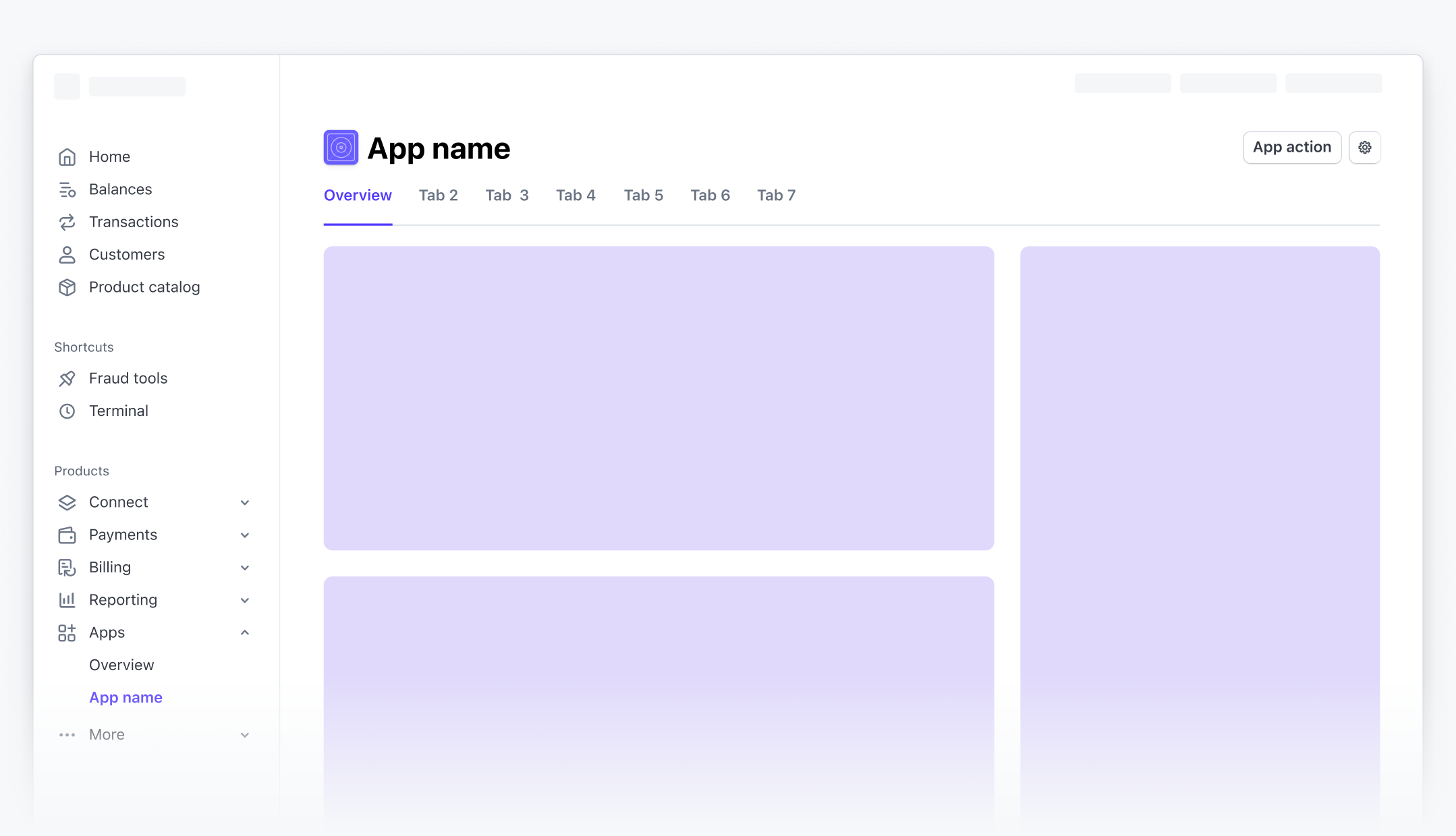
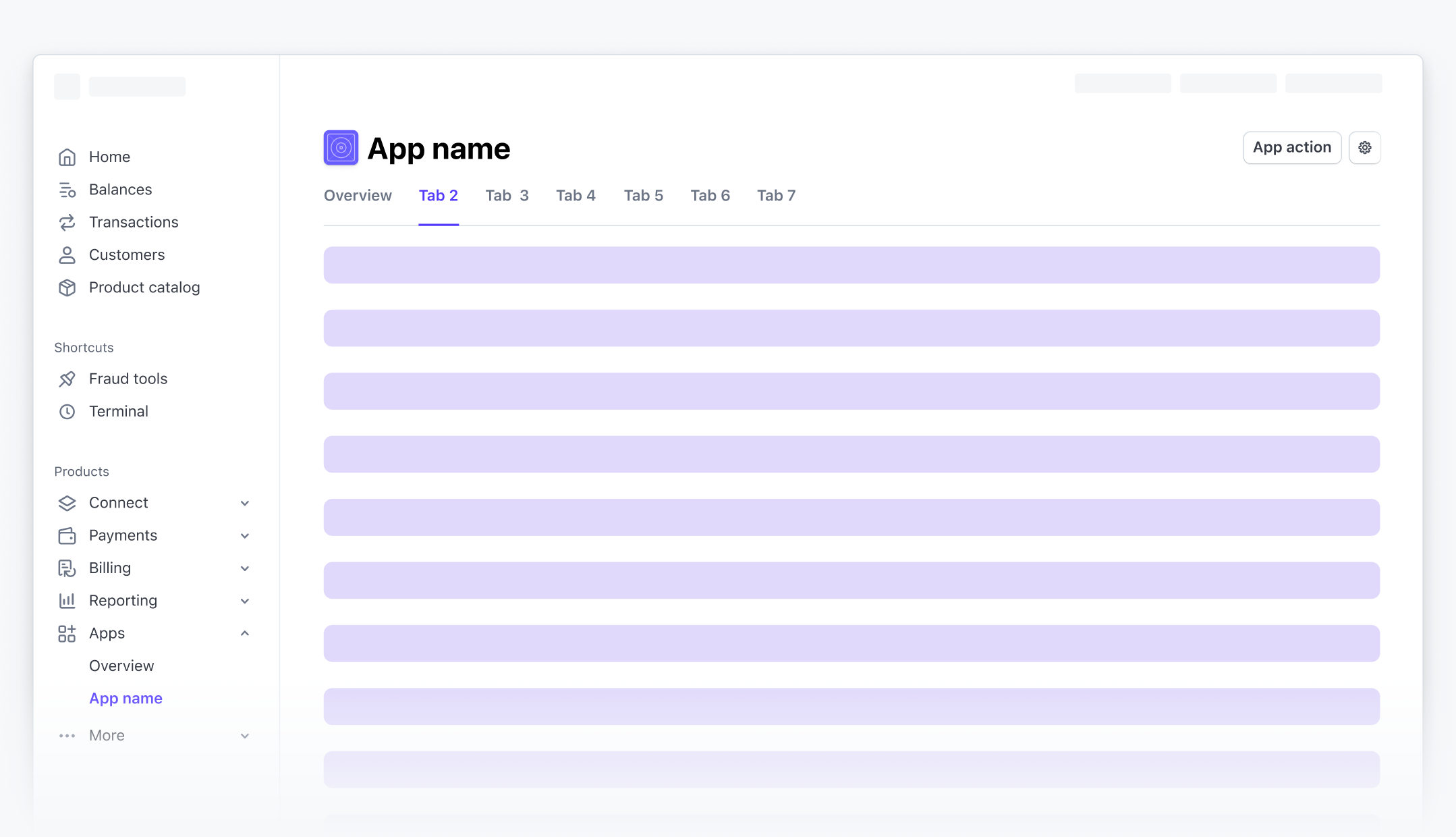
## Structure your page with tabs
Use `Tabs` and `Tab` from `@stripe/ui-extension-sdk/ui/next` to organize content into sections. Full-page apps use [routing](https://docs.stripe.com/stripe-apps/routing.md) to map URLs to views. This gives users bookmarkable URLs, browser back/forward navigation, and shareable links to specific tabs.
Start by defining your route config with a `/:tabId?` pattern so the selected tab persists in the URL:
```jsx
export const routes = createRoutes({
home: route('/:tabId?', () => (
)),
customer: route('/customers/:id', ({id}) => (
)),
});
```
See the [routing guide](https://docs.stripe.com/stripe-apps/routing.md) for the full setup, including `AppRouter`, type-safe navigation with `RouteRegister`, path patterns, and `redirectOnNotFound`.
Then wire the selected tab to your route parameter:
```jsx
import {useAppRoute, useNavigation} from '@stripe/ui-extension-sdk/navigation';
import {Tab, Tabs} from '@stripe/ui-extension-sdk/ui/next';
import {OverviewTab} from './tabs/OverviewTab';
import {CustomersTab} from './tabs/CustomersTab';
const DEFAULT_TAB = 'overview';
export function Home() {
const route = useAppRoute();
const {navigateToAppRoute} = useNavigation();
const currentTab = (route.key === 'home' && route.routeParams.tabId) || DEFAULT_TAB;
return (
navigateToAppRoute('home', {tabId})}
>
);
}
```
This pattern connects tabs to routing in three steps:
1. **Read the current tab from the route**: `route.routeParams.tabId` gives you the tab segment from the URL. Check `route.key === 'home'` first to narrow the type, then fall back to `DEFAULT_TAB` when no tab is specified (the `/` root URL).
2. **Control the selected tab**: Pass the resolved tab ID to `selectedKey` so the Tabs component renders the correct panel.
3. **Update the route on tab change**: Pass `navigateToAppRoute` to `onSelectionChange` so selecting a tab updates the URL from `/` to `/customers`.
Navigating directly to a URL like `/customers` renders the correct tab automatically, and the browser’s back and forward buttons move between tabs.
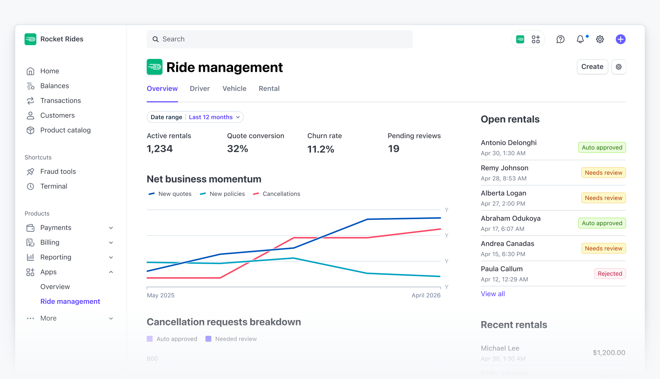
## Build an overview tab
An overview tab gives users a high-level summary of activity across your app. Use the [OverviewPage](https://docs.stripe.com/stripe-apps/components/overviewpage.md) component to structure a two-column layout with summary metrics, charts, and sidebar modules.
```jsx
import {Box, Inline, OverviewPage, Spinner} from '@stripe/ui-extension-sdk/ui';
import {PageModule} from '@stripe/ui-extension-sdk/ui/experimental';
import {LineChart, MeterChart} from '@stripe/ui-extension-sdk/ui/next';
export function OverviewTab() {
if (isLoading) {
return (
);
}
return (
}
secondaryColumn={
<>
}
/>
);
}
```
Place the [loading state](https://docs.stripe.com/stripe-apps/patterns/loading.md) inside the tab component so the tab bar remains visible and interactive while content loads.
## Build a list view
Use the [DataTable](https://docs.stripe.com/stripe-apps/components/datatable.md) component to display structured data with sortable columns, status indicators, and clickable rows. Use `navigateToAppRoute` to navigate to a detail view when a user clicks a row.
```jsx
import {useNavigation} from '@stripe/ui-extension-sdk/navigation';
import {DataTable} from '@stripe/ui-extension-sdk/ui/experimental';
export function CustomersTab() {
const {navigateToAppRoute} = useNavigation();
return (
navigateToAppRoute('customer', {id: item.id})}
pagination={{pageSize: 10}}
emptyMessage={{
message: 'No customers yet.',
action: {label: 'Add customer', href: 'https://dashboard.stripe.com/customers/create'},
}}
/>
);
}
```
Include an `emptyMessage` prop to handle [empty states](https://docs.stripe.com/stripe-apps/patterns/empty-state.md). If your list supports [filter controls](https://docs.stripe.com/stripe-apps/patterns/filter-controls.md), update the `emptyMessage` based on whether filters are active.
## Build a detail view
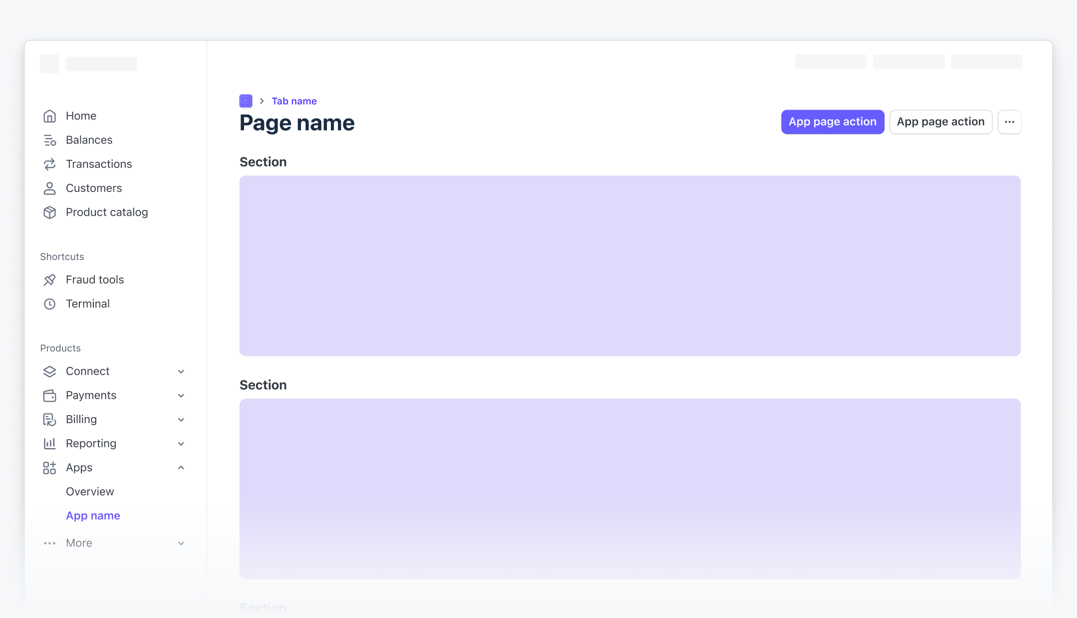
When a user selects an item from a list, the router renders the detail route. Use the [DetailPage](https://docs.stripe.com/stripe-apps/components/detailpage.md) component from `@stripe/ui-extension-sdk/ui/experimental` to structure the detail view with breadcrumbs, a two-column layout, and page-level actions.
```jsx
import {DetailPage, PageModule} from '@stripe/ui-extension-sdk/ui/experimental';
import {useNavigation} from '@stripe/ui-extension-sdk/navigation';
export function CustomerDetail({id}) {
const {createAppRoute} = useNavigation();
const customer = useCustomer(id);
return (
{/* Primary content */}
}
secondaryColumn={
{/* Sidebar content */}
}
/>
);
}
```
Because the detail view is its own route, the tab bar isn’t visible. The breadcrumb provides the path back to the list. See the [routing guide](https://docs.stripe.com/stripe-apps/routing.md#declarative-navigation-with-link) for more on `createAppRoute` and declarative navigation.
## Build create and edit flows
When users create a new item or edit an existing one, use a [FocusView](https://docs.stripe.com/stripe-apps/components/focusview.md) drawer. The drawer overlays the current view without interrupting the user’s place in the app.
Use the [Button](https://docs.stripe.com/stripe-apps/components/button.md) component’s `pending` prop to indicate that a save operation is in progress.
```jsx
import {useState} from 'react';
import {Button, FocusView, TextField} from '@stripe/ui-extension-sdk/ui';
function CreateItemForm({shown, setShown}) {
const [isSaving, setIsSaving] = useState(false);
const handleSave = async () => {
setIsSaving(true);
try {
await saveItem();
setShown(false);
} finally {
setIsSaving(false);
}
};
return (
);
}
```
## See also
- [Routing guide](https://docs.stripe.com/stripe-apps/routing.md)
- [Loading pattern](https://docs.stripe.com/stripe-apps/patterns/loading.md)
- [Empty state pattern](https://docs.stripe.com/stripe-apps/patterns/empty-state.md)
### Interested in the preview of new app components and capabilities?
Enter your email to request access.
```bash
curl https://docs.stripe.com/preview/register \
-X POST \
-H "Content-Type: application/json" \
-H "Referer: https://docs.stripe.com/stripe-apps/patterns/full-page-apps" \
-d '{"email": "EMAIL", "preview": "stripe_apps_private_preview"}'
```